Tuesday, April 16, 2019

Power BI and The Matrix: A Challenge

In this article, I will show an example to demonstrate some interesting techniques using the Matrix visual. This was inspired by a friend, Albert Herd, who asked for some help in our Malta user group to solve a problem.

The data used in the example is the list of numbers drawn on the Maltese lotto. Each record is one number from a drawing, and each drawing has five records which are the five numbers from each drawing. You can download a zip file containing a csv file with the source data, a pbix file with the data already imported to start creating the visuals, and the completed solution.

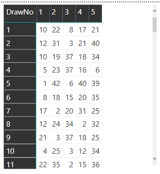
By using the Matrix visualization, the numbers for each drawing can be displayed as a single line as shown in this figure.
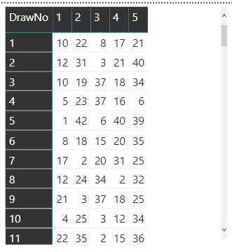
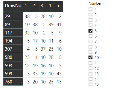
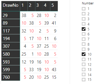
The goal is to add a slicer that filters the rows based on the number or numbers chosen. For example, if you select 5 and 10, the rows that contain those numbers will be displayed:
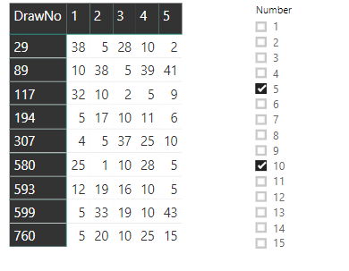
It’s also possible to add conditional formatting so that the selected numbers light up in the colour of your choice.
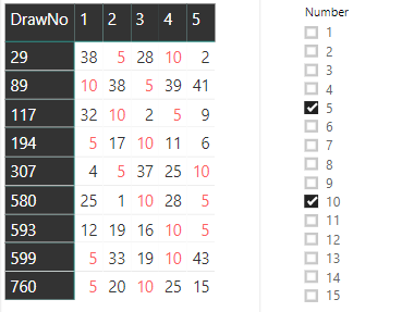
Accomplishing this is not as straightforward as it might seem. Continue reading to learn more.

The Data

Each record in the table is one number drawn on a specific lotto drawing. Each drawing has 5 numbers, so each drawing has 5 records in the table. The table is called Lotto, and the fields most important for this example are these:

DrawNo: The number of the drawing

DrawOrder: The order of the drawn number

Number: The drawn number

Starting with a new Power BI dashboard and import the csv file. As an alternative, you can also start with the MatrixSimpleStart.pbix file provided in the zip file.

Creating the Matrix

The Matrix visual has three fields to be configured: the field used for the rows, the field used for the columns, and the field used for the values. Each line of the visual should show a single drawing with the five numbers. Due to that, the field for the rows will be the DrawNo, aggregating the drawings on each row.

Each drawing has five records, the five drawn numbers, so how do you show five records on each line? The content of the field you choose as a column field will be used as the title of the columns. The best choice is easy: DrawOrder. Each row shows the DrawNo. Each column has the DrawOrder as a title and will show the drawn Number as a value in the column.

Once you have the file MatrixSampleStart.pbix opened or the csv file imported, follow a simple sequence of steps to configure the Matrix visual. You’ll be working in Report view.
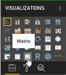
    1. Add a Matrix visual to the report from the Visualizations pane

    1. In the Fields Pane, drag the three fields, DrawNo, DrawOrder, and Number to the correct slots.
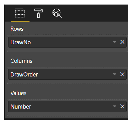
Once you have the fields in the correct spots, the Matrix will resemble this image:
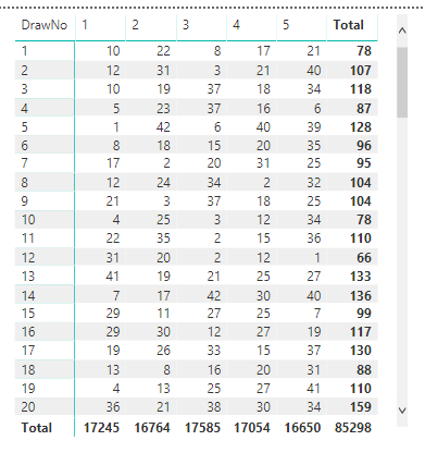
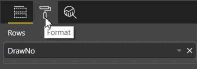
    1. In the Visualizations Pane, with the matrix selected, click the Format button and disable the subtotals for rows and columns as they are not needed.
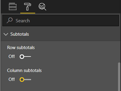
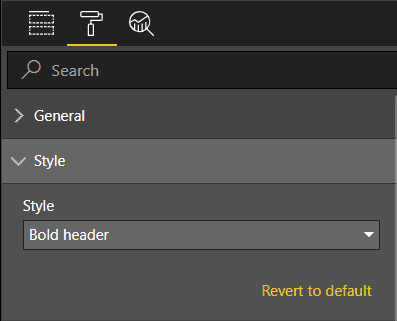
    1. While still in the Format tab, under the Style option, change the style of the matrix. You can choose any available style; I suggest Bold Header.
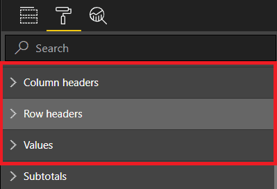
  1. Still in the Format tab, change the font size under these three different options: Row Headers, Column Headers, and Values. I like to use 12 as font size.
The completed Matrix should look like this:
Creating a Slicer and Filtering the Matrix

The matrix contains numbers from lotto drawings, so a good option for a slicer is to filter the drawn numbers, showing only the drawings with the selected drawn numbers.

There are three possible approaches to create a slicer:

  • Create a slicer based on the original table fields (Lotto)
  • Create a slicer based on a new calculated table by using a DAX expression to create the new table from the original one
  • Create a slicer based on a What-If parameter

NOTE: DAX is an expression language used in tabular models, such as the model in Power BI, to allow creating calculations over the model.

The first two options keep a relationship with the original table (Lotto). Although this relationship is not important for the result at all, it causes a small bug. The slicer needs to be inserted in the page before the matrix. If the slicer is inserted after the matrix, some of the slicer configurations will not be available. The slicer needs to be inserted first.

Creating a Slicer from the Same Table

The easiest way to add a slicer is from a field in the table. Unfortunately, it doesn’t quite provide the solution in this case. Follow these steps to see how to add a slicer based on the table:

    1. Drop the matrix
    2. In the Fields Pane, select the Number field in the Lotto table
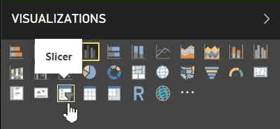
    3. In the Visualizations Pane, change the visual to Slicer
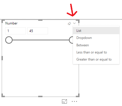
    1. In the slicer type option, inside the slicer, change the slicer format to List
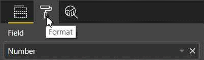
    1. In the Visualizations Pane, with the slicer selected, click the Format button. In the Selection Control options, disable the Single Select option, allowing multiple numbers selection
  1. Repeat the steps in the “Create the Matrix” section to recreate the matrix.

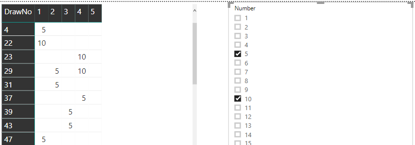
To test this solution, select two numbers, such as 5 and 10, in the slicer and look at the result in the matrix. You will notice two problems:

  • The draws are filtered to show only the selected numbers instead of all the numbers of the selected draws. That’s not the best result for this solution.
  • The multiple selections act as an OR, not an AND. Draws with only one of the two selected numbers appear.
Fixing the Selection

In order to fix the selection, a different approach for this problem is needed. The filter is automatically made by the model and visual engine in Power BI, showing only the selected numbers. In order to show all the numbers of the selected draws, you will need to break the automatic filter and create a DAX formula that will control which draws need to appear.

This leads back to the decision about how to build the slicer: Building the slicer directly from the draws table (Lotto) creates a relationship that can’t be broken. That’s the only slicer option that will not work. If you choose to build the slicer from a calculated table or What-If parameter, the relationship to the source table (Lotto) can be controlled, avoiding the filtering.

Once the matrix is not directly filtered by the slicer, you can create a DAX formula to filter the drawings. The expression will need to compare the numbers on the current drawing row to the selected numbers on the slicer, identifying if the row should be displayed or not.

First, you’ll see the two additional ways to create the slicer, both using a helper table. You can choose either method.

Creating the Slicer – Calculated Table

You can create this table using a very simple DAX expression. On the top menu, Modeling tab, you’ll find a button called New Table. After clicking this button, a space expands where you can introduce the DAX expression for this table.
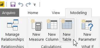
Call the table Selector. The expression is very simple:

Selector = VALUES (Lotto[Number] )

The newly created table, Selector, will have no relationship with the original one. Although it was created from the Lotto rows, the only effect will be the strange visual behaviour that requires the slicer to be created before the matrix.
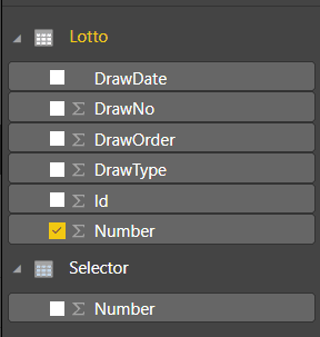
Choosing this option for the Selector table, you will need to execute the following steps:

  1. Drop the slicer
  2. Drop the matrix
  3. Create the slicer again using the steps from the “Creating a Slicer from the Same Table” section but use the Number field from the Selector table
  4. Create the matrix again

Note that at this point, the slicer will not filter the data. Continue reading to learn how to get it to work filtering the matrix.

Creating the Slicer from the What-if Parameter

Instead of creating the Selector table based on the Lotto table, you can create a What-if parameter. This is a new table with no relationship to the Lotto table.

If you created the Selector based on the table in the previous section, delete it before following these steps.

    1. Delete the matrix
    2. On the top menu, Modeling tab, click the Create Parameter button to bring up the What-if Parameter window.
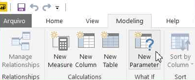
  1. Change the Name to Selector and specify a table of values from 1 to 99.
  2. Click OK once the properties have been filled in
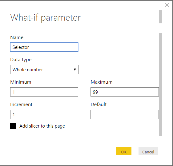
The DAX formula generated behind the scenes is:

Selector = GENERATESERIES ( 1, 99, 1 )

You’ll see the new measure in the Fields pane:
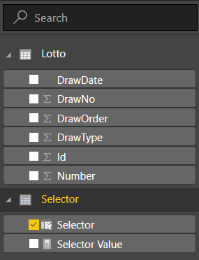
As you will notice on the image above, there is one small difference on this option: the field created inside the Selector table is also called Selector instead of Number as on the previous option.

In order to make both options the same, you can rename the Selector field to Number. It’s optional, but if you don’t, the following expressions will need to use Selector[Selector] to refer to this field instead of Selector[Number].

The steps to rename this field:

  1. In the Fields pane, under the Selector table, next to the Selector field, click the ‘…’ (More Options) button
  2. Click the Rename menu item in the context menu that will appear
  3. Change the field name to Number

Follow these steps to complete the slicer

  1. Repeat the formatting (steps 4 and 5 in the “Creating a Slicer from the Same Table”) to format the new slicer that will be automatically added to the report.
  2. Recreate the matrix as shown in the “Creating the Matrix” section

If you chose this method for the slicer, continue to learn how to get it to work filtering the matrix.

Measures vs. Calculated Columns

Before going forward, it’s interesting to understand why to create measures and not calculated columns. Both measures and calculated columns accept DAX expressions. However, they have some differences. While the calculated column expression is evaluated in the row context, row by row, measures are used on aggregations.

Another significant difference, usually the easiest one to help with the decision, is when the calculation is made. The calculated column expressions are evaluated when the table is processed, and the result is stored within the Power BI file. This means they can’t rely on any interaction with the visuals, because they are calculated before.

This makes the decision easy: you need measures that will react to the selection on the slicer as the user make it. The fact these measures will be calculated on each line of the matrix, which in fact is an aggregation of five records, is just an additional reason.

Creating the Measures for Filtering

To filter the rows according to the selected numbers, you will need to create one measure to identify if each row has the selected numbers on the slicer. It’s a boolean measure which should result in true or false, but here comes the first trick: Power BI doesn’t deal very well with boolean measures used for filtering, so you need to create it as a numeric measure resulting in 1 or 0.

Another concern about this formula is to display all the rows when there is no selection in the slicer. In this case, the measure should return 1 for all the rows, showing everything.

This measure will be calculated for each row of the matrix, and each row of the matrix has a set of five numbers. The slicer, on the other hand, also will have a set of numbers selected and you don’t know how many. If the drawing numbers in the row contain all the numbers of the slicer, the result should be 1 (show the line), otherwise 0.

A DAX expression allows you to create variables inside the expression, and you can put this to good use to solve this problem. Here is the beginning of the expression:

LineFilter =
VAR tab =   VALUES (Selector[Number] )
VAR tab2 =  VALUES ( Lotto[Number] )
VAR common =  INTERSECT ( tab, tab2 )
VAR rowsCommon =  COUNTROWS ( common )
VAR rowsSelected =  COUNTROWS ( tab )

It’s essential to consider the context used to process this expression. The Values function over the Selector table will return only the numbers selected on the slicer or all the numbers, while the Values function over the Lotto table will return only the numbers for the current drawing line, since the expression will be analysed for each line of the matrix.

On the final part of the expression, if the rowsCommon variable is equal to the rowsSelected variable, it means all numbers selected on the slicer are on this drawing, and the result will be 1. Otherwise, it will be 0. However, you need also to consider if the slicer is not filtered at all. For this, you have the ISFILTERED DAX function.

The full DAX expression is:

LineFilter =
VAR tab =   VALUES ( Selector[Number] )
VAR tab2 =  VALUES ( Lotto[Number] )
VAR common =  INTERSECT ( tab, tab2 )
VAR rowsCommon =  COUNTROWS ( common )
VAR rowsSelected =  COUNTROWS ( tab )
RETURN
    IF (
        OR ( rowsCommon = rowsSelected, 
          NOT ( ISFILTERED ( Selector[Number] ) ) );
        1,
        0
    )

The steps to use this expression are the following:

    1. In the Fields pane, Click the ‘…’ (More Options) button close to the Lotto table
    2. Click the New Measure menu option in the context menu that will appear
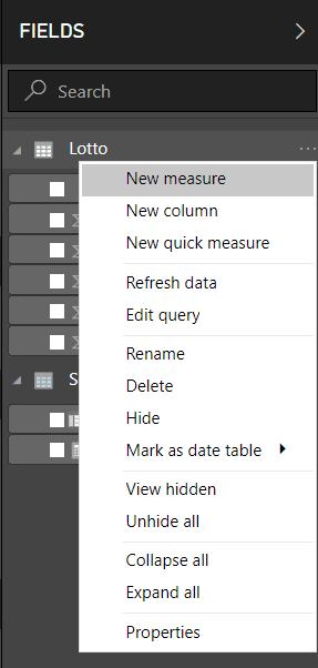
    1. Paste the entire expression, including the measure name, in the formula bar
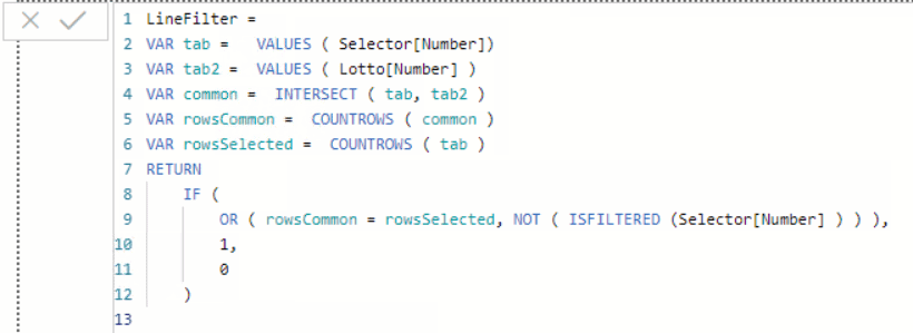
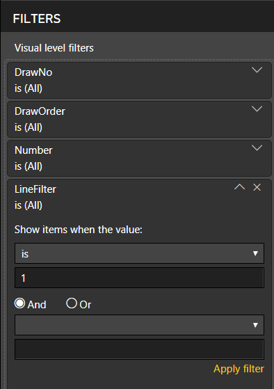
    1. Drag the newly created measure to the filter area of the matrix configuration
    2. Change the comparison expression Show items when the value to is
    3. Fill the value expression with 1

  1. Click Apply Filter

After completing these steps, the filter will be working. When you select multiple numbers on the slicer, you will see only the draws that contain all the selected numbers.
Conditional Formatting

The conditional format is the “cherry on top” of this solution. You can not only filter the drawings, but you can also highlight the numbers selected on the slicer within each line with a different colour.

The numbers selected in the slicer should appear in red or whatever colour you select. This is too complex for the conditional formatting. Due to that, you need a new measure that tells you, for each number in the drawing, if it’s selected or not.

Since this measure will be used only for conditional filtering, it will be processed for each number and not sets of numbers. However, since it’s a measure, you still need to apply an aggregation function to the Number field, a simple SUM will do the job.

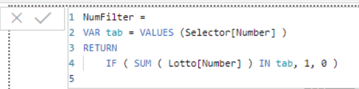
The final measure will look like this:

NumFilter =
VAR tab = VALUES (Selector[Number] )
RETURN
    IF ( SUM ( Lotto[Number] ) IN tab, 1, 0 )

The steps to complete the conditional formatting are:

    1. In the Fields pane, Click the ‘…’ (More Options) button close to the Lotto table
    2. Click the New Measure menu option in the context menu that will appear
    3. Paste the entire expression, including the measure name, in the formula bar
    1. Select the matrix visual on the main pane
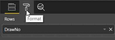
    2. In the Visualizations pane, with the matrix selected, click the Format button
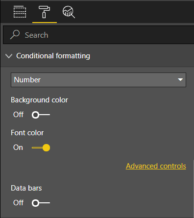
    1. In the Visualizations pane, open Conditional formatting
    2. Under the Conditional Formatting element, enable Font color option
    1. Click on the Advanced Controls link that will appear below the Font color option
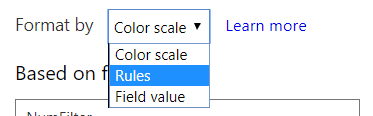
    2. In the Font color window, on the Format by dropdown box, select Rules
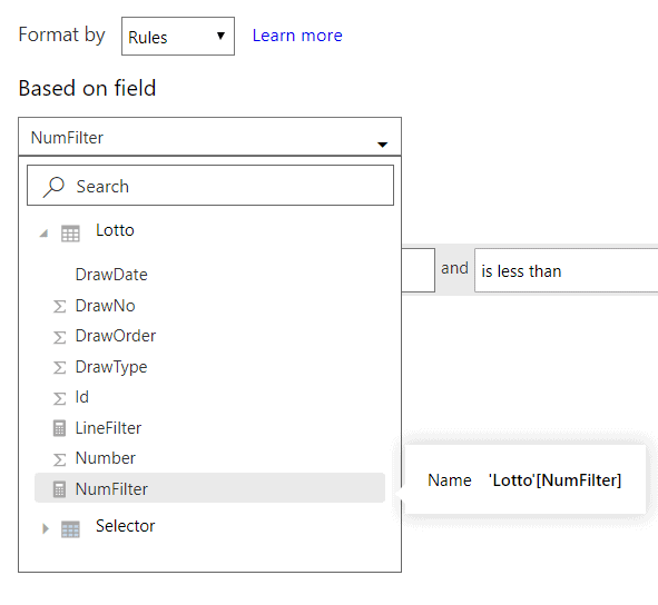
    1. On the Based on field dropdown box, select the measure, NumFilter
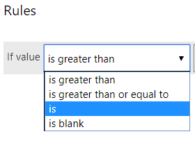
    1. On the If value dropdown box select the is option
  1. Type 1 in the textbox besides the previous dropdown
  2. Select Red in the color picker, if not selected already
  3. Click Ok

Once you have followed the steps, you should see the selected numbers light up in red or the colour that you selected.
Summary

Using some interesting DAX expressions, each line of a matrix could be filtered according to a slicer. In addition, the numbers selected could be highlighted. Of course, this is a very specific example, but I’m sure you can adapt the expressions shown here to your challenges using the Matrix visual.


The post Power BI and The Matrix: A Challenge appeared first on Simple Talk.


from Simple Talk http://bit.ly/2KFIi5m
via

Monday, April 15, 2019

The BI Journey: The Expert’s Advice – Part 2

Ruthie, the intern at the AdventureWorks sales department was in her final stages of building a semantic model for data analysis. She had had a busy week and weekend where she had initiated a business intelligence solution that evolved out of a lunchtime conversation (The BI Journey: The Analyst). She had not wasted much time since that conversation; she had read-up, gotten herself a dataset, built a prototype, and had shared it with her boss for feedback. Once she got feedback, she found herself a mentor, George, who was an expert in the field. She spent the weekend meeting with him, getting advice and incorporating the advice along with her boss’s feedback into the solution she had built. She was planning on presenting the solution to Stephen the following Monday (The BI Journey: The Expert’s Advice – Part 1). It was now Sunday, and she was adding the finishing touches to her dimensional model. She would then add the semantic layer on top, and then, to complete the solution, build a report.

The Date Table

When Ruthie’s dimensional model was in its basic form, George had asked her to add a table for dates. Date (or Calendar) is a special dimension table that is required in almost all analytic data models. It is also special since, unlike other dimensions, Date (or Time in certain cases) does not have a source. Of course, the transaction tables such as orders do have dates in them, but if you were to pull out these dates into a Date table you would most probably end up with a list of dates with gaps in them, explained George. That was because some transactions naturally do not happen on certain days such as holidays. But to do data analysis using dates it is important that a continuous list of dates be available. If not, actions such as comparing facts against a point in time in a prior year or viewing the trend of sales across the year may result in anomalies.

Ruthie first created a Date table from the Data tab of Power BI desktop. This is where, George said, most of the semantic modeling will be done from. Since the Date table didn’t have a source it had to be generated using DAX functions. George encouraged Ruthie to use the DAX reference online to help her along and suggested creating the table herself without help.

Working from the Modeling tab, she inserted a table. Using the CALENDAR and DATE functions, Ruthie first generated the rows for the table with a column holding a list of dates:

Date = CALENDAR(DATE(2017, 01, 01), DATE(2018, 12, 31))

She then derived more columns for day, week, month, quarter and year from the date column.

Day = FORMAT([Date], "DDD")
Week = "Week " & WEEKNUM([Date],2)
Month = FORMAT([Date],"MMM")
Quarter = "Q" & FORMAT([Date], "Q")
Year = YEAR([Date])

She created more derivatives of month; one with the year and month concatenated as follows:

Month Name = YEAR([Date]) & " " & FORMAT([Date],"MMM")

She then created one that was made up of month numbers, so that she could use the column to sort the Month and Month Name columns. Otherwise, the months would list in alphabetical order instead of chronological:

Month Number = (YEAR([Date]) * 100) + MONTH([Date])

The entire table including the columns, Ruthie wrote in DAX, and she thought it was pretty cool. She was liking each aspect of creating a business intelligence solution and could not wait to create the report she had in mind.

The Star (and Snowflake) Schema

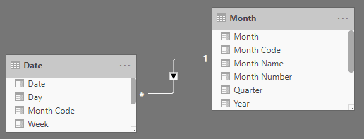
Once the Date table was setup, Ruthie linked it with the orders fact table to complete the star schema. Now that the orders star schema was completed, she needed to figure out a way to connect the Date table to targets, which was another star schema. However, the date portion of the targets’ granularity was month. So, Ruthie now quite familiar with dimensional modeling techniques promptly split the Date table at the month and created a Month table, linking both using a new column called Month Code.

Figure 1: Date and Month tables

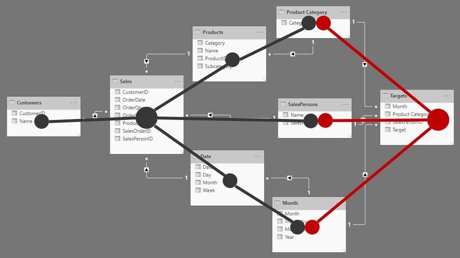
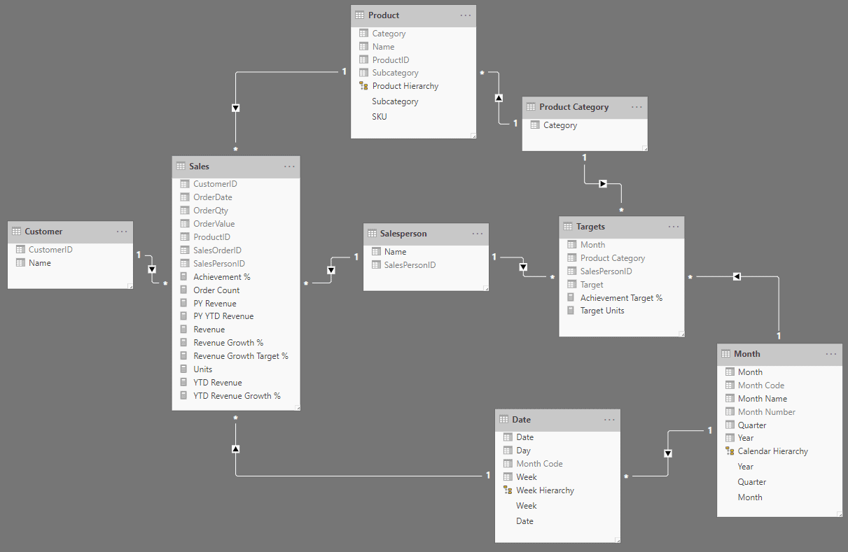
The dimensional model, a combination of two star schemas, was now done. The product table was also split at the product category because sales targets were only budgeted at the product category level.

Figure 2: Dimensional model

Completing the Semantic Layer

The semantic layer is what interfaces with the end user (or the business user who builds reports). Therefore, George had explained, it had to be designed as business-centric and user-friendly as possible. One had to go into the most detailed aspect to achieve this; even to the level of ensuring that a metric has thousand separators, so that a user is not confused if a number is a million or ten million by just glancing at it. George handed a list of some best practices and advice that should go into the semantic model. She also had the list of requirements and changes that Stephen had given her after he had looked at the first iteration of the solution. Most of what Stephen gave her needed to be created at the report level, nevertheless, she wanted to include whatever from that list that made sense in the semantic model.

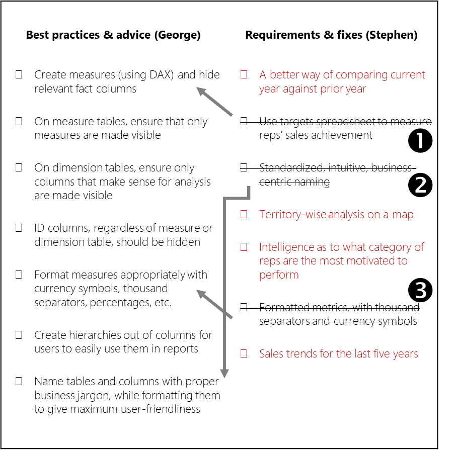
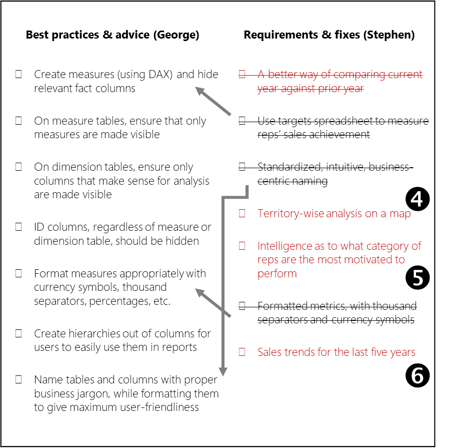
Ruthie put down a quick, condensed checklist of both lists, so that she could see if there were dependencies and ambiguities between the lists and to quickly tick off the items as she completed them:

Figure 3: Checklist of best practices, requirements and fixes

Ruthie struck out ambiguous items, marked dependencies, and highlighted report requirements in red (so that those can be looked at later). She struck out the following from Stephen’s list:

Item – The targets spreadsheet was already absorbed into the data model, and the achievement measure created.

Items – These were already items in George’s list.

Measures

Ruthie proceeded to create measures on top of the dimensional model. The following were already created (The BI Journey: The Expert’s Advice – Part 1):

  • Revenue
  • Units
  • Target Units
  • Achievement %
  • Order Count

She started thinking about more measures that could be added to the semantic model; what more will business users want to see? She immediately remembered one of the items from Stephen’s list: A better way of comparing the current year’s sales with that of the prior year. Right now, in the preliminary version Ruthie had given him, Stephen had to switch between the years in the slicer back and forth (which was utterly pointless) or rely on a trend visual to see the difference between the years, which was only useful to an extent.

Time Intelligence

She soon figured out that she needed a Revenue Growth measure which would show the difference in revenue between the selected (or current) year and the year prior as a percentage. She was quite glad about her idea because she noticed, while doing some research, that it was a standard measure used in the industry.

To create this measure, she had to first create another measure; the prior year’s Revenue (PY Revenue).

PY Revenue = CALCULATE([Revenue], SAMEPERIODLASTYEAR('Date'[Date]))

She then used PY Revenue to calculate Revenue Growth:

Revenue Growth % = 
CALCULATE(DIVIDE(([Revenue] - [PY Revenue]), [PY Revenue], 0))

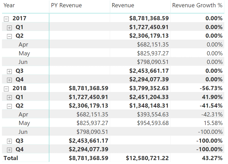
She quickly tested it out, and it looked good:

Figure 4: PY Revenue and Revenue Growth test

Ruthie learnt that these measures, which were created using various date-based fields as filters, were called time intelligence measures and were a common occurrence in business intelligence solutions.

Measures, such as MTD Revenue (month-to-date), YTD Revenue (year-to-date), PY YTD Revenue, YTD Revenue Growth %, and more, which were derived off base measures such as Revenue, provided business users with the ability to perform various types of analysis with ease. This helped users focus on their analyses, and not waste time trying to figure out the logic for calculations each time a measure had to be “modified” for a particular type of analysis. For example, If the user wanted to view a graphic of rolling revenue values from the beginning of the month on a daily basis, the Revenue measure cannot be just used on the visual since it would only show each day’s revenue instead of a rolling number. Which means the user would have to come up with a way to create a calculation that would do this. So, instead of letting the user do all that, if the data model already provided it, it would only be a matter of using that measure: a productivity win.

All of this required that the date (or calendar) table is marked as a Date table in Power BI. Doing this ensured that the date table had an unbroken sequence of dates, a prerequisite for time intelligence.

Formatting the Semantic Model

A good portion of George’s checklist dealt with formatting the semantic model. This shouldn’t be too hard, thought Ruthie and got things completed in fifteen minutes.

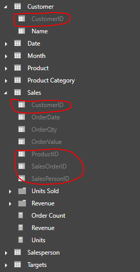
Once all the measures were created, she hid all the base aggregation columns:

In addition, she ensured that all the ID columns that were used to link to the dimension tables were hidden, and also their counterparts in the dimension tables. ID columns were only useful for linking tables, and hardly had any analytical value:

Figure 5: Hidden ID columns

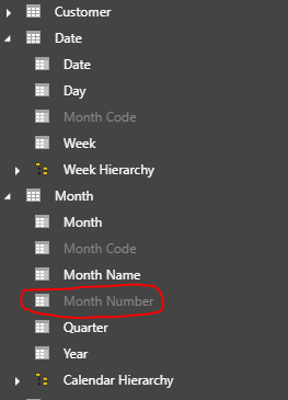
Then she looked for any other columns that did not make sense as part of a dimension so that she could hide them too. However, she only found the Month Number column in the Month table.

Figure 6:Hiding columns not needed for analysis

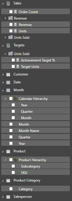
Finally, she formatted all the measures appropriately with currency formatting, percentage formatting, thousand separators, and decimal places, and made sure the tables and columns were named properly (dimensions in singular form and facts in plural form).

Figure 7: The semantic model in the relationships view

When she gave the semantic model a final look, she saw a model that gave the business users a business-centric, user-friendly set of tables that were intuitive to use. Measures were separated into their own tables so that they could be easily identified, while at the same time the measures were grouped into folders so that they could be easily located. Aptly-named, formatted measures self-described how they could be analyzed.

Figure 8: The semantic model in the report view

Dimensions had their own tables with only the columns that are used for analysis, while also being arranged into hierarchies so that it saved confusion such as “would Brand come under Category, or would Category come under Brand?”.

User Requirements

Figure 9: Checklist of best practices, requirements and fixes

She now turned to the items left over in red. She now realized that and required more data to be pulled in. required that sales territory information be brought in, which would necessitate the creation of a new dimension. required that three more years’ worth of records are pulled into the sales fact table on top of the two years of data that Ruthie already had.

Now this is a fix, thought Ruthie. She had not anticipated that she would have to put in more effort in the querying department. She had not much time left of the weekend, and she had to complete the report. But at the same time, she wanted to really impress Stephen by incorporating all his requirements.

Then she looked at the final item and her heart sank. suggested a type of analysis that Stephen wanted where he would know what which category of salesperson was the most productive, and this category that Stephen was talking about could be anything: a certain age bucket, a certain experience level, a certain salary range, anything!

Backlogging

Ruthie was worried now, she did not want all her hard work to be worthless when Monday came. She called George for guidance. George assured her that whatever she had done so far was quite a lot, and that there were always situations when the tasks that needed to be completed required more effort than what was anticipated.

George explained the importance of maintaining a backlog of tasks with an estimate of effort and priority. This way, when there was limited time to complete all the work, one could decide as to which tasks will be done during that time, based on priority and effort, and leave the rest of the tasks for another time. This way expectations can be set with the stakeholders as to what they could expect to see this time, and what they could expect next time. He told her that there was more to that concept, but for now not to worry about it, and that she could defer items and for later and include item which would only require her to get the 5-year set of data of the same dataset she had.

Ruthie, feeling better now, thought it was a good idea and suggested that she would ask Dan, the DBA for the five-year sales dataset as soon as she went in to office the next day. She could quickly do a file replace and get Power BI to refresh the data set.

Reports

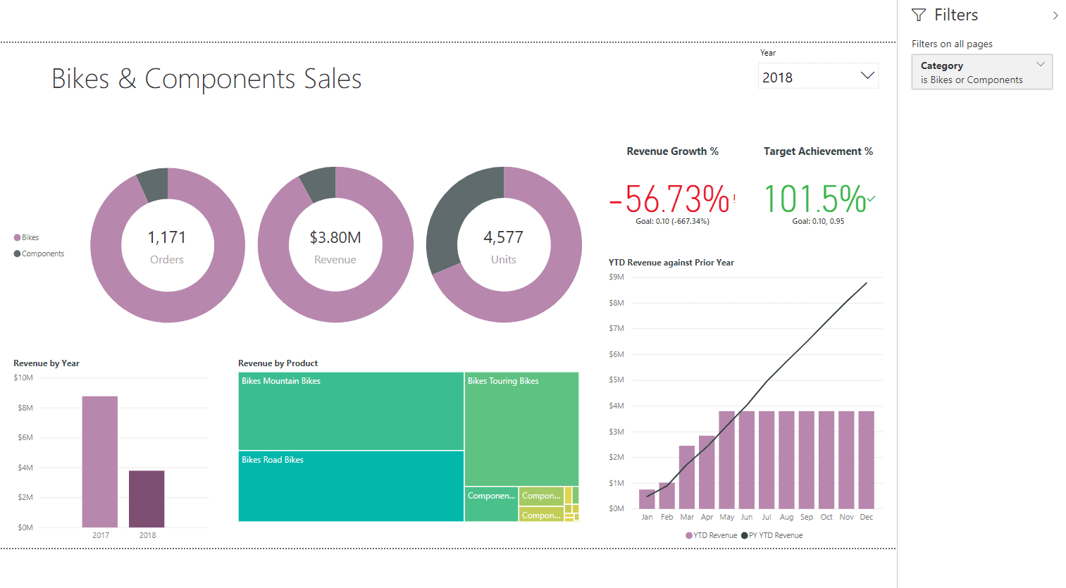
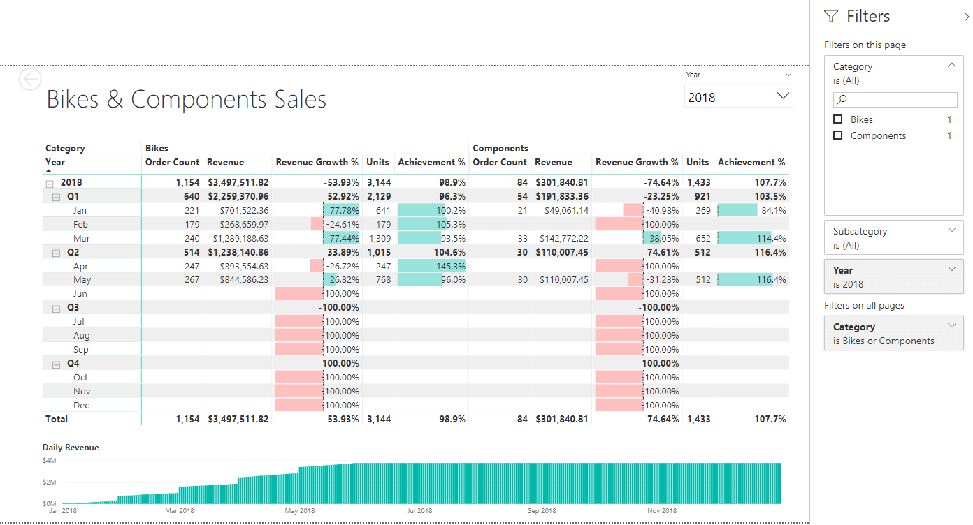
Ruthie was now finally at the point of creating reports. She decided to provide a summary page, and a detailed page which had the detailed analysis of what was on the summary page.

Figure 10: Summary Page

Figure 11: Detailed Page

Ready for Launch

Ruthie’s sense of satisfaction was double from what she felt the previous night. She was quite confident and proud of her solution, despite not completing the list of requirements. She had them in a backlog, and would work on them during the next week, after the solution was showcased.

The solution she had built comprised of a semantic data model which was cleansed and formulated to be user-friendly and intuitive for business users, with all possible measure made available. The model was made up of data that came from two sources; the sales database, and the sales targets spreadsheet. On top of the semantic model was a visual analytic report that represented the data as an overview, and then allowing for it to be drilled down and through for detailed analysis. The best part of the solution was that it allowed the business users to quickly create their own reports by making use of the data model and then sharing and collaborating with other users.

Ruthie’s joyful realization at the end of all this was that she now understood that a BI solution was not a one-time thing. It needed to evolve, it should evolve, and it will evolve, as users’ requirements kept increasing, as they keep seeing more and more value from the solution. She was ready and looking forward to all of it.


The post The BI Journey: The Expert’s Advice – Part 2 appeared first on Simple Talk.


from Simple Talk http://bit.ly/2PetrgX
via
Saturday, April 13, 2019

Extract the Path from Filename in SQL

While I was preparing an article, I faced the challenge to extract the path from a filename in SQL Server. It’s an interesting challenge with many possible uses, so I decided to create a function to solve this problem.

The Main Expression

First, let’s understand the main expression to solve the problem. The path is everything before the last backslash (‘\’) in the full file name. So, we can proceed this way:

  • Reverse the full filename
  • Get the CharIndex of the first backslash (‘\’)
  • Get the length of the full filename subtracted by the CharIndex of the first backslash
  • From the left of the full file name, get the number of characters calculated by the previous formula


Creating the function

The next step is creating a function to solve this problem, so we don’t need to repeat the expression all the time.

The function will be like this:

CREATE FUNCTION dbo.Pathfromfullname (@FullName VARCHAR(500))
returns VARCHAR(500)
AS
  BEGIN
      DECLARE @result VARCHAR(500)

      SELECT @result = LEFT(@FullName, Len(@FullName)  Charindex(‘\’, Reverse(
                                                        @FullName)))

      RETURN @result
  END 

In order to test the function, we can execute the following instruction:

SELECT
dbo.Pathfromfullname(‘C:\Program Files\Microsoft SQL Server\MSSQL15.SQL2\MSSQL\Log\system_health_0_131996396680890000.xel’) 

Increasing the Safety

If the parameter has no backslash, the function will fail. A simple check can increase the safety of the function, but we can also turn this into another function that may be used in many places:

CREATE FUNCTION dbo.Isfullpath (@FullName VARCHAR(500))
returns BIT
AS
  BEGIN
      DECLARE @result BIT

      IF Charindex(‘\’, @FullName) = 0
        SET @result=0
      ELSE
        SET @result=1

      RETURN @result
  END 

Let’s fix the PathFromFullName function:

ALTER FUNCTION dbo.Pathfromfullname (@FullName VARCHAR(500))
returns VARCHAR(500)
AS
  BEGIN
      DECLARE @result VARCHAR(500)

      IF ( dbo.Isfullpath(@FullName) = 1 )
        SELECT @result = LEFT(@FullName, Len(@FullName) 
                                         Charindex(‘\’, Reverse
                                         (
                                                        @FullName
                                                             )))

      RETURN @result
  END 

Now if the parameter is not a full filename the result will be null

The post Extract the Path from Filename in SQL appeared first on Simple Talk.


from Simple Talk http://bit.ly/2IuLRIZ
via
Tuesday, April 9, 2019

Processing Data Using Azure Data Lake, Azure Data Analytics, and Microsoft’s Big Data Language U-SQL

Azure Data Lake Store is an extensive repository in Azure Cloud which can be thought of as a store of varied forms of data such as structured, unstructured, and semi-structured data. There are different ways this data can be loaded to the data store. You can use Azure Data Factory, Azure UI, using languages such as C# or Java SDKs, etc. Once the data is uploaded to Data Lake, you can use U-SQL scripts to process that data.

When working on huge datasets, you might need more processing power and space. Azure Data lake provides an easy and simplified approach to improve development. The Azure Data Lake efficiently manages the data in HDFS (Hadoop Distributed File System). As you might be aware, HDFS brings in a lot of other benefits such as replication, scalability, and durability. This makes Azure Data Lake Store a very beneficial option when you have a huge amount of data being generated in your organization.

I’ll first explain what U-SQL is and how you can use this powerful big data query language to process the data.

U-SQL

The data being stored needs to be processed and analyzed to understand the current and future statistics by various departments within the organization. One such solution is U-SQL, Microsoft’s big data query language which unifies the benefits of T-SQL and C#. The use of C# types makes it even more powerful and easy to write. This allows the developer to conceptualize the way data will be processed right at the time of writing the query. You won’t need expertise in T-SQL or C# to write these queries, just the fundamental understanding of both these languages should be enough to move forward.

You can visualize how the ETL process works and, after you have the picture in mind, you will be able to write the U-SQL scripts easily. U-SQL helps you to extract and transform data in the required form. You can write the scripts to perform these operations and get the results/output back the way you want. U-SQL supports the extraction of values from various types of files such as txt, csv, etc., by using the concept of extractors. You can write your own extractors depending on the type of file you are using. Just like the way extractors are used to extract the data, there are outputters to output the data. The built-in extractor for tab separated files is Extractors.Tsv and for comma separated file it is Extractors.Csv. Similar to this, you can use Outputters.Tsv and Outputters.Csv depending on the format you want your output to have.

There are two ways to run the U-SQL scripts, the first is to execute the U-SQL locally and the second is U-SQL Cloud execution. When running locally, the data read and written by the scripts will be present on your local computer. On the other hand, if you are using Cloud execution, the data and script will be executed on the Azure Cloud which means you are using the Azure resources and thus paying for compute and storage resources. You may want to choose the local execution over cloud execution, especially during development, as it doesn’t cost you anything. In this article, I am going to demonstrate both the local execution path and Azure Data Lake execution. The first section of the article will show how to use Visual Studio to write and execute U-SQL scripts, and in the later section, you will see how to run the same U-SQL job using Azure Data Analytics and Azure Data Lake.

Creating and Executing the U-SQL Script Using Visual Studio

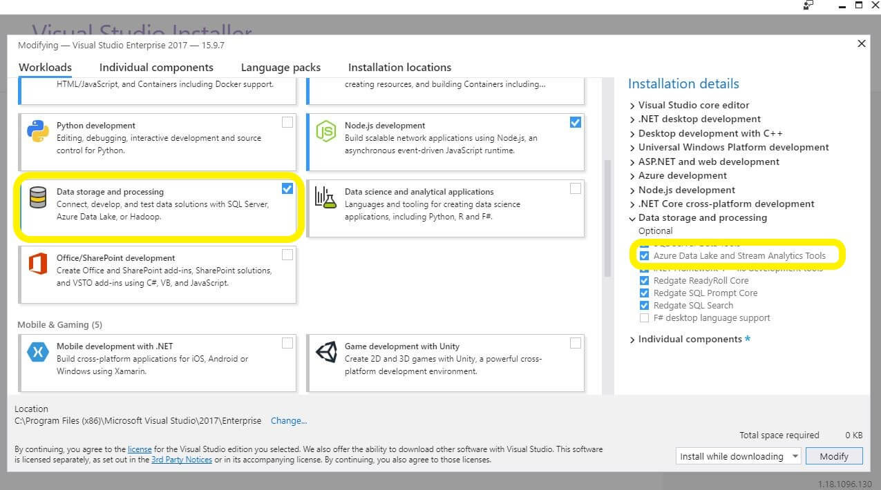
The first thing you should do is set up your environment, making sure that the proper workload is in place. Run the Visual Studio Installer. Navigate to the Workloads tab, Data storage and processing section. Select Azure Data Lake and Stream Analytics Tools. If this has not been installed, install it now.

C:\Users\spande\AppData\Local\Microsoft\Windows\INetCache\Content.Word\AZ1E.JPG

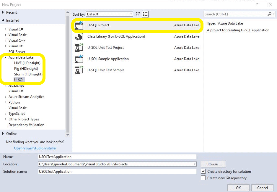
After you have installed the Azure Data lake and Stream Analytics Tools, workload you can create a new project in Visual Studio by selecting the U-SQL option from the Azure Data Lake section.

You might have noticed that there are various project options available here that provide you the flexibility to create unit test projects or class library projects. The class library projects will be used when you want to create your own USQL objects in C#, like custom outputters or extracters. For the scope of this article, select the U-SQL Project and start writing your first U-SQL script.

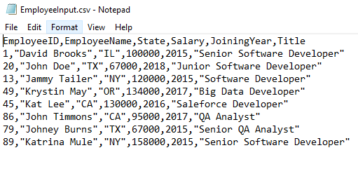
Before moving ahead and getting your hands dirty writing the U-SQL script, first, download the sample csv file. This is how the csv file looks:

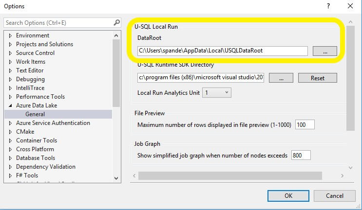
To feed the data to your script, you can add a physical path to your SQL script, but this might not be a good idea if you want to deploy this script over to the Azure Cloud later. Because any paths that exist in your local file system won’t exist in the Azure Data Lake account, this would eventually cause your script to fail. So instead of a physical path, you may want to use the relative paths which will help to run the paths locally as well as in Azure Data Lake. While running the script locally, the data file needs to be copied to an Azure Data Lake Catalogue which you can find by navigating to the Azure Data Lake Toolbar and clicking the options/settings from the menu.

The file needs to be copied to this location motioned in Data root folder path highlighted below.

C:\Users\spande\AppData\Local\Microsoft\Windows\INetCache\Content.Word\AZ4E.JPG

After you navigate to USQLDataRoot folder, create a folder called InputFiles and copy the EmployeeInput.csv file there. It can then be referenced by the U-SQL script.

Another thing that you might notice here is that your U-SQL file comes with a C# code-behind file Script.usql.cs which can be used to add custom functions that can be used in your scripts.

The next step is to rename the Script.usql file to TestUsql.usql. Here is the code for the script:

//Extract values from input 
@employeedetails = EXTRACT EmployeeID int,
                      EmployeeName string,
                      State string,
                      Salary decimal,
                      JoiningYear int,
                      Title string
FROM "/InputFiles/EmployeeInput.csv"
//Use in-built CSV extractor to read the CSV file and skip the first row
USING Extractors.Csv(skipFirstNRows:1);
//Query for calculating average on Salary field
@average = SELECT State,
AVG(Salary) AS AverageSalary  
FROM @employeedetails
GROUP BY State;
//specify output file and write the headers to the output file
OUTPUT @average TO "/OutputFiles/AverageSalaryResults.csv"
USING Outputters.Csv(outputHeader:true);

Understanding the U-SQL Script

The first step is to extract the data from csv file and then perform the required transformations on the data. After these transformations are complete, the results are finally written to the output file. For extraction of the data, U-SQL provides various extractors depending on the file type. Here, the input file is in csv format, so a csv extractor is required. To extract the data, supporting C# types are used depending on the type of data elements.

For collecting the extracted values, the script uses a row-set variable @employeedetails. You might notice that the naming convention for variable declaration is similar to T-SQL naming convention with the @ sign.

A row-set variable @employeedetails will store the extracted values

@employeedetails = EXTRACT EmployeeID int,
                      EmployeeName string,
                      State string,
                      Salary decimal,
                      JoiningYear int,
                      Title string
FROM "/InputFiles/EmployeeInput.csv"

A CSV extractor is used, and to help the extractor to detect that row headers are present on the first row of the file you have to set skipFirstNRows to 1.

USING Extractors.Csv(skipFirstNRows:1);

For transformation, the SQL average function calculates the state-wide average. The results will then be collected into the @average variable.

@average = SELECT State,
AVG(Salary) AS AverageSalary  
FROM @employeedetails
GROUP BY State;

The contents are written out to AverageSalaryResults.csv that will be created in the OutputFiles folder

OUTPUT @average TO "/OutputFiles/AverageSalaryResults.csv"

Outputters.Csv is specified with the formatting using the Outputter command:

USING Outputters.Csv(outputHeader:true);

Running the Script

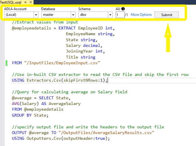
Normally, for running any solution, you use the Start button in the Visual Studio toolbar, but, in this case, you will use a U-SQL toolbar to run the U-SQL script. By doing this, you will see the step-by-step execution of the script.

C:\Users\suhas\Downloads\image.png

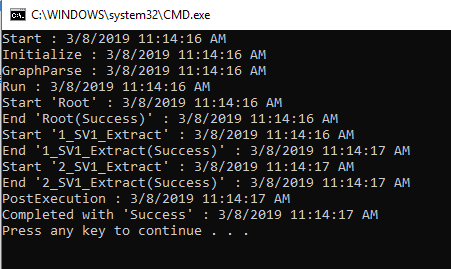
After the script runs, you will see the compile summary shown below.

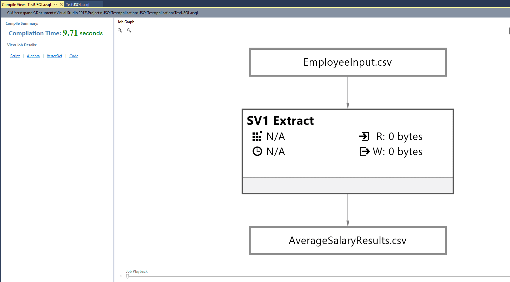
By running with the Submit button, you will see detailed information about the job. For instance, the compile view will show you how the data has been processed from step1 to step n. Also, it shows the compile time details and easy to navigate to script options.

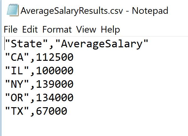
As mentioned, the output data should be written to the file /OutputFiles/AverageSalaryResults.csv. You can now go and check the same root directory where you created the InputFiles folder. You can also access the file using the local run results window just by right-clicking the output result path and selecting the Preview option to view the file.

As you can see, the resulting file, AverageSalaryResults.csv, contains the state-wide average salary as shown in the image below.

Create and Run U-SQL Scripts Using Azure Data Lake Analytics Account

Running the scripts locally is often a good option since Visual Studio doesn’t cost you anything for using the resources. In a real-life scenario, there might be many situations where you will want to use the Azure Portal to execute the U-SQL script. In the next section, I will show you how to execute a U-SQL script with an Azure Cloud account.

You will load your input file into Azure Data Lake Storage and then run a U-SQL script job using an Azure Data Lake Analytics account.

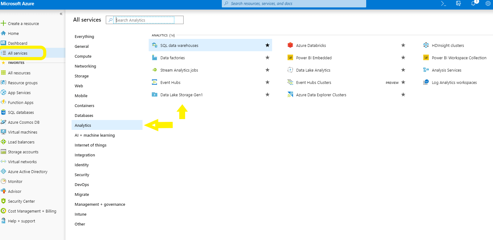
First login to Azure Portal and select the All services from the left options panel. Now choose the Analytics options. Select Data Lake Storage Gen1 and create a new Data Lake Storage account.

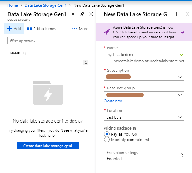
Configure your new Data Lake Storage giving it a Name, your Subscription, and a Resource Group. Note that the name must be unique across Azure. You might want to create a new Resource Group so that cleaning up the resources is easy when you are done experimenting.

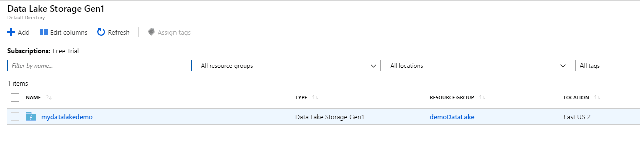
Once the Data Lake Storage has been deployed, you’ll see it in the list.

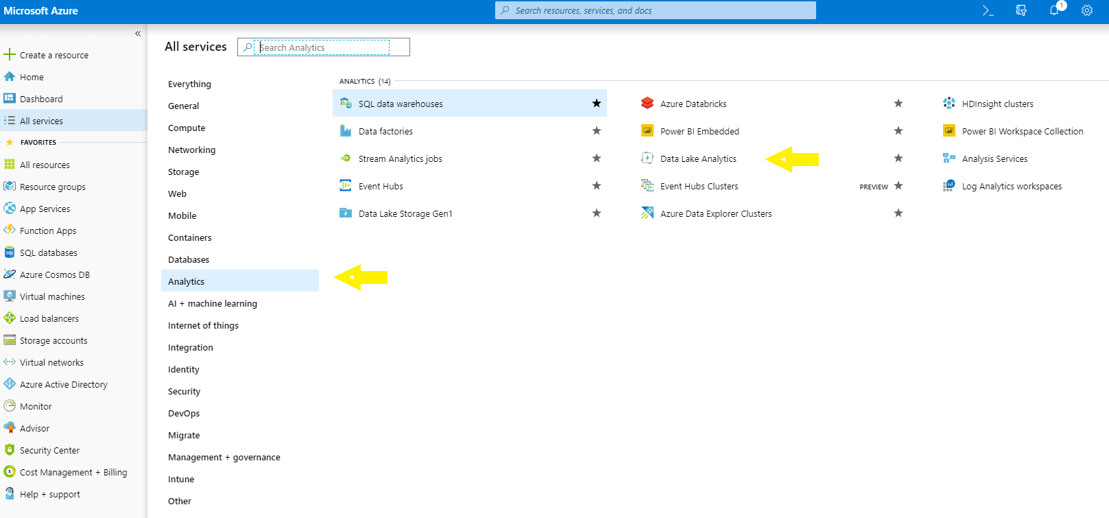
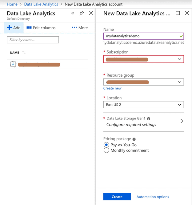
Now that the storage is created, you will learn how to create an Azure Data Lake Analytics account. From the Analytics menu, select the Data Lake Analytics option.

Now add a new Data Analytics account and select the Data Lake Storage that you just created.

C:\Users\suhas\Downloads\image (1).png

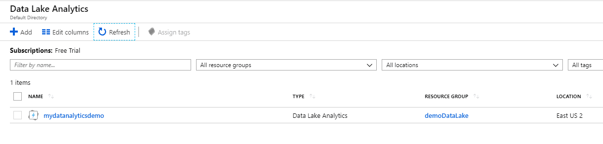
Once completed, you will notice your new account has been added to the Data Analytics section.


Uploading the Input File to Azure Data Lake Storage

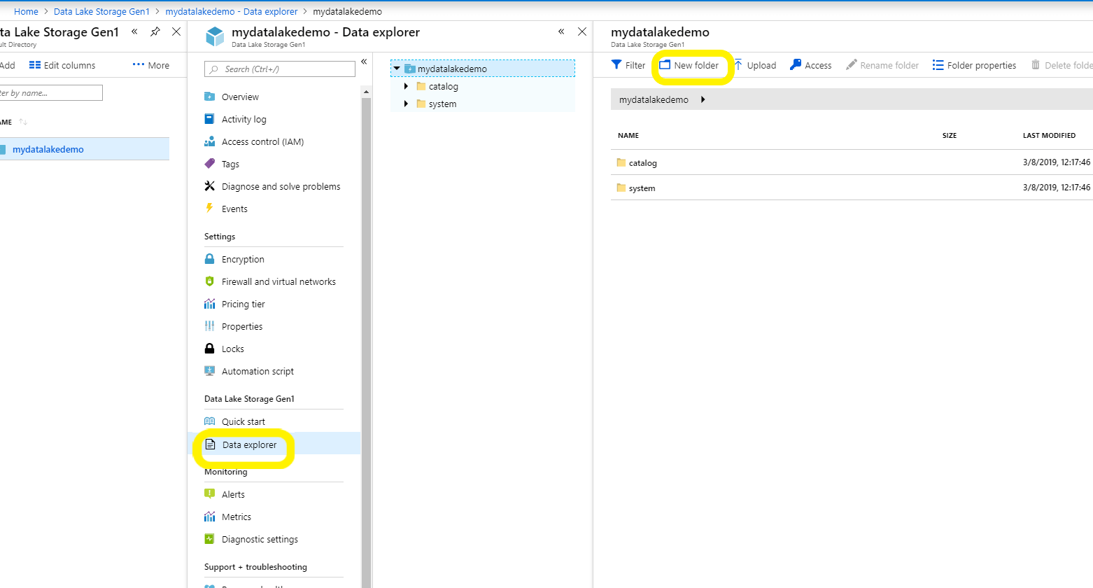
Navigate back to the Azure Data Lake Storage that you just created and click on the Data explorer option. You will notice that there are two default folders (catalog and system) already present in the storage account. Add a new folder named InputFiles to upload the file so that the experiment files are separated from system files.

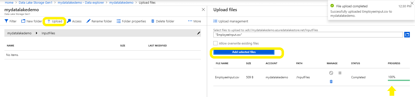
After creating the new folder, click Upload and select the file and click Add selected files.

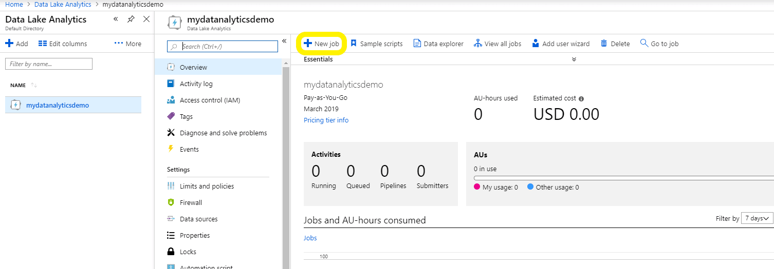
The next step is to create your first job with the Data Analytics account.

Adding a New Job to Azure Data Analytics

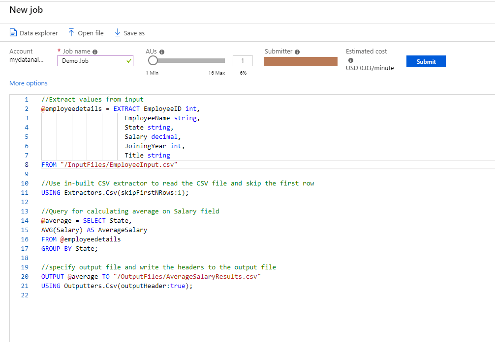
After you navigate to the Azure Data Analytics account and create a new job, be sure to name your new job so that you can keep track of it in the future.

Just for demonstration purposes, copy the same U-SQL script that you used in the previous section of the article. Make sure you use the correct path for the input and output files.

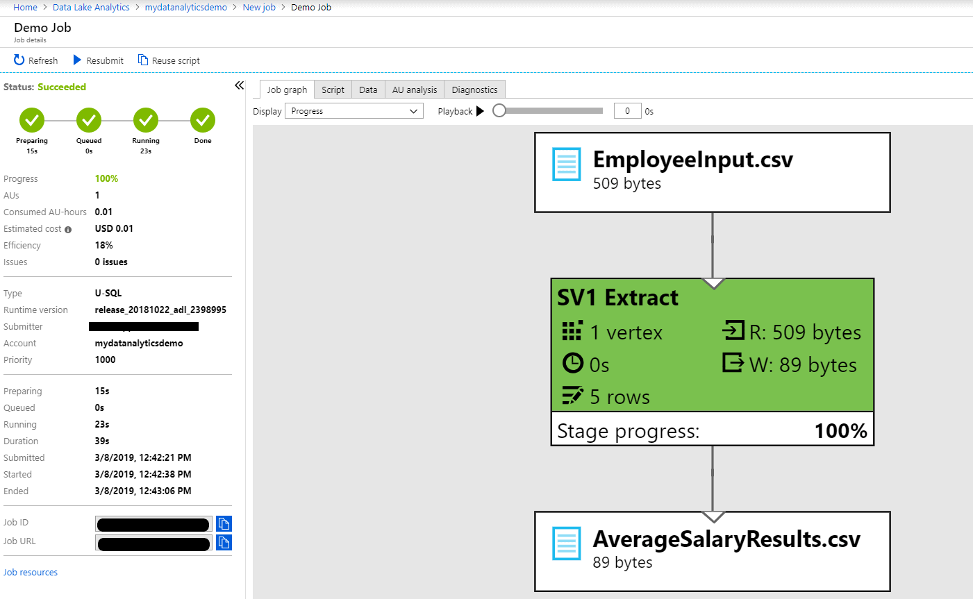
Once everything is ready, click on Submit. You will see the status of the job on the left-hand side section of the screen. This section contains all the details that you might want to know such as estimated cost, efficiency and the timestamp for all the steps involved in the process. It will take a few seconds to process the results. After every step has successfully executed, you will start seeing the Job graph. Yay! The job has run successfully, and you can see that everything has turned green.

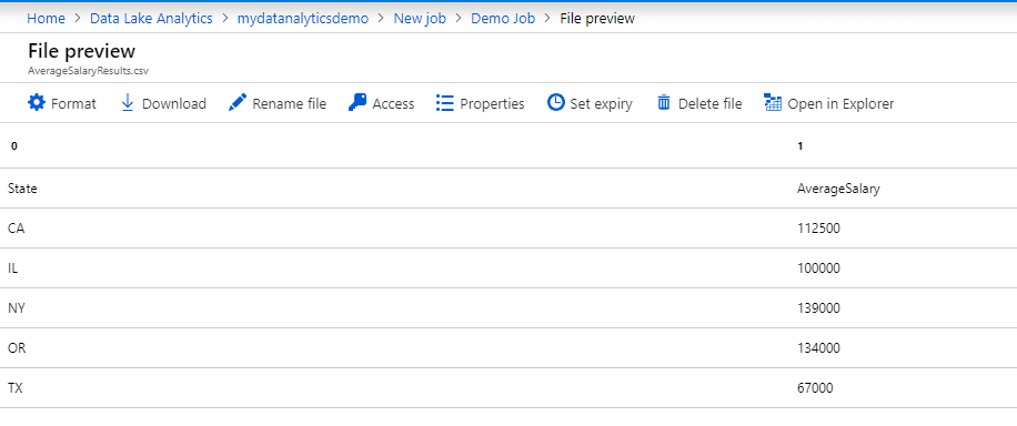
The job graph will show you the details of the job, where the input file is transformed, and that the results are written over to AverageSalaryResults.csv file. The easiest way to access the file is by clicking the AverageSalaryResults.csv in the graph.

You can now download the file and edit it as per your business requirements. There are various options that are available such as providing access to people who need to download the file which are very helpful when you need to share your results within your organization.

Whenever you need to access the output file in the future, you can simply navigate to the Azure Data Lake Storage and then access the file in OutputFiles folder that was created through the U-SQL job.

C:\Users\suhas\Downloads\unnamed.png

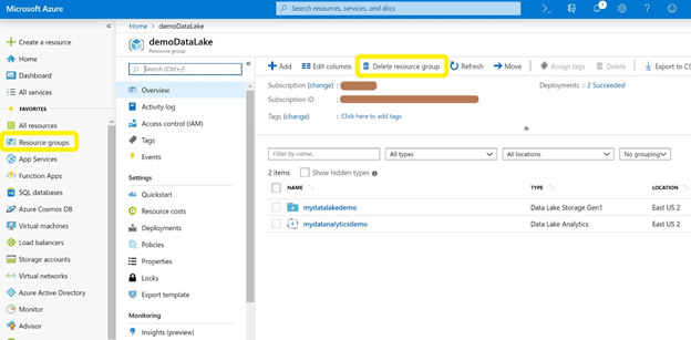
If you created a new Resource Group when you set everything up, you can delete the resources after you are done experimenting. For this, you can navigate to the Resource Group you have created and click the Delete resource group option. Make sure you have a copy of the input and output files downloaded before you delete the resource group.

C:\Users\suhas\Downloads\image (3).png

Summary

In this article, I showed how you can conveniently write U-SQL scripts using SQL and C# language types and constructs. ETL is made easy with these new approaches of writing the U-SQL script and running it locally or on the Azure Cloud. You have seen how you can build your script locally using the local Visual Studio setup which is free of cost as it does not require any cloud resources. On the other hand, you can write and run the U-SQL script on the Azure Data Analytics account which works based on a pay-per-use basis, depending on resources used while running the job and for using the storage as well.

References

https://docs.microsoft.com/en-us/azure/data-lake-analytics/data-lake-analytics-u-sql-get-started

https://azure.microsoft.com/en-us/solutions/data-lake/

The post Processing Data Using Azure Data Lake, Azure Data Analytics, and Microsoft’s Big Data Language U-SQL appeared first on Simple Talk.


from Simple Talk http://bit.ly/2OXkI2N
via
Designing Highly Scalable Database Architectures

With traditional web application development in an on-premise environment, there is generally a large number of associated constraints: infrastructure provisioning, limited access to development teams, support from the operations team, scaling resources based on traffic spike, continuous maintenance of infrastructure, and more. The development effort is dependent upon infrastructure procurement and availability of new technology, thus delaying the delivery of business features and functionalities.
Database systems can be broadly categorized as relational database management systems (RDBMS) and non-relational NoSQL databases. Based on your requirements and use case, you can leverage any of these technologies to build your system architecture. NoSQL databases are document stores or key-value stores and maintain a flexible schema which can change over time, compared to Relational databases which have rigid schemas. NoSQL data stores have gained popularity because of their ability to scale horizontally for meeting high-performance requirements.

This article reviews design principles which can help you in designing a scalable, performant and highly available data intensive architecture. It focuses on database scaling and discusses how cloud infrastructure can help you to support fluctuating workloads.

Problem Statement

 In a traditional web application architecture, generally, there is a single point of failure at the database layer. What happens if the database goes down? How can you address the latency associated with multiple database trips? How can you scale your database when there is a spike in load?

In an on-premises environment, scaling is always a challenge. Making a correct estimation of the expected traffic and configuring hardware resources to match the spike in load is not easy. Generally, you need to go through multiple layers of approval for infrastructure purchases and provide strong reasoning and documentation to support the new infrastructure purchase. However, in a cloud environment, you can benefit from the capabilities available while architecting a data-intensive application. Developing cloud native applications enables you to scale your workload dynamically based on fluctuating performance requirements. In this article, you will learn about design principles which can help you in designing a scalable, cloud-native data intensive architecture.

Database Scaling – Horizontal vs. Vertical

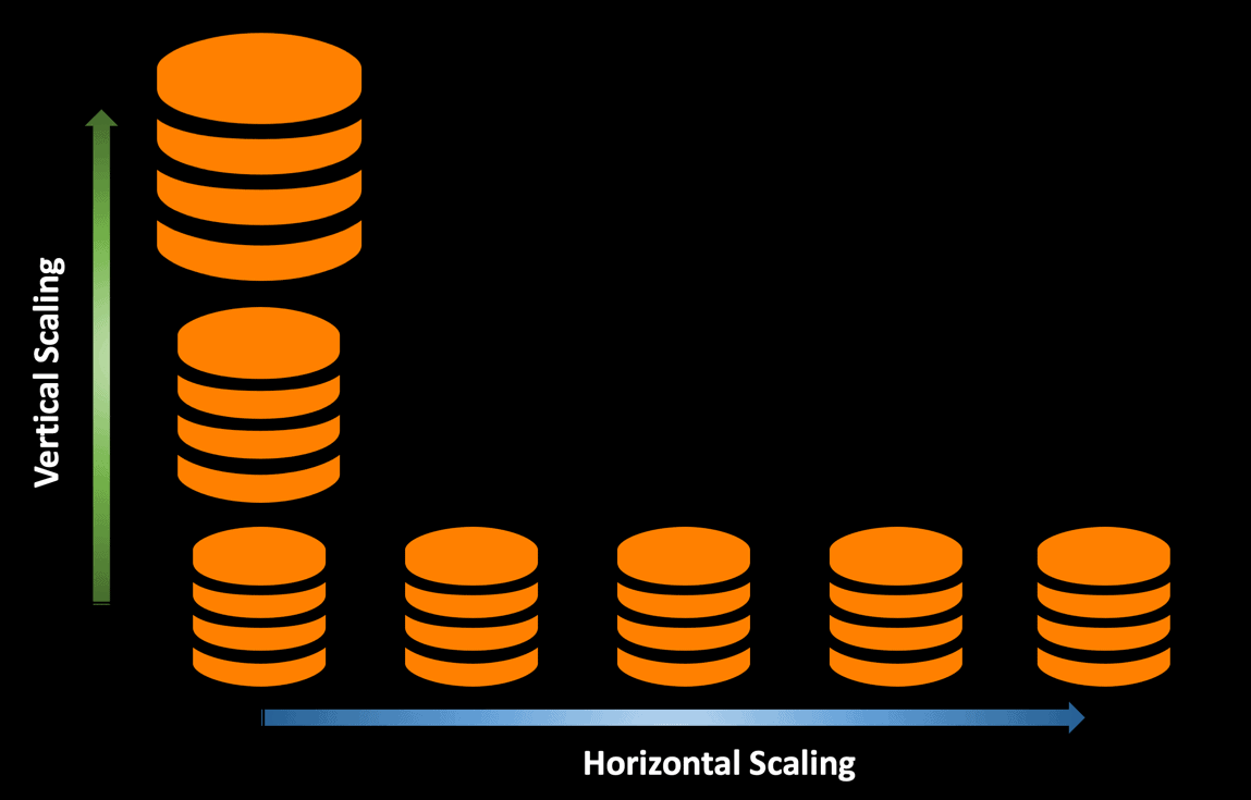
One of the challenges while designing data-intensive applications is database scaling and the ability to meet the service level agreements (SLAs) under high load scenarios. Database calls are expensive, and the number of database trips you make to cater to user requests plays an important role in the overall application performance. The ability to dynamically scale in or out resources based on the workload is one of the core strength of cloud architecture. This also ensures that the resource usage is optimized resulting in controlling the cloud expenditure. 

Vertical Scaling

You can scale your database vertically by allocating additional resources (CPU, memory, storage) which will give you immediate performance benefits and allow you to process more transactions. When you bump into scenarios where your database cannot handle the spike in user requests from the application, you can scale your database vertically to use a larger instance size to gain superior performance.

Scaling your database vertically is very easy to implement. In a cloud environment, it is straightforward to change your database instance size based on your requirements, since you are not hosting the infrastructure. From an application perspective, it will require minimal code changes and will be fast to implement.

I would recommend running performance tests for your application and find out the optimal database instance size, which matches the performance service level agreements defined by the business. Keep in mind that every time you decide to increase your database instance size, you will incur additional resource costs.

The probability of overprovisioning resources is generally high with vertical scaling. However, the top cloud providers like Azure and AWS have made this process of scaling up/down very simple. Customers need not wait for new hardware to be provisioned and can change the database instance size on the fly. They can scale up the database size if they see any performance issues, and can scale down when it’s not required. 

  Horizontal Scaling

Horizontal Scaling

If you want to handle more user requests or process an increased workload which is beyond the capabilities of a single database instance, you can leverage the benefits of scaling out your database instances by implementing horizontal scaling.

 There are a number of ways to scale your database horizontally –

  • Adding read replicas to handle Read-Heavy workloads.
  • Reading from the cache before hitting the primary DB to reduce database load.
  • Sharding your database into multiple servers to improve both read and write performance.

In a cloud environment, you have the flexibility of scaling out your database based on the load. You won’t be stuck with a large database instance when the load decreases. You can always scale in and out based on the load. There is a cost associated with auto-scaling, however, it’s directly proportional to the traffic and workload your application receives.

While rightsizing the database instance size, you can run performance load tests to find the most optimal read-write performance metrics based on the business requirements and SLAs defined. However, having horizontal scaling in place will help you to dynamically scale based on the load spike and be good custodians from a cost perspective. If you have a steadily increasing workload, then scaling vertically makes sense. However, if you have a spiky nature of workload, scaling horizontally seems to be the preferred approach.

Database Read Replicas

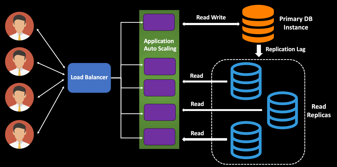
A read replica is just a read-only copy of your database, and each replicated instance has the full set of data. Using read replicas is an excellent technique to offload the database read operation from the primary master instance and hence process more user requests. From an application perspective, the database queries can now be routed to the read replicas which results in enhanced performance.

The primary purpose of the read replicas is to provide scalability and support the read traffic and improve the performance of read-heavy workloads. Any update to the primary DB instance is automatically replicated to the associated read replicas. However, there can be scenarios where you might experience a replication lag, and hence should be aware of it.

Load Balancer Read Write Application Auto Scaling Read Read Read Primary DB Instance Replication Lag Read Replicas

In the architecture shown in the above diagram, if one of the read replicas goes down, then the user traffic is routed to rest of the available read replicas. If the primary DB instance goes down, then one of the read replicas is promoted as the new primary DB instance and will accept both read and write traffic. You can configure a number of read replicas for your database and direct all the reads to those nodes. You will have a primary write node, and all the replicas are updated with any changes made to the primary. There will be a slight replication lag between the primary instance and the replica instances. In disaster scenarios, you have multiple reliable copies of your database in different regions. Hence it provides increased database availability.

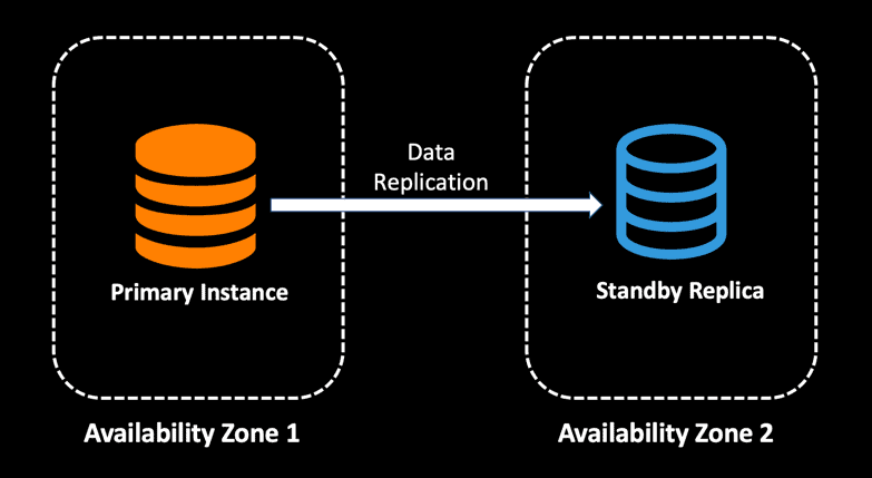
The cloud infrastructure is built around geographical regions, where each region consists of multiple availability zones. With Multi-AZ deployments, any updates to the master database instance are synchronously replicated to another instance in a different availability zone. This allows customers to run their production workload with fault tolerance compared to data center failures.

A screenshot of a cell phone Description automatically generated

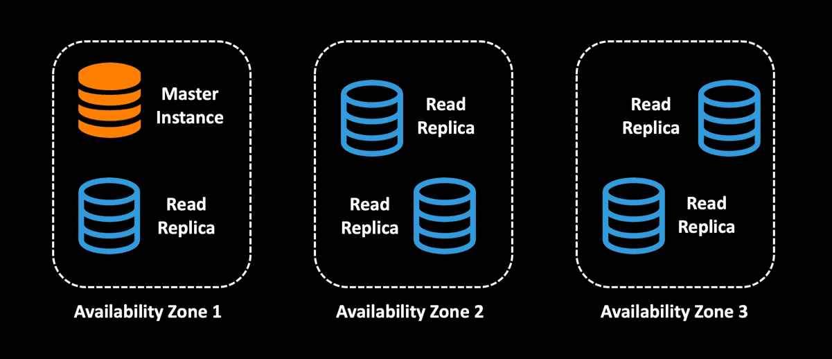
The primary purpose of Multi-AZ database deployments is high availability. You can combine read replicas with Multi-AZ deployments so that you can also have multiple reliable copies of your database in different availability zones to provide increased database availability. Since all the read replicas will be accessible to the application, the architecture below can additionally be used for read scaling.

A screenshot of a cell phone Description automatically generated

From a cost perspective, a read replica has the same price as the standard primary DB Instance. However, once you have an autoscaling policy defined for your read replicas, you can ensure that you are not paying for the additional read replicas when there is no load. Keep in mind that with read replicas, you can increase the read throughput of your application but not the write speed, since you are still writing only to the primary master DB instance. 

Database Caching 

While building distributed systems that require blazing fast performance, it is critical to improve the database performance to match the SLA requirements. An effective caching strategy can help to improve your application performance and reliability by reducing the overhead on the database while optimizing for cost. You can keep the frequently accessed data in an in-memory cache and save the roundtrip to database. To fetch the data from the database you need to execute a stored procedure or query involving multiple tables, which might be an expensive operation. Instead of making this database call every time, you can store the value in the cache, and the next time this data is required, you can return it with sub-millisecond latency. 

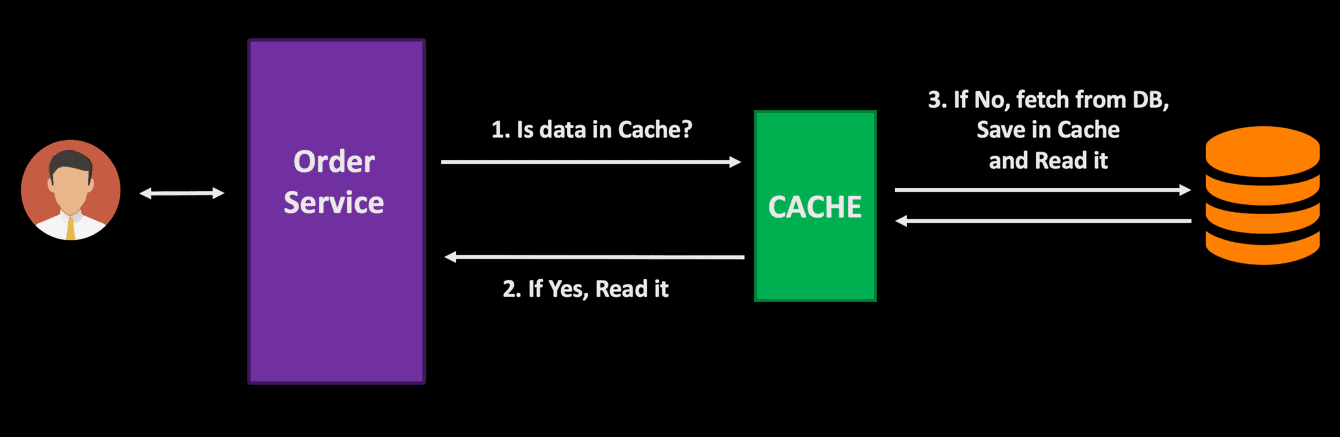
In a microservice architecture, when you have several dependent services, a well-designed caching strategy can decrease the network cost and improve application performance. When a user makes a request, the cache is first checked for the data, and, if it is available, it is fetched from the cache itself. This saves the roundtrip to the database reducing any latency associated with the database call.

Order Service 1. Is data in Cache? 2. If Yes, Read it 3. If No, fetch from DB, Save in Cache and Read it CACHE

You can improve the performance of the database by using advanced query optimization techniques, but for frequently accessed data you can reduce the load on the database and improve response time by storing and fetching it from an in-memory cache. Based on the performance requirements and data access pattern, you can finalize your own caching strategy – what data to cache, how long to store in cache, etc.

Database Sharding

When your application receives a lot of traffic and continues to grow in size, at some point you would want to start thinking about ways to optimize the database performance. Sharding is a potential solution to this problem scenario where you can scale out even the write transactions to your database. Sharding can be defined as partitioning of data across servers to meet the high scalable needs of the modern-day distributed systems so that you can manage data volume efficiently. This improves both the read and write performance of the data store since each database is handling fewer volumes of data. You can visualize a shard as an individual database. 

With sharding, data is split into a number of nodes based on a shard key. Each shard contains a subset of data, making it faster to manage data across all shards. Any queries executed are run in parallel across all shards. In simple words, sharding can be viewed as horizontal partitioning, where you distribute data across multiple data stores to achieve horizontal scalability.

A real-life use case scenario can be sharding a customer database based on customer ID so that you can isolate the processing of customers based on the business requirements.

Determining how to identify your shard key to distribute your data is critical, and you can go with a number of approaches:

  • Shard your customer database with customer ID.
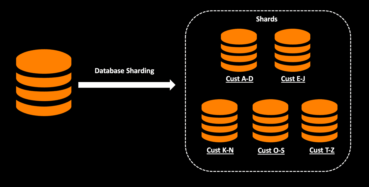
  • Shard your customer database with an alphabetical filter on the customer last name.


Shards Database Sharding Cust A-D Cust K-N Cust E-J Cust O-S Cust T-Z

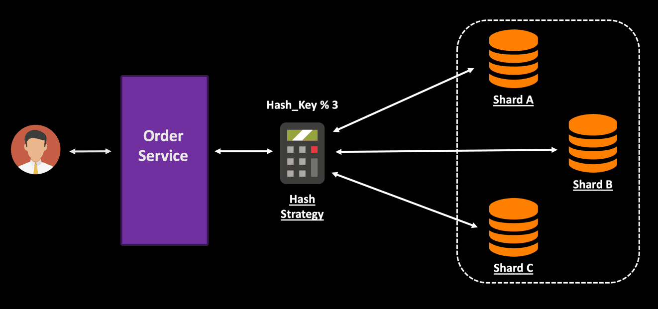
A drawback found the above range hashing strategy is that it causes an imbalance in the shard size. Partitioning the data based on customer ID or last name can result in unequal data volume in different shards. To address this problem, you can shard based on a hash strategy. You can use a hash match algorithm for hashing on an entity field. A router containing the mapping information can be used to distribute the request to the correct shard based on the hash key.

Э pjet..IS aens раек V рек ларю

To implement sharding, you will need to make significant application level changes, and having an optimal sharding technique is critical. Sharding does bring in some complexity when you have some complex querying involving multiple shards. If it cannot leverage the shard key, then the query is executed against all the shards, and the response is gathered and sent back to the user. You should also ensure that you don’t have the shard allocation imbalance, and that data is evenly distributed among the existing shards. 

Database Design in a Microservice Architecture 

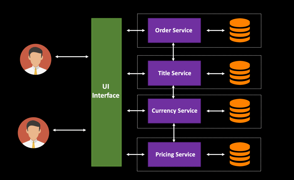
Handling database changes in a microservice architecture is challenging. When you are designing your cloud-native services, it is important to have each individual microservice have its own separate database. This will enable you to deploy and scale your microservices independently. In the diagram below, all four services will have different loads, and hence it makes sense to have separate data stores. This type of design can be termed as a decentralized data management architecture and is a very common pattern while developing highly scalable distributed systems.

nterface Order Service Title Service Currency Service Pricing Service

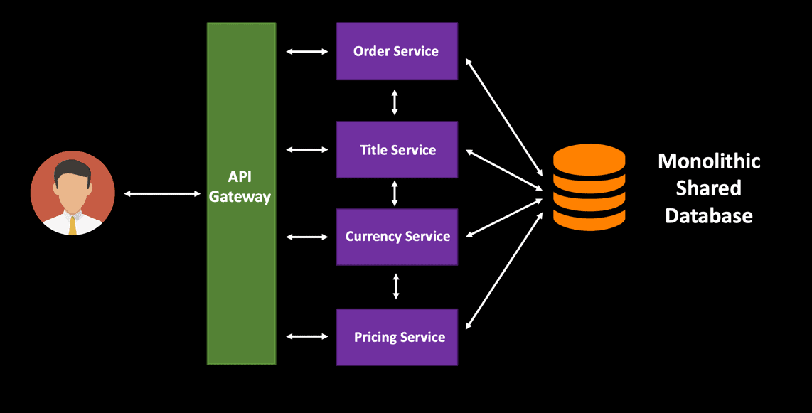
When these services have a single monolithic shared database, it is very difficult to scale the database based on the traffic spike. This design pattern is common with traditional applications where data is often shared between various components. However, the tight coupling between the services will be a hindrance to deploying service changes independently. The only option you have is to scale out the entire monolithic database – you cannot scale an individual component.

API Order Service 1 Title Service 1 Currency Service Pricing Service Monolithic Shared Database

Summary 

Scalability is an essential trait while designing cloud native applications. With all the technology advancements, it is imperative for business systems to be able to handle workload fluctuations without any performance degradation. No matter how well the applications are designed, if the databases are not scalable, then you are bound to bump into performance issues while processing user requests. Dynamic scaling of databases is required to be able to process the load within SLAs that are defined by the business.

When you are designing cloud-native applications, it is better to keep scalability in mind right from the beginning and should not be treated as an afterthought. Each use case is different. Depending upon your business use case, you can weigh in the pros and cons of horizontal and vertical scaling and make an informed decision on what might be the best fit for you. From my experience, vertical scaling is not the optimal solution for a cloud native application which continuously deals with a huge volume of data. With increasing load, you will need the ability to scale without being restricted. Horizontal scaling is my favorite because of its ability to dynamically auto-scale based on load with optimal performance. It is a more cost-effective solution to handle database scaling since you are not stuck with paying for the maximum load scenarios. You have the flexibility of scaling in and out based on the usage.

The post Designing Highly Scalable Database Architectures appeared first on Simple Talk.


from Simple Talk http://bit.ly/2I7vTVN
via

Using JSON for matrices in SQL Server.

From SQL Server 2017, it becomes more practical to use JSON arrays for representing and processing a matrix. SQL Server can read them, and update values in them but can’t create them. To do this, you have to create the JSON as a string. The great advantage of them is that you can pass them between procedures and functions as easily as any other string, and quickly turn them into tables.

For the SQL Server developer, matrices are probably most valuable for solving more complex string-searching problems, using Dynamic Programming. Once you get into the mindset of this sort of technique, a number of seemingly-intractable problems become easier.  Here are fifty common data structure problems that can be solved using Dynamic programming. Until SQL Server 2017, these were hard to do in SQL because of the lack of support for this style of programming.  Memoization, one of the principles behind the technique is easy to do in SQL but it is very tricky to convert existing procedural algorithms to use table variables. It is usually easier and quicker to use strings as pseudo-variables as I did  with Edit Distance and the Levenshtein algorithmthe longest common subsequence, and  the Longest Common Substring. The problem with doing this is that the code to fetch the array values can be very difficult to decypher or debug. JSON can do it very easily with path array references.

Would it be possible to use JSON arrays to solve one of these problems? If so, is it much slower? I thought it might be interesting to convert the Lowest Common Subsequence problem into a json-based form and run over a few tests back-to-back. The conclusion was, for those with the TLDR habit, was that it took twice to three times as long to run, but produced code that was easier to write, understand and debug.  I suspect there are ways and means to make it faster.

IF Object_Id(N'LCS') IS NOT NULL DROP FUNCTION LCS;
GO
CREATE FUNCTION LCS
  /**
summary:   >
 The longest common subsequence (LCS) problem is the problem of finding the
 longest subsequence common to all sequences in two sequences. It differs
 from problems of finding common substrings: unlike substrings, subsequences
 are not required to occupy consecutive positions within the original
 sequences. For example, the sequences "1234" and "1224533324" have an LCS
 of "1234":
Author: Phil Factor
Revision: 1.0
date: 05 April 2019
example:
 code: |
     Select dbo.lcs ('1234', '1224533324')
     Select dbo.lcs ('thisisatest', 'testing123testing')
     Select dbo.lcs ( 'XMJYAUZ', 'MZJAWXU') 
     Select dbo.lcs ( 'beginning-middle-ending',
       'beginning-diddle-dum-ending')
returns:   >
  the longest common subsequence as a string
**/
  (@xString VARCHAR(MAX), @yString VARCHAR(MAX))
RETURNS VARCHAR(MAX)
AS
  BEGIN

    DECLARE @ii INT = 1; --inner index
    DECLARE @jj INT = 1; --next loop index
    DECLARE @West INT; --array reference number to left
    DECLARE @NorthWest INT; --array reference previous left
    DECLARE @North INT; --array reference previous
    DECLARE @Max INT; --holds the maximum of two values
    DECLARE @Current INT; --current number of matches
    DECLARE @Matrix NVARCHAR(MAX);
    DECLARE @PreviousRow NVARCHAR(2000); -- the previous matrix row
    DECLARE @JSON NVARCHAR(4000); --json work variable
    DECLARE @Numbers TABLE (jj INT);
-- SQL Prompt formatting off
INSERT INTO @numbers(jj) --this is designed for words of max 40 characters
VALUES(1),(2),(3),(4),(5),(6),(7),(8),(9),(10),(11),(12),(13),(14),(15),
      (16),(17),(18),(19),(20),(21),(22),(23),(24),(25),(26),(27),(28),
          (29),(30),(31),(32),(33),(34),(35),(36),(37),(38),(39),(40)
-- SQL Prompt formatting on
--the to start with, the first row is all zeros.
    SELECT @PreviousRow =
      N'[' + Replicate('0,', Len(@xString) + 1) + N'"'
      + Substring(@yString, 1, 1) + N'"]';
    SELECT @Matrix = @PreviousRow;--add this to the matrix
        /* we now build the matrix in bottom up fashion.  */
    WHILE (@ii <= Len(@yString))
      BEGIN
        SELECT @West = 0, @JSON = NULL;
                --now create a row in just one query
        SELECT @NorthWest =
          Json_Value(@PreviousRow, '$[' + Cast(jj - 1 AS VARCHAR(5)) + ']'),
          @North =
            Json_Value(@PreviousRow, '$[' + Cast(jj AS VARCHAR(5)) + ']'),
          @Max = CASE WHEN @West > @North THEN @West ELSE @North END,
          @Current =
            CASE WHEN Substring(@xString, jj, 1) = Substring(@yString, @ii, 1) THEN
                   @NorthWest + 1 ELSE @Max END,
          @JSON =
            Coalesce(@JSON + ',', '[0,')
            + Coalesce(Cast(@Current AS VARCHAR(5)), 'null'), @West = @Current
          FROM @Numbers AS f
          WHERE f.jj <= Len(@xString);
                  --and store the result as the previous row
        SELECT @PreviousRow =
               @JSON + N',"' + Substring(@yString, @ii, 1) + N'"]';
          --and add the reow to the matrix
        SELECT @Matrix = Coalesce(@Matrix + ',
                       ', '') + @PreviousRow, @ii = @ii + 1;
      END;
    --we add the boundong brackets.
    SELECT @Matrix = N'[' + @Matrix + N']';
    SELECT @ii = Len(@yString), @jj = Len(@xString);
    DECLARE @previousColScore INT, @PreviousRowScore INT, @Ychar NCHAR;
    DECLARE @Subsequence NVARCHAR(4000) = '';
    WHILE (@Current > 0)
      BEGIN
        SELECT @Ychar = Substring(@yString, @ii, 1);
        IF (@Ychar = Substring(@xString, @jj, 1))
-- If current character in X[] and Y[] are same, then it is part of LCS
          SELECT @ii = @ii - 1, @jj = @jj - 1,
            @Subsequence = @Ychar + @Subsequence, @Current = @Current - 1;
        ELSE
--If not same, then find the larger of two and traverse in that direction 
          BEGIN
                    --find out the two scores, one to the north and one to the west
            SELECT @PreviousRowScore =
              Json_Value(
                          @Matrix,
                          'strict $[' + Convert(VARCHAR(5), @ii - 1) + ']['
                          + Convert(VARCHAR(5), @jj) + ']'
                        ),
              @previousColScore =
                Json_Value(
                            @Matrix,
                            'strict $[' + Convert(VARCHAR(5), @ii) + ']['
                            + Convert(VARCHAR(5), @jj - 1) + ']'
                          );
           --either go north or west
            IF @PreviousRowScore < @previousColScore SELECT @jj = @jj - 1;
            ELSE SELECT @ii = @ii - 1;
          END;
      END;
    RETURN @Subsequence;
  END;
GO
-- Now we do a quick test and timing with the old version
DECLARE @timing DATETIME;
SELECT @timing = GetDate();

IF dbo.LongestCommonSubsequence('1234', '1224533324') <> '1234'
  RAISERROR('test 1 failed', 16, 1);
IF dbo.LongestCommonSubsequence('thisisatest', 'testing123testing') <> 'tsitest'
  RAISERROR('test 2 failed', 16, 1);
IF dbo.LongestCommonSubsequence('Patient', 'Complaint') <> 'Paint'
  RAISERROR('test 3 failed', 16, 1);
IF dbo.LongestCommonSubsequence('XMJYAUZ', 'MZJAWXU') <> 'MJAU'
  RAISERROR('test 4 failed', 16, 1);
IF dbo.LongestCommonSubsequence('yab', 'xabyrbyab') <> 'yab' RAISERROR(
'test 5 failed', 16, 1
);
IF dbo.LongestCommonSubsequence(
'beginning-middle-ending', 'beginning-diddle-dum-ending'
) <> 'beginning-iddle-ending'
  RAISERROR('test 6 failed', 16, 1);

SELECT DateDiff(MILLISECOND, @timing, GetDate()) AS [ms FOR traditional way];
--now do the same test run with the current function
SELECT @timing = GetDate();

IF dbo.LCS('1234', '1224533324') <> '1234' RAISERROR('test 1 failed', 16, 1);
IF dbo.LCS('thisisatest', 'testing123testing') <> 'tsitest' RAISERROR(
'test 2 failed', 16, 1
);
IF dbo.LCS('Patient', 'Complaint') <> 'Paint'
  RAISERROR('test 3 failed', 16, 1);
IF dbo.LCS('XMJYAUZ', 'MZJAWXU') <> 'MJAU' RAISERROR('test 4 failed', 16, 1);
IF dbo.LCS('yab', 'xabyrbyab') <> 'yab' RAISERROR('test 5 failed', 16, 1);
IF dbo.LCS('beginning-middle-ending', 'beginning-diddle-dum-ending') <> 'beginning-iddle-ending'
  RAISERROR('test 6 failed', 16, 1);

SELECT DateDiff(MILLISECOND, @timing, GetDate()) AS [ms FOR JSON-based] ;

This returns …

ms FOR traditional way
----------------------
10

(1 row affected)

ms FOR JSON-based
-----------------
30

(1 row affected)


These tests form part of the build script for the procedure to try to make sure that as few as possible mistakes are left in! 

Obviously, I’d like a bit more speed in the JSON querying but it is acceptable unless one is doing a lot of this sort of querying. I’m happy to us JSON for doing this because it is quicker to get things up-and-running. In my article ‘Doing Fuzzy Searches in SQL Server‘, I show how it is possible to cut down on the amount of searches by filtering the likely candidates with conventional SQL Commands first.


The post Using JSON for matrices in SQL Server. appeared first on Simple Talk.


from Simple Talk http://bit.ly/2G1MIy8
via