Tuesday, March 3, 2020

Knowledge Sharing with SQL Notebooks

Whether presenting at a conference, to colleagues, or to an academic audience, choosing the best tool to share knowledge can be a challenge. PowerPoint is an effective presentation tool so long as the contents are static and there is no need for demonstrations or live feedback.

SQL Notebooks, a component of Azure Data Studio, is an excellent tool to add to your presentation arsenal. It allows you to merge markup, text, and code from a wide variety of languages in a single document. In addition to presentation, it can also be a powerful tool for documentation.

This article will introduce SQL Notebooks and discuss the various ways this tool can be used to improve knowledge sharing across any organization.

What are SQL Notebooks?

Azure Data Studio is a management tool provided by Microsoft that can be used to manage both on-premises SQL Servers and cloud-based servers. When compared to other management tools, it has a more modern interface, excellent support for extensions, and a more rigorous update schedule.

SQL Notebooks is a tool that is included in Azure Data Studio and is a Microsoft implementation of Jupyter Notebooks. A notebook can contain blocks of either code or text.

Text may include raw text, text formatted with markdown, equations, HTML, and more. This allows great flexibility in how to display text, as well as the ability to embed all sorts of images, videos, and other content into a presentation.

There is a wide variety of code that can be executed within SQL Notebooks, including T-SQL, PowerShell, Python, Spark, and more! Extensions are available that add additional functionality for other services and languages.

A key feature of Azure Data Studio is that updates are issued regularly. These updates often contain enhancements and new features, in addition to the typical bug fixes that are expected of regular updates. This ensures that SQL Notebooks is a product that gets better with time as Microsoft implements improvements.

A full list of release notes can be found here.

Using SQL Notebooks

Once Azure Data Studio is open, you can create a new notebook from the main menu, like this:
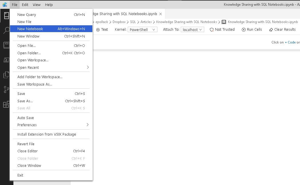
From here, there is a binary option to add either code or text:

To create an introduction, you could insert some text that introduces a topic and provides a basic framework for whatever you want to present:

Note that you will type markup in the top portion of the text box and the output as it will look in the Notebook appears on the bottom. This provides immediate feedback on fonts, colors, layout, and other presentation details without the need to switch screens or load the document into a browser/viewer.

There are a variety of conventions for markup that are useful to note. Each of these will be demonstrated in SQL Notebooks below.

  1. Headings are denoted with hash symbols. One hash (#) denotes heading 1 (the largest) and six hashes (######) indicates heading 6, the smallest heading allowed. A space needs to be included in between the hash symbols and subsequent text.
  2. HTML Markup and tags are supported. Most HTML conventions for formatting text, inserting images, files, and other content are supported.
  3. Bullets can be used by placing a dash (-) at the start of a line, followed by a space. Similarly, starting a line with 1. begins a numbered list. The list will indent and display as a distinct object within the markup, but the user needs to continue numbering with each new line to maintain that structure.
  4. Three asterisks (***) will create a horizontal line.
  5. URLs will automatically highlight and be clickable in the notebook.

The following illustrates a variety of these concepts in a short text block:
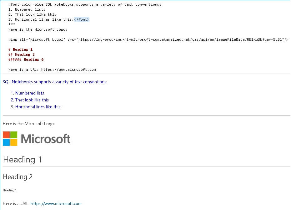
Note that the end result looks and feels like a web page, which allows text to be used effectively for both presentation and documentation.

A variety of code can be inserted into SQL Notebooks as well. When you choose a code block, you can adjust the language like this:
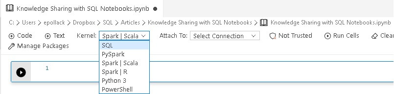
Once selected, you can begin writing and testing code as you usually would:

The kernel selection affects all code blocks, therefore, to change languages mid-demo requires changing the kernel. Test this ahead of time as it may take a few moments to make the switch.

T-SQL written in SQL Notebooks will benefit for the familiar color-coding, as well as IntelliSense, and will therefore look quite similar to what we would compose in a more traditional IDE.

When the play button on the top-left is clicked, the query will execute against whatever server the session is attached to:
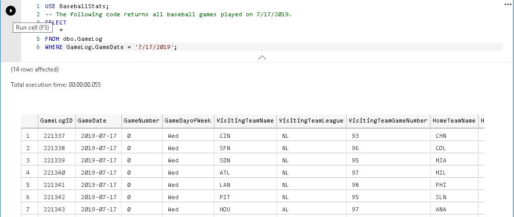
The ability to mix code and markup is the big selling point of SQL Notebooks and can be a huge time-saver when presenting or attempting to document a system where lots of demos are needed. Whether you comment the code or create markup to reference it above is a matter of style and will vary depending on the complexity of the code you are working with.

A few options at the top of the window allow you to control the current display of code and results:

  • Run Cells will execute code for all code blocks.
  • Clear Results will remove the result grid from all code blocks.
  • Collapse Cells will reduce all code blocks to a single line with an arrow to expand as needed.

These options are useful while sharing as they allow you to remove noise from your presentation. They also offer a clean starting point with minimal clutter.

The following is a simple example of some code written in Python to calculate the area of a triangle:
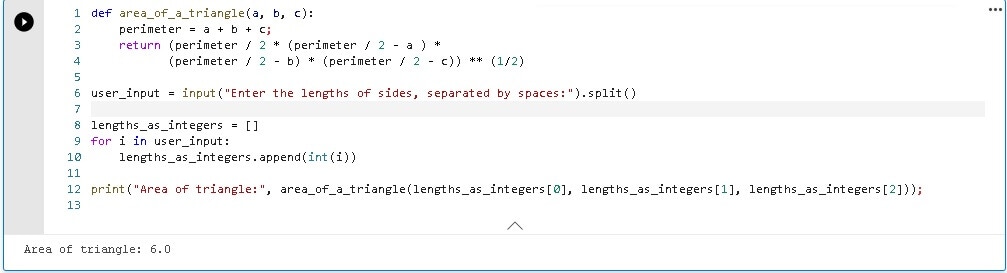
The ability to mix and match different types of code into a single notebook is a huge time-saver, as well as a way to greatly reduce the need to switch between presentation, documentation, and multiple IDEs.

What are SQL Notebooks Useful For?

Live Presentation

Bridging the gap between presentation and demo allows more seamless documentation as it removes the need for the frequent context switching. While one can get used to switching windows to skip between presentation, documents, and demo, there are notable downsides to this approach that wear on even the most seasoned presenter:

  • Time is wasted switching applications and refocusing on a new screen.
  • When in full screen mode, A/V hardware or monitor-switching software may not behave as expected, resulting in downtime or confusion. This has happened to me before, and it is painful!
  • Each additional application results in greater presentation complexity and more things to remember. Many presenters write notes to themselves in comments, or even write documentation for their presentation to follow along with like a script.

Overcoming these challenges often results in compromises as it becomes necessary to add more components to a presentation that are used solely for the purpose of minimizing the impact of a hectic interface.

Presenting in SQL Notebooks allows everything to be in one place, regardless of what languages you are working in. It’s possible to mix text, markup, PowerShell, Python, and T-SQL all in a single window. This greatly simplifies a presentation when there is only a single window to worry about and at worst, maybe multiple tabs.

Documentation

The format of a SQL Notebook resembles the feel of a web page or document. Being able to articulate markup alongside code makes it far easier to document a process or create a how-to guide for an important procedure.
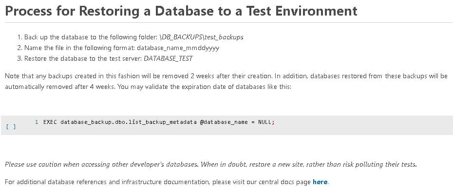
This is a relatively simple example, but it illustrates the value of embedding code into a how-to doc. The reader can copy and use the code as needed or run it inline within the notebook. This is especially useful when the code is more complex or when it changes often and maintaining central documentation is important. Version controlling a SQL Notebook in GIT or another source control app is also a valid way to track documentation changes over time, if this fits into your version control infrastructure.

One big benefit of using SQL Notebooks for documentation purposes is that it allows documentation and development to be centralized together. Using the same app for both purposes can be a time-saver as there is no longer a need to duplicate one’s work into a separate app. Eliminating redundancy can also reduce maintenance costs as the process to update documentation changes from “Update source and update documentation” to “Update source”.

Consider the following example, where a stored procedure change is documented within its own release script:
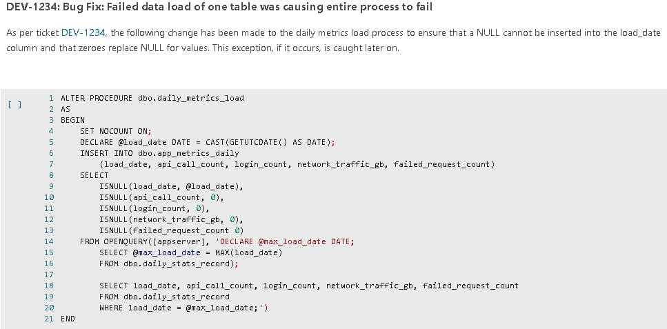
While the example is simple, it illustrates how documentation and software development can merge when needed to ensure that future developers know how and why a change took place.

Problem Solving

SQL Notebooks are great tools for sharing and solving challenging problems. Code and notes can easily be shared between individuals or teams for review and revision. This avoids the challenge of sharing commented code, which tends to be harder to read and understand without context or more familiarity.

There are many ways that SQL Notebooks can make useful brainstorming and problem-solving tools, including:

  • Ability to include demos and examples of similar behavior or desired results.
  • Images can be included, allowing for additional experiences to be shared.
  • Text, markup, and hyperlinks allow content to be shared, linked, and referenced.
  • Comments and notes can be added to recent or notable changes.

This allows for the ability to quickly state a problem and then build upon it over time, until a resolution is reached. As a bonus, the problem-solving process can become part of the documentation that explains the end-result.

SQL Notebooks is not a well-developed IDE, and therefore is not ideal for developing intricate code, performance testing, or running in-depth analysis. For development purposes, continue to use your preferred IDE.

There is utility in developing in Azure Data Studio and having SQL Notebooks available in the same window. Being able to swap between a notebook and in-progress code is convenient, fast, and is often a better alternative to switching applications for documentation or collaboration.

All of the Above

The best use of SQL Notebooks is combining different use-cases into one. When a single notebook can be developed and used for a presentation and then the subsequent documentation or collaboration afterwards, time and effort are saved. In addition, a SQL Notebook is far easier to follow than a stack of scripts, code, and PowerPoint slideshows.

Sharing a notebook is easy, and they self-document far better than code alone.

Extensions

Azure Data Studio supports and encourages extensions to be created and used. This allows Microsoft to add optional features as needed, but also for third parties to develop and add features that enhance Azure Data Studio and any associated components, such as SQL Notebooks. Adding extensions is easy as there is a built-in system that manages the extensions you have and can install:
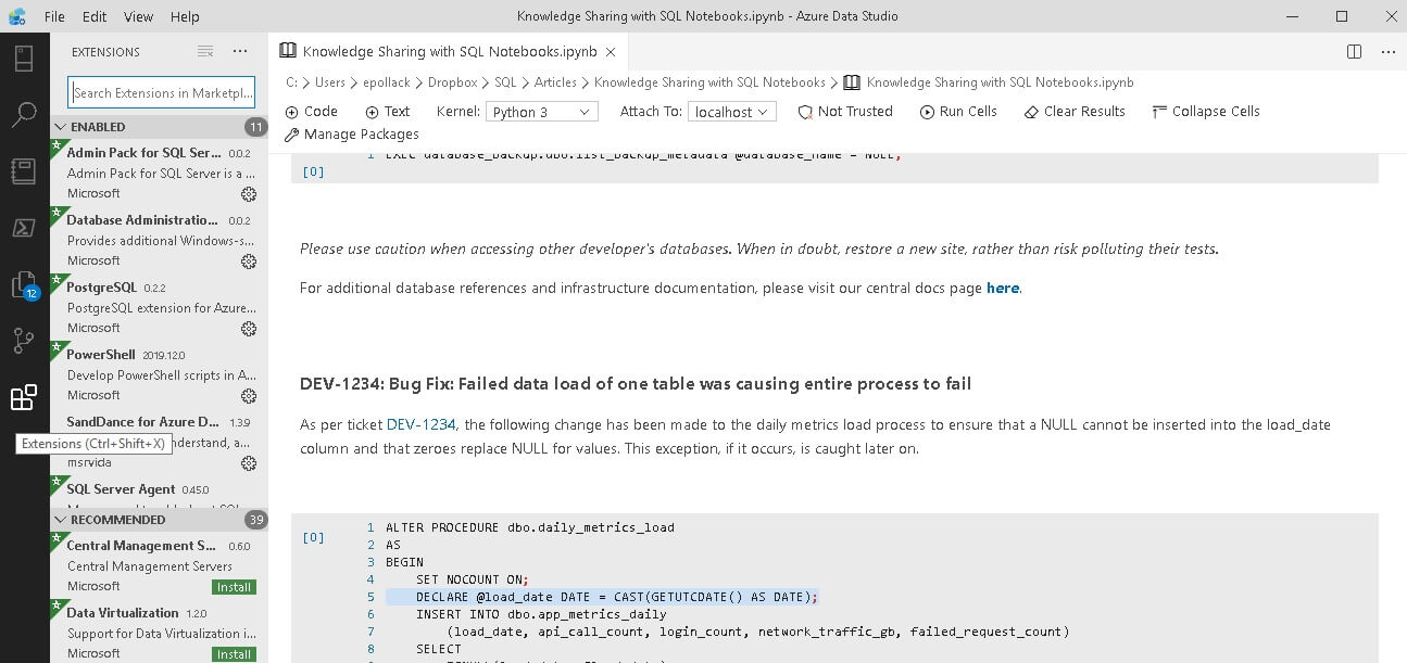
The bottom button on the left navigational bar reveals a list of extensions. From there, you can search, learn more about interesting extensions, and install ones you’d like using the installation button provided with the extension. This makes adding new extensions exceptionally fast when compared to other Microsoft IDEs, such as Visual Studio or SQL Server Management Studio.
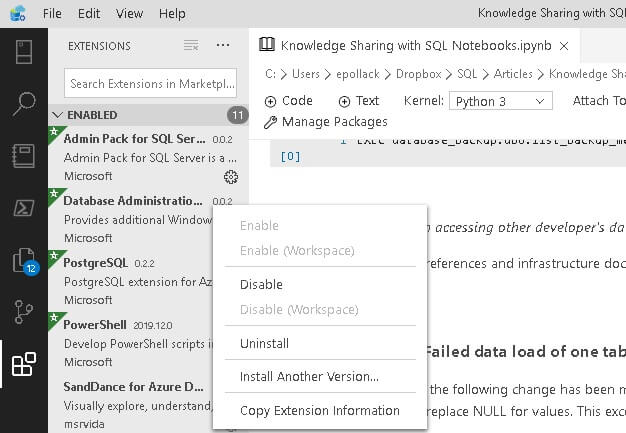
Clicking on the gear next to an installed extension displays a variety of options that include disabling the extension or uninstalling it.

SQL Notebooks vs. Jupyter Notebooks

This discussion would be incomplete with some comparisons between the various tools that are out there. Jupyter Notebooks is the product that SQL Notebooks is modelled after and therefore deserves some attention.

On the whole, the native Jupyter Notebooks application has far more functionality built into it. As a product, it has existed longer and has had more time to grow and gain new features.

Its presentation mode allows a notebook to be played back in a similar fashion to a PowerPoint slide show. This is likely the biggest feature that SQL Notebooks does not have implemented yet, and that I will continue to be anxiously awaiting.

On the flip side, Jupyter Notebooks is not a Microsoft implementation and is therefore not SQL Server-centric or Windows-centric. As a result, connecting to servers and configuring the app to work with SQL Server in the same fashion as SQL Notebooks does require some amount of effort before you can begin authoring notebooks.

After hours of testing and playing around in Jupyter Notebooks, I concluded that using it for SQL Server and Windows-based code was not worth the effort. Instead of providing screenshots and a side-by-side comparison, it made more sense to leave this topic with the knowledge that for most SQL Server professionals, SQL Notebooks will provide a far smoother experience. As a native Microsoft app (and one that is updated often), you can be safe in knowing that the SQL Notebooks app is a solid way to present and document the languages it supports and will only get better with time.

SQL Notebooks Scripting vs. Azure Data Studio Scripting

While SQL Notebooks supports any code that is natively supported by SQL Server, the features of the IDE are exceptionally limited. Within a notebook you may add and execute code, but beyond that there is very little functionality that typically is found in Azure Data Studio.

You can use any output-based features to display query metrics and get feedback, such as STATISTICS IO or STATISTICS TIME. Similarly, row counts and execution time are returned by default:
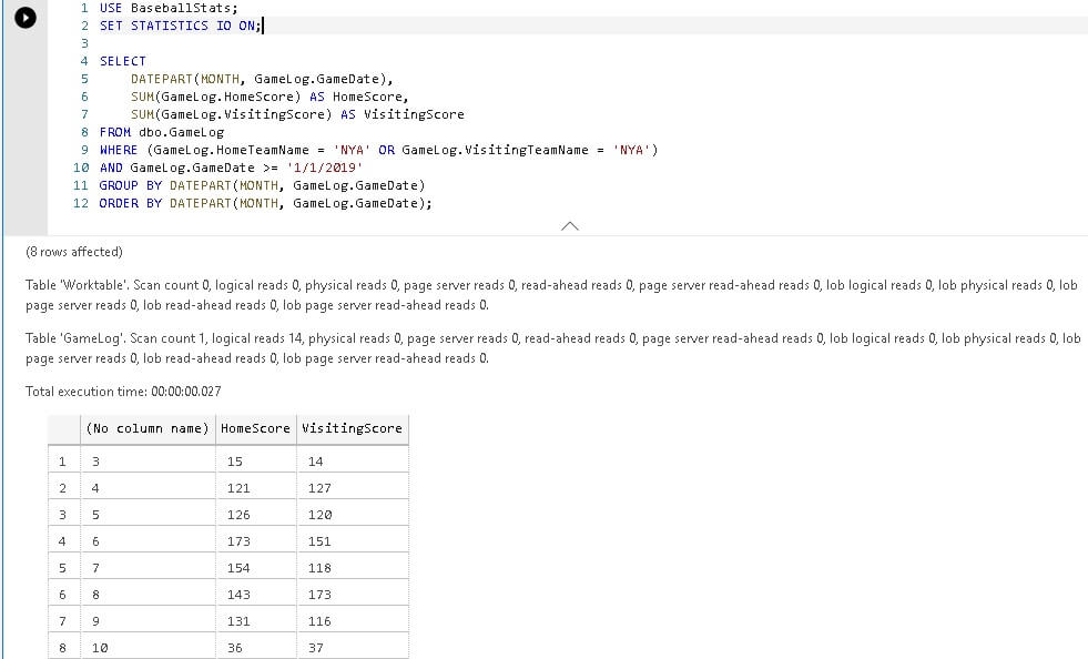
Execution plans and other XML output is not available. In addition, some plugins for Azure Data Studio apply to editing T-SQL within a *.sql file and not within SQL Notebook. As a result, object exploration is not the same as it is in other tools and code validation beyond basic syntax is not available. Right-clicking on any object within a code block provides options to view the object’s definition or to format the T-SQL.

Scripting in SQL Notebooks is primarily for sharing and not for troubleshooting, whereas performance testing or in-depth analysis are better done in Azure Data Studio or SQL Server Management Studio.

If you want to demo execution plans or features not included in SQL Notebooks, then opening a query window alongside the notebook is a relatively painless way to manage this scenario:
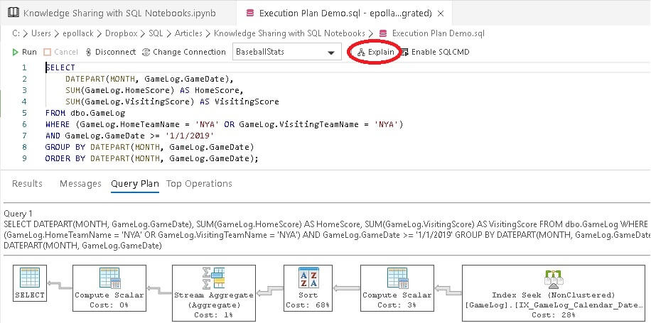
Once in a native query tab, click Explain to get an estimated execution plan. Since both tabs are in Azure Data Studio, swapping back and forth is nowhere near as disruptive as switching between different applications.

In general, SQL Notebooks is great for sharing, presenting, and documenting code, but leave the in-depth analysis to a native SQL editor, as there will be far more functionality available and development will generally be faster.

Azure Data Studio vs. SQL Server Management Studio

This is likely the biggest question asked by SQL Server professionals. Is Azure Data Studio worth the switch? Is SQL Notebooks worth the effort to install, configure, and use Azure Data Studio.

The answer mostly depends on how invested you personally are in SQL Server Management Studio. If you have many plugins configured in SSMS and a highly customized configuration, then switching will be challenging. Similarly, if you use many features of SSMS, such as live query stats or extended events management, then you may find them missing or lacking in Azure Data Studio.

Alternatively, if you use SQL Server Management Studio as primarily a code editor, then the switch should be easy and will likely represent an improvement to your coding quality of life. In addition, you can directly integrate Azure Data Studio with a source control app, which allows for native change tracking for any schema you are developing. For example, you can integrate a Git repository into Azure Data Studio, and then run Git commands from within the app, like this:
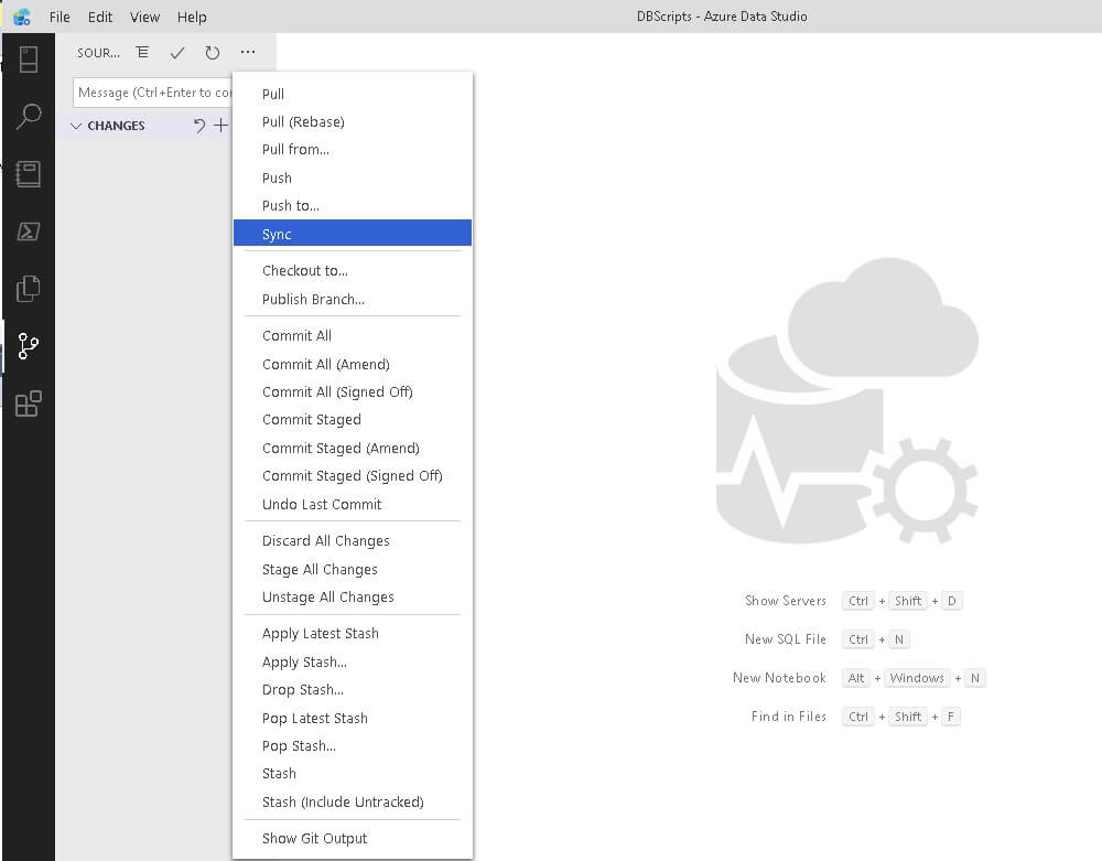
This is a nice addition and allows you to manage source and code in one place!

Long-term, Azure Data Studio is expected to eclipse SQL Server Management Studio in terms of features and usability. New extensions, features, and the addition of missing functionality will eventually make the switch very worthwhile.

What am I Doing?

SQL Notebooks has been a worthwhile addition to my presentation arsenal. When I can use it effectively, I do. Being able to present everything in a single window is a huge convenience and makes the flow of presentations far less awkward. Alt-Tab has worn on me over the years and flipping between 2 or more windows repeatedly has always felt like a hassle.

Using SQL Notebooks for more casual small-group presentations has consistently been a win. While live demos are risky and typing in demos doubly so, SQL Notebooks makes it far easier to manage code and presentation in a way that makes demos easier to create, test, and execute reliably each time.

Sharing a SQL Notebook after a presentation is easy and eliminates the need to share multiple disjointed files with viewers that may or may not be very familiar with your code. I far prefer providing a single notebook file, rather than a pile of PowerPoint slideshows, SQL files, documents, readme files, notes, etc.

On the Azure Data Studio side, I am still in the middle. Some missing features and extensions are painful and lead me back to SQL Server Management Studio. More often than not, I can code, troubleshoot, and test in Azure Data Studio without issues. Overall, I love SQL Notebooks and their counterpart, Jupyter Notebooks. I am confident that they will continue to make my presentation life easier in the future as new features are added and existing features enhanced.

Conclusion

SQL Notebooks is a great feature addition in Azure Data Studio that provides an excellent alternative to presentation, documentation, and overall knowledge-sharing. While it is still a somewhat new product, the value provided by it is high, and increases as updates and extensions are added.

For any technical professional that presents, shares, or documents often, this tool is worth testing and experimenting with. It has the potential to reduce the number of apps needed to present and improve the reliability of those presentations by keeping everything contained in a single window and in as few files as possible.


The post Knowledge Sharing with SQL Notebooks appeared first on Simple Talk.


from Simple Talk https://ift.tt/2PHDdK3
via

Text Mining and Sentiment Analysis: Power BI Visualizations

The series so far:

  1. Text Mining and Sentiment Analysis: Introduction
  2. Text Mining and Sentiment Analysis: Power BI Visualizations

The first article of this three-part series introduced Azure cognitive services Text Analytics API and Power BI. With a team health survey use-case, I demonstrated:

  • Creating Azure Cognitive services resource
  • Loading the survey data into Power BI
  • Creating and Invoking Custom Functions in Power BI, to extract key phrases and generate sentiment scores from raw text
  • Saving the Key phrases and sentiment scores as new columns, into the data table loaded in Power BI

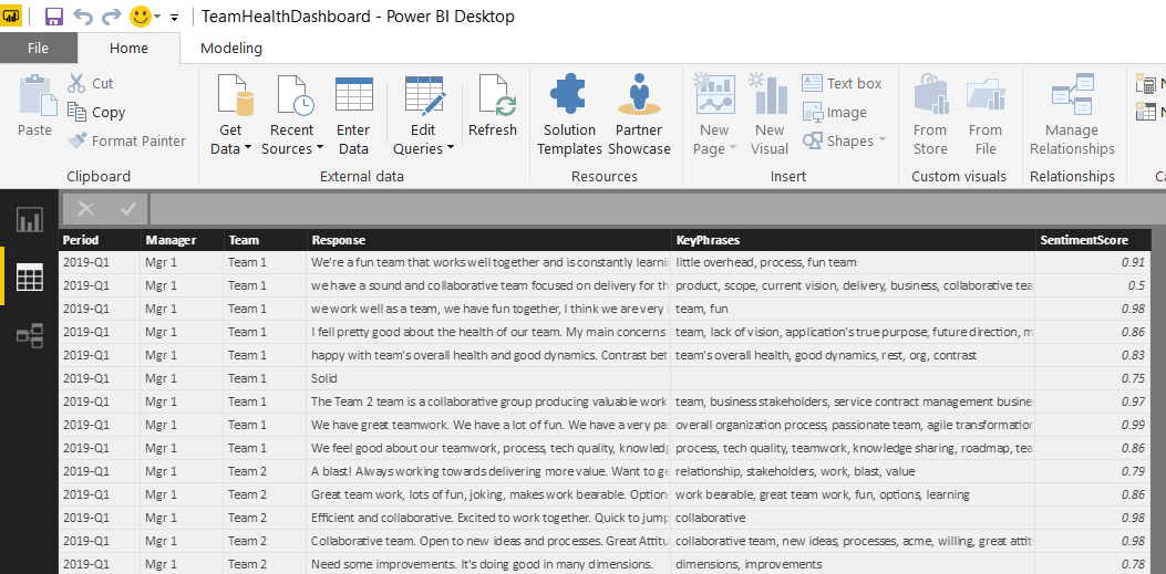
After completing the steps demonstrated in the first article, the data table in Power BI Desktop has six fields. The fields Period, Manager, Team and Response come from the raw data file, while fields KeyPhrases and SentimentScore are added and populated by invoking the Text Analytics API.

Figure 1. Power BI Desktop Data Pane – data tables with six fields

In this article, I will demonstrate how to apply various analytical and visualization techniques in Power BI to the qualitative (Key Phrases) & quantitative (Sentiment Scores) data extracted from the survey responses, using word cloud, charts and filters.

Visualization Page One – Word Cloud & Slicers

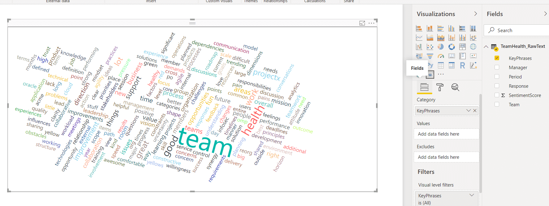
A Word cloud is one of the most popular ways to visualize and analyze qualitative data. It’s an image composed of key words found within a body of text, where the size of each word indicates its frequency in that body of text. I will use the new KeyPhrases field to generate a word cloud, because it has only the important words. This will help ensure the word sizing in the resulting cloud isn’t skewed by the frequent use of common but trivial words in the response text.

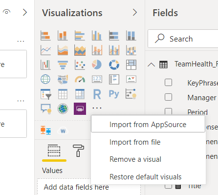
Click on the Reports pane from the left menu of Power BI desktop, then expand the Visualizations pane on the right side. If you don’t already have the Word Cloud custom visual installed, import the Custom Visual from the Store. In the Visualizations panel to the right of the workspace, click the ellipses () and choose Import from AppSource. (In some older versions, you may see Import from marketplace).

A screenshot of a cell phone Description automatically generated

Figure 2. Import Custom Power BI Visuals from AppSource/Marketplace

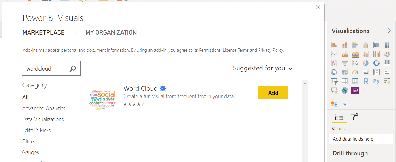
Then search for word cloud and click the Add button next to the Word Cloud visual to install it. (Please do your due diligence when installing add-ins from the online marketplace, as they may pose a potential security / privacy risk)

A screenshot of a social media post Description automatically generated

Figure 3. Import Word Cloud Custom Visual from the Marketplace.

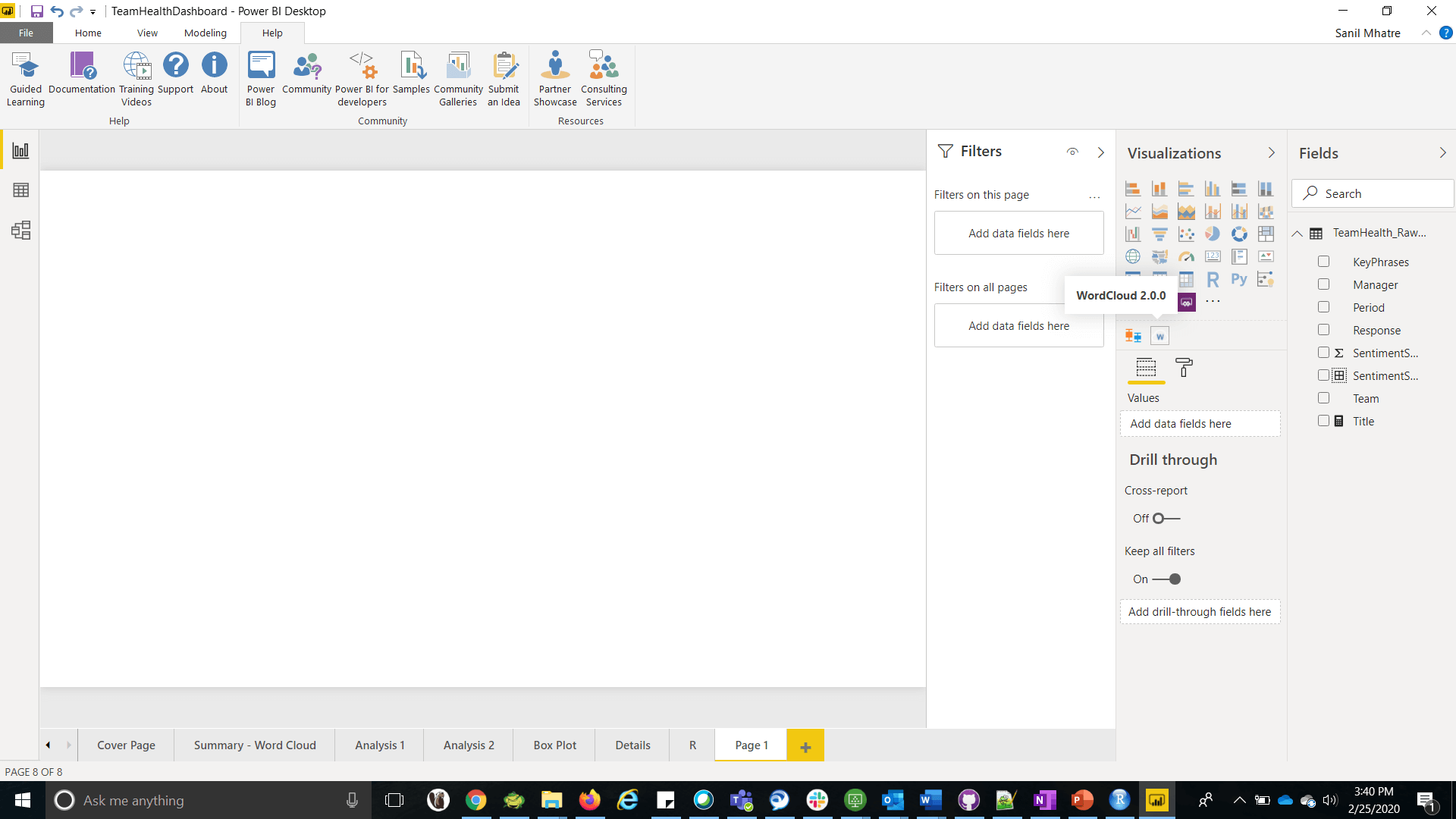
Once installed successfully, click on the visual (look for a w under the main visualizations section) in the Visualizations pane and a new report will appear on your page.

Figure 4. WordCloud custom visual in the Visualization Pane

Then drag the KeyPhrases field from the Fields panel into Category field of the Visualizations panel, which creates a basic word cloud in your report.

Figure 5. The basic word cloud

The basic word cloud looks a bit clumsy with the default settings. I will walk through some clean up steps and tweaks to the default settings, giving it a more polished look.

From the Visualization Pane for the Word Cloud, switch to the Format section and expand the General menu. Enter the number 5 in the field Minimum number of repetitions to display, which only eliminates words appearing less than five times (you can tweak this setting anytime to suit your needs).

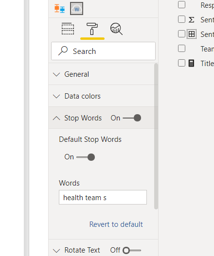
Next, expand the Stop words menu and turn on Default Stop words, which will eliminate the most commonly used but low value words from appearing. For additional reading about stop words in the context of Natural Language Processing, please follow this link. You can also add custom stop words (each word separated by a space), in the Words field of this section. For example, I have added health, team and s to the list of custom stop words

Lastly, switch off Rotate text and switch on Title and set it to Word Cloud.

A screenshot of a cell phone Description automatically generated

Figure 6. Custom stop words

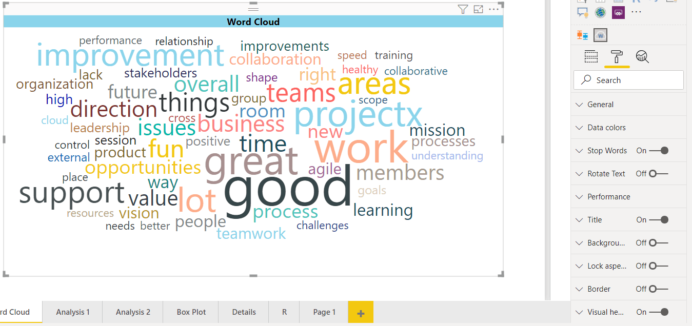
The word cloud now looks much cleaner.

A screenshot of a cell phone Description automatically generated

Figure 7. The polished word cloud

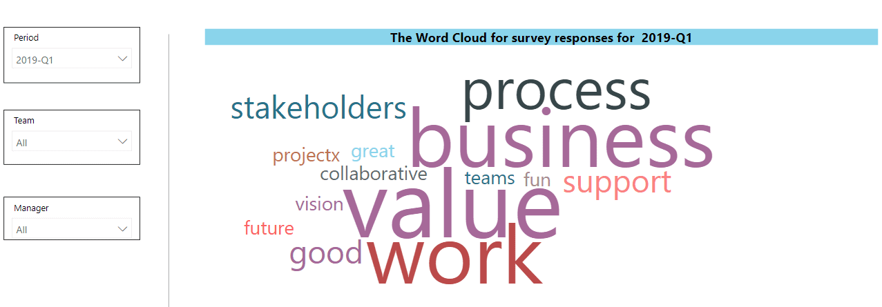
This word cloud covers responses from all periods, teams and managers in your data. Wouldn’t it be great if you could focus on identifying popular topics by period, team, manager or any combination of thereof? You can easily implement this with filters, or with slicer visualizations;

  • Visual level filters are applicable only to the visualization they are set up for
  • Page level filters apply to all visualizations on the page
  • Report level filters apply to all visualization on the report, across all pages
  • Slicers are visualizations used as filters on the report canvas for easier access

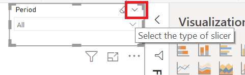
To add a slicer to your report, click on the Slicer icon in the Visualization pane. Then drop the period field into it. Then, at the top right of the slicer, select Dropdown as the Slicer Type.

Figure 8. Type of slicer

Next, repeat these steps to add slicers for Team and Manager fields. Your users can now use these slicers to filter the word cloud.

A screenshot of a cell phone Description automatically generated

Figure 9. The polished word cloud with Slicers for Period, Team and Manager

Visualization Page Two – Line, Column and Bar Charts

The Sentiment score is a numeric value that lends itself to quantitative analysis. This section will demonstrate:

  • A Line Chart, to see how Sentiment Scores are Trending over a period of four quarters
  • A Column Chart, to compare Sentiment Scores for teams rolling up to different managers
  • A Bar Chart, to compare Sentiment Scores rolling up to different teams

Add a New Page, then add the following three visualizations to this page.

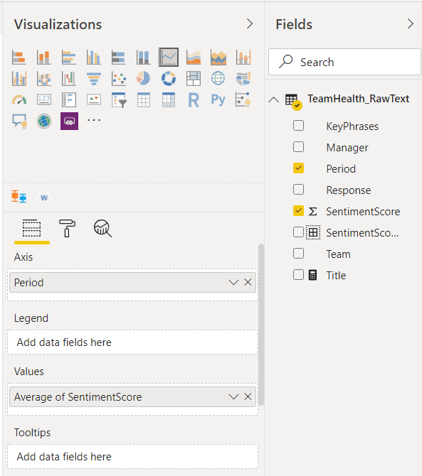
Visualization One – Line Chart: A line chart is a type of chart which displays information as a series of data points called markers connected by straight line segments. A line chart is typically used to visualize a trend in data over a period of time. Click on the Line Chart in the Visualizations pane, to add it to the page. Next, add the period field into Axis, which sets the X-axis. Then add SentimentScore field into Values and set the aggregation to Average. Set title to Average of SentimentScore by Period.

A screenshot of a computer Description automatically generated

Figure 10. Visualization settings for a line chart

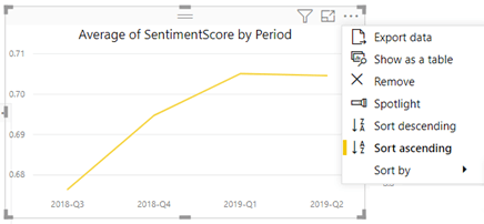
Lastly, click the ellipses on the top right corner of the report, to expand More Options, then select Sort ascending and Sort by Period. This will sort the Periods on the X-axis in an ascending sequence, showing the trend of average sentiment score over time.

Figure 11. Sorting the chart by Period

Visualization Two – Column Chart: A column/bar chart is a type of chart where each category is represented by a column/bar and the height of the column/length of the bar is proportional to the value being plotted. Click on the Stacked Column Chart in the Visualizations pane, to add it to the page. Next, add Manager field into Axis, which sets the X-axis. Then add SentimentScore field into Values and set the aggregation to Average. Set title to Average of SentimentScore by Manager. Lastly, set this chart to Sort Ascending and Sort by Manager.

Visualization Three – Bar Chart: Click on the Stacked Bar Chart in the Visualizations pane, to add it to the page. Next, add Team field into Axis, which sets the Y-axis. Then add SentimentScore field into Values and set the aggregation to Average. Set the title to Average of SentimentScore by Team. Lastly, set this chart to Sort Descending and Sort by Average of Sentiment Score. This sorting is useful in visually ranking the teams from the highest to lowest values of their Average Sentiment Score.

Adjust the placement of the three visualizations on your page if necessary. You can always add filters as you see fit, to allow further in-depth analysis on each chart (for e.g., it might be valuable to add Team as a filter to the line chart, which allows users to see how average sentiment Scores are trending over four quarters for each team).

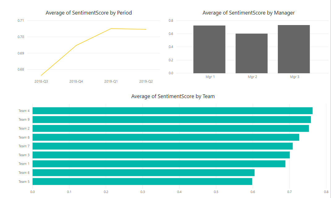
A screenshot of a cell phone Description automatically generated

Figure 12. Line, Column and Bar Chart visualizations on single page

These three visualizations help to infer the following:

The line chart shows the Average Sentiment score went up for the first three quarters and the gains leveled off in the fourth quarter.

  • The column chart shows that Average Sentiment scores rolling up to all three managers are close.
  • The Bar chart indicates that Team 4 has the highest sentiment score, whereas Team 5 has the lowest.

Visualization Page Three – Histogram

A Histogram is a representation of the distribution of numerical data. To construct a histogram, the first step is to bin (or bucket) the range of values into a series of intervals , then count how many values fall into each interval. The bins are usually specified as consecutive, non-overlapping intervals of a variable. The bins (intervals) must be adjacent and are often (but not necessarily) of equal size. In the team health survey scenario, the sentiment score bin will form the x axis, and the frequency (count of responses) belonging to that bin will be on the y axis.

There are two ways to plot a histogram in Power BI – either use the custom histogram visualization or use a regular bar chart by binning the data beforehand. I will demonstrate the regular bar chart method in this article.

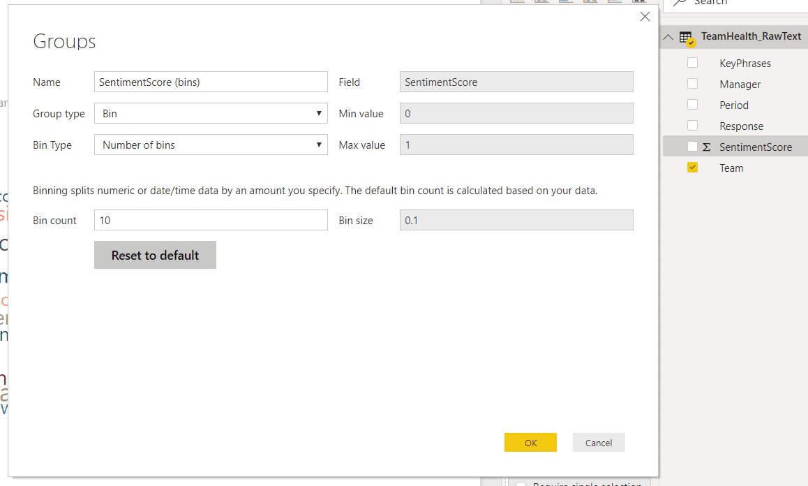
To Bin the data, right click on SentimentScore and select New Group. On the Groups page, change Bin Type to Number of Bins and set Bin Count to 10, then click OK. This will create ten equal sized bins for the range of sentiment score values.

Figure 13. Bin Sentiment Score for Histogram

Next, create a new page and

  • Pull the stacked column chart visualization on this page
  • Drag and drop SentimentScore(bins) field into Axis
  • Drag and drop Response field into Value and set aggregation to Count
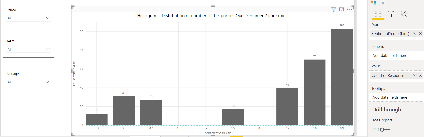
  • In the Formats tab, expand X axis (should be set to ON by default) and set Title to ON. This will display title Sentiment Score (bins) for the X axis. Do the same for Y axis, which will display title Count of Response for the Y axis
  • In the Formats tab, set Data Labels to ON
  • In the Formats tab, set Title to ON and enter text Histogram – Distribution of number of Responses Over SentimentScore (bins) in the Title field
  • Add slicers for Period, Team and Manager as demonstrated earlier, which will allow users to filter the Histogram using these dimensions

A screenshot of a computer Description automatically generated

Figure 14. Histogram with slicers

This Histogram shows an almost bimodal data distribution, indicating there is some degree of polarization in terms of how team members feel about their team’s health. Many team members (200+ responses clustered towards the right) feel strongly positive about their team’s health, while some (about 100 responses clustered towards the left) feel strongly negative. Very few (only 17 responses in the middle) are in the neutral score range. Users can filter the histogram by period, team or manager for further analysis.

Visualization Page Four – Box and Whiskers Plot

A box plot is a method of graphically depicting groups of numerical data through their quartiles. Box plots may also have lines extending from the boxes (whiskers) indicating variability outside the upper and lower quartiles, hence the terms box-and-whisker plot. It is commonly used in descriptive statistics and is efficient way of visually displaying data distribution through their quartiles. They take up less space and are very useful when comparing data distribution between groups.

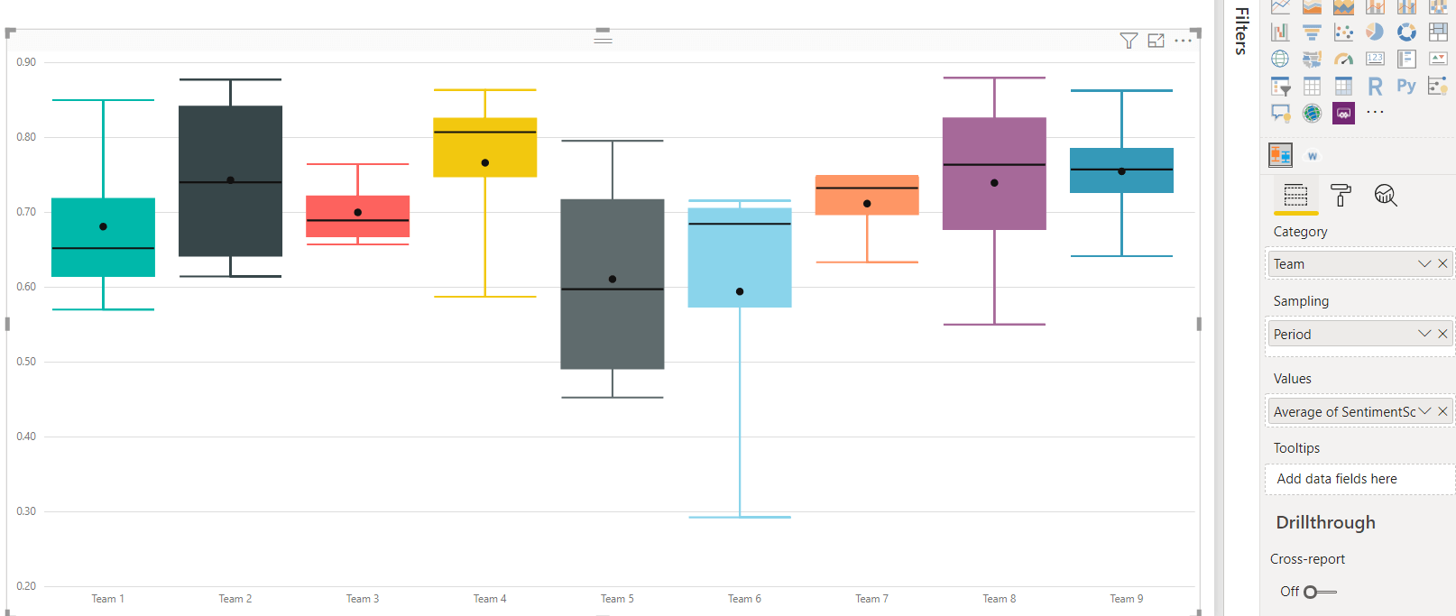
To build a box plot, create a new page and import the box and whiskers chart custom visual from the marketplace and add it to the page. Since I find value in comparing distribution of sentiment score data between various teams, drag the Team field into Category. Next, drag the Sentiment Score field into Values and select Average for aggregation. Lastly, drag the Period field into Sampling.

Figure 15. Box and Whiskers plot

This box and whiskers plot reveals some interesting insights. Without any background in statistics, just focusing on just the height of each box and its position along the vertical axis, one can interpret:

  • For Team 9, the box is short, and the whiskers are short, too. The distribution of their response sentiment scores is grouped tightly around the median value of 0.76. I would interpret it as most team members agree about their team’s health. The placement of the box is high on the vertical axis, which indicates they feel quite positive about their team’s health as well. The short whiskers indicate the outliers are not too far away from the upper and lower quartile boundaries.
  • For Team 5, the box is taller, but the whiskers are not too long. The distribution of their sentiment scores is spread wider (not as tightly grouped together) around the median score of 0.60. It means several team members feel negatively about their team’s health, compared to others on the same team. This could indicate a disconnect between how different team members feel about their team’s health. The placement of the box is lower on the vertical axis. I would interpret it a Team 5 feels less positive about their team’s health, relative to Team 9.

Visualization Page Five – Focus on Targeted Responses

The first four pages of visualizations have helped with analyzing:

  • What are the trending topics for each team, across various periods and managers?
  • Which teams have the highest sentiment scores, versus teams that might need help?
  • How do the team’s sentiment score trend over time?
  • How do the aggregated sentiment scores stack up across all managers?
  • How does the distribution of sentiment scores look like within the team and how does it compare across teams?

After this analysis, it’s appropriate to guide your users towards viewing the actual responses that match their criteria of interest. Some users might be interested in reading the most negative responses for a period, while the most positive responses from a particular team might interest other users. In this section, I will demonstrate a set of visualizations for serving up this detailed information in an easy to consume format.

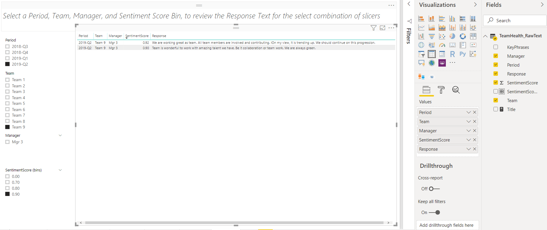
Create a new page and add the table visualization to it. Drag and drop the fields Period, Team, Manager, Sentiment Score and Response onto to table visualization. In the Format section of the Visualizations pane, expand Totals and set it to off.

I will add four slicers to the left side of the table, for easy filtering of the table:

  • Add the slicer visualization to the left side of the page, then drag and drop the Period field on it
  • Add the slicer visualization to the left side of the page, then drag and drop the Team field on it
  • Add the slicer visualization to the left side of the page, then drag and drop the Manager field on it
  • Add the slicer visualization to the left side of the page, then drag and drop the SentimentScore(bin) field on it.

Change the Slicer type for all four slicers to List. Last, add text box at the top of the page, with a helpful message to guide your users Select a Period, Team, Manager, and Sentiment Score Bin, to review the Response Text for the select combination of slicers.

Say one of your users is interested in reviewing the most positive responses for Team 9, in the latest quarter. The would simply need to select 2019-Q2 from the Periods slicer, Team 9 from the Team slicer and 0.90 from the SentimentScore(Bin) slicer.

A screenshot of a social media post Description automatically generated

Figure 16. Table Visualization with slicers for filtering responses

The visualizations demonstrated so far have helped to analyze the team health data.

  • The word cloud identifies popular topics/themes and allows drill down by Period, Team and Manager
  • The line chart shows how the average sentiment scores are trending over a period.
  • The column chart shows how the average sentiment scores compare across all managers.
  • The bar chart enables easy comparison of average sentiment scores across teams. It helps to identify which teams have the highest/lowest average scores and if they changed over time.
  • The histogram visualizes the distribution of responses across the range of sentiment scores. It helps with identifying clusters/groupings in the positive, neutral or negative ranges.
  • The box plot enables a quick and efficient visualization of how the distribution of scores for one team compares to others. It is useful to interpret if the team members are tightly aligned with each other or not.
  • The table visualization with slicers, allows for review of the actual response text, based on the selection of Sentiment Score Bin, Team, Period and Manager.

This analysis enables you to identify which teams are doing great, which ones may need some help to improve their team’s health and what areas deserve further in-depth conversations with Team managers.

Conclusion

This article demonstrated how to do a visualize Key Phrases & Sentiment Scores in Power BI and interpret them to gain insights. The word cloud and several statistical charts helped with analyzing data, extracting business value and narrating a meaningful story from the team health survey. The last article in this three-part series will explore R for texting mining and sentiment analysis.

References:


The post Text Mining and Sentiment Analysis: Power BI Visualizations appeared first on Simple Talk.


from Simple Talk https://ift.tt/2PGjydu
via

Translating a SQL Server Schema into a Cassandra Table: Part II Integrity Constraints

The series so far:

Integrity constraints, including functional dependencies, guide the modeling process for relational database systems. They are no less important when designing Cassandra structures – although support can be limited.

This second of the series revolves around four separate problems to solve, each presenting modeling principles in Cassandra and some in SQL Server as well. Each highlights different facets. In the first, tracking surgeries in an OLTP relational model is straightforward, but there are alternatives in Cassandra.

In the second, complex integrity constraints for plane rentals are covered in several ways in SQL Server but prove problematic in Cassandra. The third problem presents a series of unrelated functional dependencies from which I deduce rules for Cassandra key design.

The last to solve then breaks the rules with architects and blueprints to reuse a Cassandra base table as the basis for other tables.

Each example is meant to be an enjoyable logic puzzle in itself. You need a background in Cassandra key and table design as gotten from Part I or elsewhere as well as experience with relational systems.

Collections and Key Uniqueness

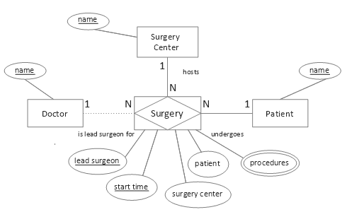
Consider the following entity-relationship diagram (ERD):

A picture containing text, map Description automatically generated

Figure 1. Conceptual surgeries model

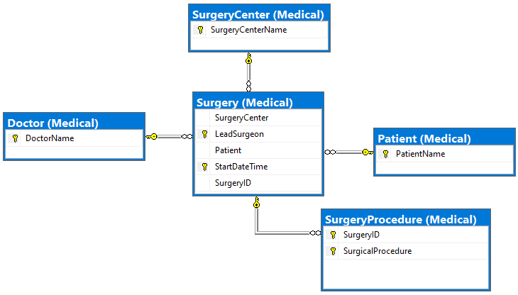
In a normalized relational physical model, the multivalued procedures attribute would comprise its own table, its composite key containing a foreign key referencing the associative table (from the associative entity) for Surgery and using appropriate cascading referential integrity to prevent orphans. The associative table, in turn, could have three unique constraints: the primary key as shown, plus (Patient, Start Date Time), and (Surgery ID). This is straightforward.

A screenshot of a social media post Description automatically generated

Figure 2. SQL Server physical solution

In designing a Cassandra table, though, often there are more choices. Assume this access pattern:

Qk. Find lead surgeons and procedures performed at a surgery center for a given week

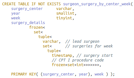
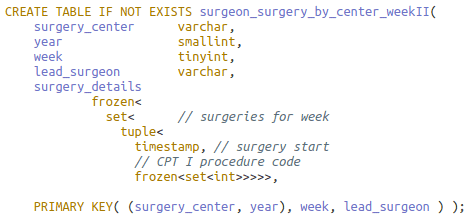
Here is one possible design (all code examples can be found here):

A screenshot of a cell phone Description automatically generated

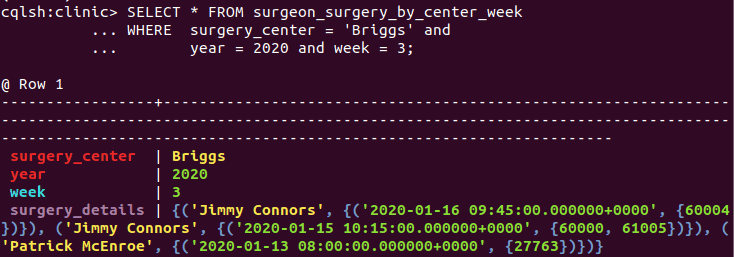
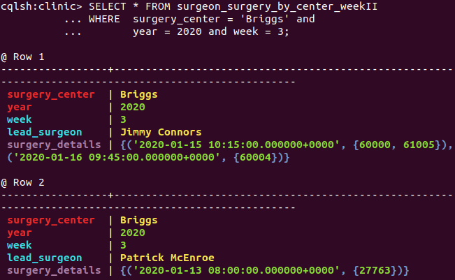
Numeric columns year and week together identify the week (see readout below). Column year as a partition key prevents the partition from growing unbounded.

All told, by inserting nested collection type surgery details, the design is apropos for the query, and the primary key meets the uniqueness criteria. The problems are, however, the complexity and size of surgery details.

A screenshot of a cell phone Description automatically generated

The DataStax CQL shell (cqlsh) displays query result partition columns in red, clustering columns in aqua, regular (non-key) columns in mauve and statics in white.

There is not a way in CQL to retrieve a smaller segment of the potentially substantial surgery details column, e.g. by surgeon or date. Solely by removing the lead surgeon from the nested collection and appending it to the clustering column list, though, the collection’s size and complexity shrinks; its number of collections reduces from five to three:

A screenshot of a cell phone Description automatically generated

This key is also unique! Because of collections, the infamous 1NF violator, there is no danger of compromising Cassandra data by making keys out of non-minimal superkeys as happens in poor relational designs.

Notice that the same query can be reused on this revised table. One more row is returned, each with less (inapplicable) data:

A screenshot of a cell phone Description automatically generated

A query now has the flexibility to restrict on the lead surgeon as well if known via the application’s workflow. Further, an aggregate query can count the distinct doctors performing surgery in the week.
The process can be extended. Surgery start time could also be taken from surgery details and appended after lead surgeon in the key, leaving surgery details as a single set of procedure codes. Similarly, the codes could be appended and surgery details removed. Each clustering column addition places the rowset at a finer granularity, i.e. more rows albeit with less, but more focused, information.

Another option affecting the number of rows in a partition is to slide keys in or out of the partition.

In this exercise, placement and suggested possible placement of key attributes all follow the correct ordering of attributes. This concept will be explored in section Placement of Functional Dependencies below.

Enforcing Integrity Constraints

Say a proof-of-concept Cassandra database monitors a single flight club under the auspices of the Federal Aviation Administration (FAA). A transactional plane rental table to be designed is bound by these integrity constraints (IC; aka enterprise/business rules):

  1. A member can rent at most one plane on any day
  2. A plane can be rented at most once on any day
  3. Rentals require a single credit card payment
  4. A set of credit cards uniquely identifies a member
  5. Violation of club or FAA or other rules disqualifies a member from renting a plane

In a relational system, point 5 requires procedural code to enforce. Functional dependencies (FD), a special class of IC, can be deduced from points 1 through 4. Here they are using letter abbreviations M: member, D: day, P: plane, C: credit card, and ‘→’ for functionally determines:

  1. DM → P IC 1.
  2. DP → M IC 2.
  3. C → M IC 4.
  4. DM → C IC 1. and 3.

Together these FDs imply three overlapping candidate keys. This can be proven using Armstrong’s Axioms and secondary rules. I’ll show one – DC as candidate key – and omit the rest.

  1. DC → DM (3, augmentation)
  2. DC → P (1 and 5, transitivity)
  3. DC → DMP (5 and 6, union)
  4. DC → DCMP (7, augmentation)

The candidate keys can be displayed graphically, the bold R as shorthand for all columns in the relation:

Figure 3. Two functional dependency diagrams for the Plane Rental table

The diagrams imply an interesting barebones relational table: there are no non-prime attributes. A non-prime attribute doesn’t appear in any candidate key. Further, owing to functional dependency C → M, the table would be in 3NF, with redundancy occurring with each repeated credit card-member pair.

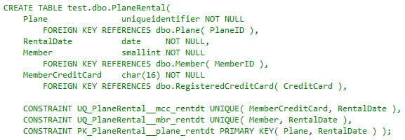
This sketch is enough to start modeling. I’ll defer for the moment the design considerations in Cassandra and continue with a sample physical model of the transactional table in SQL Server:

A picture containing indoor Description automatically generated

As expected, foreign keys reference tables with more related attributes. Unique constraints represent the three candidate keys, the Plane-Rental Date pair having been elevated to the primary key. This satisfies ICs 1 and 2 and the implied IC involving 3. Member credit card as non-null implies the credit card payment in point 3. What remains is addressing integrity constraints 4 and 5.

A screenshot of a cell phone Description automatically generated

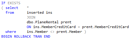
The code snippet is taken from an insert-update trigger on the table to enforce point 4, the rule that credit cards functionally determine members. (This can also serve as a rudimentary basis for a fraud detection system (members as drug smugglers, e.g.)). A more advanced prototype trigger would include joining on the registered credit card table (not shown).

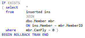
This next snippet is from a second insert-update trigger that joins another table to satisfy rule 5, ensuring a member is cleared to fly:

A screenshot of a cell phone Description automatically generated

The relational table Plane Rental in its very definition covers every integrity constraint required of it. Now switch the effort to Cassandra.

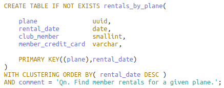
This is the data access pattern for which the table – the precomputed, sorted result set – is to be modeled:

Qn.Find member rentals for a given plane.

The phrase “for a given plane” signals that attribute plane should be in the partition key. The choices for the full primary key, then, are these: ((P)) or ((PD)) or ((P)D), the inner parentheses separating partition keys from clustering keys. The first choice ((P)), a deviant (unique) key, creates a single row for each plane with a possibly large collection, unsuitable for a transactional workload. This situation was discussed in the previous section.

The second ((PD)) addresses the access pattern but is non-performant as Qn. queries may access many nodes over the cluster.

That leaves ((P)D).

A screenshot of a cell phone Description automatically generated

The table definition allows for one manageable row for each plane-day pair on one partition. Below is a sampling of data legal for the table:

A black sign with white text Description automatically generated

The result is failure on all but one integrity constraint. Restricting a plane rental to at most once in a day, FD point 2 (DP → M), is satisfied by the primary key. Point 1, though, limiting a member to at most one rental a day {DM → P}, is shown violated by rows two and four; Cassandra doesn’t support alternate keys (think of the complexity and expense in a distributed data system).

Requiring credit card payment, point 3, fails in the first row; in the Cassandra wide-row model, any regular value may be missing from a row, displayed here as null. Point 4, in which a set of credit cards uniquely identifies a member (C → M), is not enforced, as seen in rows two and three. Recall that it was verified in the SQL Server trigger.

The readout does not indicate if point 5, which disqualifies a member in violation of rules from renting a plane, is being enforced – another trigger-based test not available in Cassandra.

Integrity constraints don’t go away when the storage/retrieval engine changes. Most enforcement in Cassandra must be written in the client app(s). Bulletproofing that was almost paint-by-the-numbers simple now requires more effort.

Placement of Functional Dependencies

As seen in the previous section, functional dependencies are an important type of integrity constraint. For this section, consider these attribute sets and their many-to-one (‘→’ ) relationships in the unified relation:

Figure 4. Unrelated functional dependencies

In Part I, I introduced the unified relation as a container for entities, attributes and relationships of interest to an access pattern in the logical design phase. Besides placing focus on relationships to support, much Cassandra analysis relies on functional dependencies, which exist only in relations.

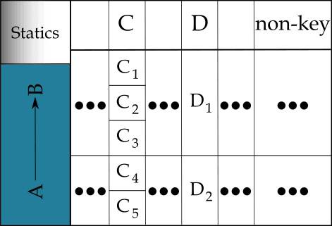
Attribute sets in a functional dependency relationship can appear anywhere in the primary key or as regular attributes or spanning both. This diagram shows placement – poor placement, to be discussed – using Cassandra conceptual row nesting disc layout:

Figure 5. Functional dependency errors in partition and clustering keys

The first problem occurs with the partition keys. CQL queries in support of an access pattern mostly restrain on all partition attributes. It may make sense for the access pattern to place the A attribute set in the partition, or the B set. Importantly, however, it makes no sense to place them both in the partition. Doing so cannot affect logical partitioning and can only complicate querying. One is in, and one is made static, assuming there are clustering keys.

(Recall that a static column’s value is stored once per partition, not once per row. Making a column static only makes sense when it is in a relationship with a subset of the partition columns and clustering columns exist. Depending on the relationship type (not necessarily functional), a static may store an atomic value or be a collection type or user-defined type (UDT).)

The second problem occurs with clustering keys C and D. In the diagram, the dependent D follows the determinant C. As a result, many C values converge on a single D value. This buys nothing. Rather, the D dependent side cannot affect searching, sorting or uniqueness, and can only complicate queries.

Now imagine the D dependent occurring before the C determinant. The search space now correctly expands in the conceptual row nesting. If C is holes and D is a golf course, each course correctly diverges into many holes.

These two issues suggest a pair of general rules for primary key design given non-overlapping attribute sets X and Y such that X → Y. X must be irreducible (no attribute can be removed or the dependency is invalidated) and all attributes of X are in the key. For Y, take it to mean any non-empty subset of Y appearing in the key:

  • X and Y can never appear together in the partition
  • Regardless of where X and Y appear in the primary key, dependent Y must precede determinant X

In clarification of the second point: only (a subset of) Y may (or may not) be in the partition, as per the first point.

I illustrate both rules with an example.

Say the table is to be built for this access pattern:

Qn. Find product lines by industry and manufacturer

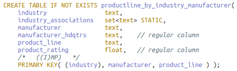
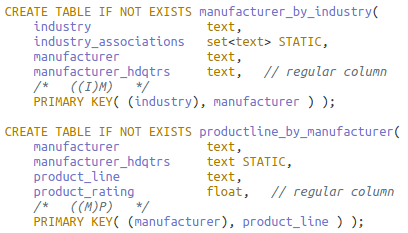
Identifiers for product line (P), industry (I) and manufacturer (M) are in a hierarchical FD relationship such that P → M → I as in Figure 4. Here is the initial physical table developed from the logical model (not shown); it follows both rules:

A screenshot of a cell phone Description automatically generated

The advantages are single-pass querying over one partition and redundancy limited to the manufacturer columns. If ‘I’ and ‘M’ together would not be available through all relevant, connected application workflow paths, however, Qn. and the table may need to be rethought, or the deficient workflow paths/access patterns amended. For the exercise, assume the former tactic – but consider how the solution next still alters the workflow path.

The table is split in two. The first table is made by sliding over the ‘M’ to make it a partitioning key: ((IM)P). By the first rule, this reduces to ((M)P) with ‘I’ as static (if needed). It also remains in agreement with the second (and eliminates redundancy on manufacturer columns).

Could another access pattern require its reverse, ((P)M)? This would falsely imply that a product line can be made by multiple manufacturers, in violation of the integrity constraint formalized as P → M (and the second rule). Instead, a single-row partition ((P)) may hold all product line details for access later in the workflow.

I think you can deduce the second table: ((I)M), also in accord with the rules. Here they are:

A screenshot of a cell phone Description automatically generated

There is, though, a significant exception to these rules. See the next section.

Materialized Views

In the problem for this section, tables for queries on custom homes need to be designed. Here are the integrity constraints:

  • Each blueprint is attributed to one architect
  • An architect develops one or more blueprints
  • A blueprint is registered before the house is built
  • A blueprint cannot be reused

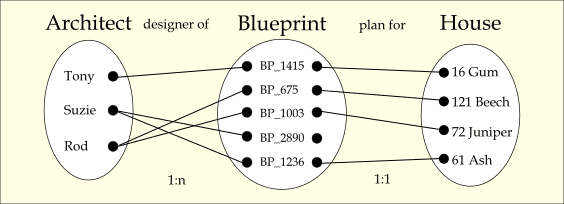
This entity-occurrence diagram captures the integrity constraints:

A picture containing drawing Description automatically generated

Figure 6. Merged occurrence diagrams

The architect-blueprint “designer of” relationship is one-to-many (1:n) with total participation, and the blueprint-house “plan for” relationship is one-to-one (1:1) with blueprint having partial participation.

There are several access patterns needing tables that reference the three entities and their attributes. Unlike in preceding designs, though, the tables can be defined on a single base table and automatically managed and updated by Cassandra as the base table changes.

This is the access pattern for the base table:

Qi. Find blueprints and houses for a given architect.

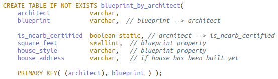
Below is the sample table definition:

A screenshot of a cell phone Description automatically generated

Acronym NCARB means National Council of Architectural Registration Boards.

The base table purposely and necessarily follows the two rules from the previous section and has all the data – there is no loss of information:

A picture containing electronics Description automatically generated

It is also a rare table in that there is no redundancy. (Don’t let the readout fool you: although static is ncarb certified appears in every row in the readout, it is stored once per architect (partition)).

The first materialized view table is defined for this access pattern:

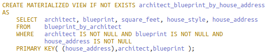
Qi. Find architect and blueprint information for a given house address.

A screenshot of a cell phone Description automatically generated

The base table is referenced in the FROM clause. In the WHERE clause, each primary key column is restricted at minimum to be non-null for key correctness.

Notice that static column is ncarb certified is not in the SELECT list. There is now some information loss as static columns cannot be included in materialized view definitions:

A close up of a sign Description automatically generated

More critically, now the rule placing determinants after dependents is violated. House address, elevated from regular column to partition key, functionally determines both clustering keys architect and blueprint. This may happen in the view. All primary key columns in the base must be, in any order, in the view primary key to preserve the 1:1 mapping from base rows to a subset of rows in the view. Failure to do so could collapse multiple rows into one from base to view and is prohibited.

This is a second access pattern:

Qk. Find all houses constructed for an architect.

This mirrors the previous view except that the house address moves from the partition to the end of the clustering key list. In restricting the address to non-null, not all of Suzie’s base table rows are in the view as the readout following the definition shows:

A screen shot of a social media post Description automatically generated

A close up of a computer Description automatically generated
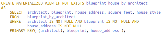
This is the final access pattern:

Ql. Find architect and house design information by blueprint.

To realize the view, simply reverse the partition and clustering keys from the base. In contrast to the previous view, house address is not in the key lest it incorrectly remove rows given blueprint’s partial participation with it.

A screenshot of a cell phone Description automatically generated

A close up of a sign Description automatically generated

As with the base table, the view table has no redundancy as any attributes in a cardinality relationship with the architect should be static, and statics aren’t carried into the view.

Conclusion

You saw that integrity constraints and functional dependencies are just as crucial for Cassandra design and, although only implied, table updates and maintenance as well.

On the relational side, built-in features and theory are tremendous aids in modeling. For the surgery problem, the way was clear in translating entities and a multivalued attribute into interconnected tables and using cascading referential integrity appropriately. For the plane rental problem, it was translating some ICs into FDs, and reasoning from them to apply a mixed strategy of unique and referential constraints and triggers to cover all ICs.

In Cassandra, the first lesson was about moving non-key attributes to the key and enlisting (nested) collections to ensure the key is always unique. In the next, you saw how, having only a primary key for IC enforcement, a legal instance of a Cassandra table can violate almost all ICs.

The third presented two rules for placement of FDs in the primary key: disallowing determinants and dependents both to reside in the partition and ordering of dependents before determinants to ensure proper nested row layout.

Finally, the discussion on materialized views showed that the base table must follow the rules, but the views built on the base necessarily don’t. Materialized views enable reusing of data with automatic synchronization.

Last Word

Imagine building a SQL Server backend for a medium- to large-size OLTP application. You enforce a clean separation of concerns between app and database, allowing only execute permission on stored procedures in a handful of schemas. Whether you agree with me that this is a best practice – a topic for another day – one thing is clear: coupling between the two is as loose as can be.

All I’ve discussed points to the fact that, in contrast, Cassandra and OLTP apps are as tightly coupled as possible. Do you want integrity constraint enforcement? Mostly, write it in the app.

Looking ahead, the last article in the series is in three parts. The first discusses the common case of many-to-many relationships in the ERD. The second presents a function for doing attribute closure given a set of functional dependencies. This process has important implications for key and table design and functional dependency enforcement.

The last part returns to the original problem; solutions, given all the background, now come easily.


The post Translating a SQL Server Schema into a Cassandra Table: Part II Integrity Constraints appeared first on Simple Talk.


from Simple Talk https://ift.tt/3ammjsc
via

Sunday, March 1, 2020

Identity column vs ETL Process

Creating ETL process can pose so many challenges we will only fully discover them when really building the ETL.

Before you complain about modelling, the example here has no relation to data warehouse modelling. The ETL in question was a migration from a data source to another. The need for executing multiple times was mainly for a testing purpose.

Let’s get back a bit and understand what I’m talking about.

Imagine you are building an ETL. Importing a lot of data to a set of tables and implementing many rules inside the ETL. Your ETL will be executed many times, but the tables need to be always empty when the process starts. As a result your ETL needs a cleaning task, in the beginning, clearing all the tables.

Some tables have an identity field. Since you are clearing the tables and ensuring everything will start again from the same point, you need to reset the identity as well.

Probably your first thought is to use Truncate Table statement. The problem is Truncate Table is not supported in tables referenced by a foreign key.

Check the example below: The Truncate Table is blocked by the foreign key.

CREATE TABLE class
  (
     id    INT IDENTITY(1, 1) PRIMARY KEY,
     title VARCHAR(50)
  )
go

CREATE TABLE students
  (
     id      INT IDENTITY(1, 1) PRIMARY KEY,
     NAME    VARCHAR(50),
     classid INT,
     FOREIGN KEY (classid) REFERENCES class(id)
  )
go

TRUNCATE TABLE class 

You need to use Delete or drop and re-create the constraints. Choosing the simplest solution, let’s talk about using the Delete.

Let’s consider the scenario where your ETL will need to run many times and need to start with a cleaning task. This scenario, sometimes, is used for staging servers in the middle of a bigger ETL process. I used for data migration and had to make the execution many times during development, always returning to the start point before executing again.

That’s why you need a cleaning process, deleting all the records on the tables, but that’s not enough. The tables have identity fields and you also need to reset the identity seed before executing again the ETL.

Reseting the Identity Seed: Regular behaviour

Reset an identity seed seems simple:

DBCC checkident(‘testTable’, reseed, 1) 

The problem is the combination of Delete and the DBCC CheckIdent. This combination can lead to very strange results. Let’s see what can happen below:

The first execution will be in an empty table, never used before.

CREATE TABLE testtable
  (
     id    INT IDENTITY(1, 1) PRIMARY KEY,
     price NUMERIC(15, 2)
  )
go

DELETE testtable

DBCC checkident(‘testTable’, reseed, 1)

INSERT INTO testtable
VALUES      (10)

SELECT *
FROM   testtable 

The following executions will be in a table already used, having passed by a delete and dbcc checkident. It’s the same code executed again:


DELETE testtable

DBCC checkident(‘testTable’, reseed, 1)

INSERT INTO testtable
VALUES      (10)

SELECT *
FROM   testtable 

As you may notice, even making the dbcc checkident using the same seed value, the initial identity value in the table becomes different, what can cause all sort of problems for your software.

The root cause of the problem is one statement, DBCC CheckIdent, behaving in different ways according to how the table is at the moment. Our cleaning script needs a consistent result and it’s not achieving this.


Investigating the root cause

We will need to search deeper in SQL Server to discover why the checkident has these differences and where is SQL Server storing the current number for the Identity column of a table.

The DMV sys.identity_columns has a column called LAST_VALUE which contains the last value used for the identity column. Let’s analyse the value this column stores during the execution of the script.

DROP TABLE testtable
go

CREATE TABLE testtable
  (
     id    INT IDENTITY(1, 1) PRIMARY KEY,
     price NUMERIC(15, 2)
  )
go

DELETE testtable

SELECT object_id,
       NAME,
       column_id,
       last_value
FROM   sys.identity_columns
WHERE  Object_name(object_id) = ‘testTable’ 

Just after have been created, the Last_Value column contains NULL, even after the delete statement has been executed.


DBCC checkident(‘testTable’, reseed, 1)

SELECT object_id,
       NAME,
       column_id,
       last_value
FROM   sys.identity_columns
WHERE  Object_name(object_id) = ‘testTable’ 


Even after the execution of the checkident, the Last_Value column remains with NULL value.

Let’s insert a record:

INSERT INTO testtable
VALUES      (10)
go 2

SELECT *
FROM   testtable 


The Null value on Last_Value results in a first identity as 1, which is the exact value set as a seed for the identity.

Let’s repeat again:

DELETE testtable

SELECT object_id,
       NAME,
       column_id,
       last_value
FROM   sys.identity_columns
WHERE  Object_name(object_id) = ‘testTable’ 


After the delete, the last_value is 2, the last identity used. We need the checkident:


DBCC checkident(‘testTable’, reseed, 1)

SELECT object_id,
       NAME,
       column_id,
       last_value
FROM   sys.identity_columns
WHERE  Object_name(object_id) = ‘testTable’ 

Now we can easily see the difference: When the table is empty the last_value is NULL and it continues to be NULL after the checkident. However, when the table already had some records included, the last_value is filled and the checkident will reseed it to the value we are providing. So, it’s a difference between last_value field being NULL or the seed value.

Solving the problem

Knowing these details, we can create a query to calculate the next identity value for a table. If the last_value is NULL the next value will be the seed value, if last_value has a value, the next one will be the last_value + the increment


SELECT Isnull(CONVERT(INT, last_value)
              + CONVERT(INT, increment_value), CONVERT(INT, seed_value))
FROM   sys.identity_columns
WHERE  Object_name(object_id) = ‘testTable’ 


The Converts are needed because on this DMV the columns are of type sql_variant, so we need to convert them to an integer.

Knowing how to find the correct value we can now fix our cleaning code in order to always have the same result, with the identity starting in 1.


DECLARE @lastValue INT

DELETE testtable

SELECT @lastValue = last_value
FROM   sys.identity_columns
WHERE  Object_name(object_id) = ‘testTable’

IF ( @lastValues IS NULL )
  DBCC checkident(‘testTable’, reseed, 1)
ELSE
  DBCC checkident(‘testTable’, reseed, 0) 

The post Identity column vs ETL Process appeared first on Simple Talk.


from Simple Talk https://ift.tt/2TkKxw0
via