Thursday, August 30, 2018

10 Best Practices for Writing Oracle SQL

Writing efficient and high-quality SQL is hard to do. Sometimes it comes down to trialling different types of queries to get one that gives you the results you want and has good performance. There are a range of ‘best practices’ or tips that are recommended for working with SQL. Many of them relate to SQL overall, and some of them are specific to Oracle SQL. In this article, I’ll explain ten of the Oracle SQL best practices to help improve your SQL queries.

1. Use ANSI Joins Instead of Oracle Joins

In Oracle SQL, there are two ways to join tables. You might be familiar with the ANSI method, which involves using JOIN keywords between tables:

SELECT emp.*, dept.*
FROM emp
INNER JOIN dept ON emp.dept_id = dept.id;

You can also do outer joins such as a LEFT JOIN:

SELECT emp.*, dept.*
FROM emp
LEFT JOIN dept ON emp.dept_id = dept.id;

There is another method which is occasionally referred to as an Oracle join, because the syntax is Oracle-specific. An inner join is done using the WHERE clause:

SELECT emp.*, dept.*
FROM emp, dept
WHERE emp.dept_id = dept.id;

An outer join is done by placing a (+) on the WHERE clause after the column that NULLs are allowed. For example, a LEFT JOIN can be written as:

SELECT emp.*, dept.*
FROM emp, dept
WHERE emp.dept_id = dept.id(+);

A RIGHT JOIN can be written by putting the symbol on the other side of the join:

SELECT emp.*, dept.*
FROM emp, dept
WHERE emp.dept_id(+) = dept.id;

The recommendation with writing joins is to use the ANSI style (the JOIN and ON keywords) rather than the Oracle style (the WHERE clause with (+) symbols). I’ve written about this before in my guide to joins in Oracle, and there are a few reasons for this:

  • In large queries, it’s easy to forget to add a WHERE clause to join a table, causing unnecessary cartesian joins and incorrect results
  • The WHERE clause should be used for filtering records, not for joining tables together. A subtle difference, but it makes the query easier to understand
  • ANSI joins are arguably easier to read, as you can see which section is used for joins and which is used for filtering data.

2. Avoid WHERE Clauses with Functions

Another recommendation for working with Oracle SQL is to avoid writing WHERE clauses that use functions. In SQL, WHERE clauses are used to filter the rows to be displayed. These are often used to check that a column equals a certain value:

WHERE status = ‘A’

You may have a need to compare a column to a value that has used a function. For example:

WHERE UPPER(last_name) = ‘SMITH’

Another example could be:

WHERE ROUND(monthly_salary) > 2000

Using functions on columns in the WHERE clause should be avoided. This is because any indexes that are created on the columns themselves (e.g. last_name or monthly_salary) will not be used if a function is applied in the query, which can slow the query down a lot.

To avoid using a function on a column, consider if there’s a way to write the WHERE clause without the function. Sometimes there is, but other times you need to write the function.

If you do need to have the function on the column in the WHERE clause, consider creating a function-based index on the column. This is a type of index that is created on the result of a function applied to the column, which could be used in this query.

3. Use CASE Instead of Multiple Unions

I’ve seen several examples of queries that are looking up a range of records based on criteria. The criteria are more than just a simple WHERE clause, and depending on different types of records, the joins and other criteria might be different.

This is often implemented as several SELECT queries joined together using UNION or UNION ALL keywords. For example:

SELECT id, product_name
FROM product
WHERE status = ‘X’ AND created_date < TO_DATE(‘2017-01-01’, ‘YYYY-MM-DD’)
UNION ALL
SELECT id, product_name
FROM product
WHERE status = ‘A’ AND product_series = ‘WXT’;

This is a simple example, but often the different queries may include joins or lookups to other tables.

Structuring a query like this means that the tables need to be queried several times (once for each SELECT query), which is quite inefficient. There is a chance that your table will have an index on it to make it run more efficiently, but there is another method that’s worth trying. Rather than having separate queries with UNION ALL, try putting the logic inside a CASE statement inside a single SELECT:

SELECT id, product_name
FROM (
SELECT id, product_name,
CASE
WHEN status = ‘X’ AND created_date < TO_DATE(‘2017-01-01’, ‘YYYY-MM-DD’) THEN 1
WHEN status = ‘A’ AND product_series = ‘WXT’ THEN 1
ELSE 0 END AS prodcheck
FROM product
) sub
WHERE prodcheck = 1;

This query would only run once on the product table and will show the same results as separate SELECT queries with a UNION ALL.

The logic to show the right records is in the CASE statement. There are several lines, one for each set of criteria, and it returns a 1 if a match is found. This logic is all inside a subquery, and the outer query filters to show only those records where that CASE is 1.

There are a few different ways to write the CASE statement, but the idea is to only have the main query and several criteria in the CASE statement, rather than separate queries. However, make sure you test both versions of the query for performance, as there may be indexes that are used with the UNION query that don’t run with the CASE query.

4. Minimise the Use of DISTINCT

The DISTINCT keyword in SQL allows you to return unique records in the result set by eliminating duplicate results. This seems simple, and it’s a useful command. Using DISTINCT is OK in many cases, however, it can be a symptom of a different issue. If your result set is displaying data from many different tables, you might end up getting some duplicate results. I’ve seen this many times in my queries.

It can be tempting to add a DISTINCT keyword to ensure you don’t get duplicate records. But adding a DISTINCT keyword will likely cause an expensive operation to be performed on your query, slowing it down. It will give you the results you need, but it’s masking a problem elsewhere. It could be from an incomplete JOIN, or incorrect data in a table, or some criteria you aren’t considering, which is causing the duplicate row. Fixing the issue in your query or in your data is the right solution.

5. Redesign Data Value Lists to Use Tables

Occasionally you may need to write queries that use several values as criteria. This is often done as a WHERE clause and an IN keyword:

SELECT *
FROM product
WHERE status IN (‘A’, ‘P’, ‘C’, ‘S’);

This query might give you the results you want. What would happen if the status values change at some point in the future, or the business rules change which means you need to adjust this list.

If this list is coded into your query, you’ll need to adjust your query. This may result in change in application code and a deployment process.

Another way to do this is to store the values in a separate table and join to this table. For example, you could have a status_lookup table which has values and categories in it, where the category defines the data you need.

Your query could then be something like this:

SELECT product.*
FROM product
INNER JOIN status_lookup ON product.status = status_lookup.status
WHERE status_lookup.category = ‘ACTIVE’;

This way, whenever the business rules change, all you need to do is update the data in your status_lookup table, and no code changes are required. This recommendation was also suggested in the article on SQL Code Smells.

6. UNION ALL instead of UNION

There are two similar keywords in SQL that are used to combine results: UNION and UNION ALL. They are called ‘set operators’, as they work with result sets.

There are some minor differences between them. UNION ALL shows all records in both result sets, and UNION shows all records excluding duplicates.

Just to be clear, UNION removes duplicates and UNION ALL does not.

This means, in Oracle, that an extra step is performed when using a UNION to remove all duplicate rows from the result set after it is combined. It’s the same as performing a DISTINCT.

If you really need duplicates removed, then use UNION. But, if you only want to combine values and don’t care about duplicates, or want to see all values, then use UNION ALL. Depending on your query, it will give you the same results and also perform better as there is no duplicate removal.

7. Use Table Aliases

A great way to improve your queries is to use table aliases. Table aliases are names you can give to tables in your queries, to make them easier to write and work with. For example, using our earlier query on product and status_lookup tables, this is what it looks like without a table alias:

SELECT product.*
FROM product
INNER JOIN status_lookup ON product.status = status_lookup.status
WHERE status_lookup.category = ‘ACTIVE’;

You can add table aliases by specifying a name after the table name. These table aliases are usually short (one or a few characters), and are usually an abbreviation for the full table name:


SELECT p.* FROM product p INNER JOIN status_lookup s ON p.status = s.status WHERE s.category = ‘ACTIVE’;

The table alias of p for product and s for status_lookup are included with the tables in the query. Then, anytime you refer to those tables (in the SELECT clause, the JOIN, or the WHERE clause), you can use the table alias. It makes it easier to read and write.

Also, p and s were deliberately chosen as they are abbreviations for the full table name. This is a good practice to use, especially when working on larger queries, rather than using generic letters such as a or b. It’s much easier to tell which table a field comes from if you use a descriptive alias.

8. Only Use HAVING on Aggregate Functions

The HAVING clause in Oracle SQL is used to filter records from your result set. It’s very similar to the WHERE clause. However, the WHERE clause filters rows before the aggregate functions are applied, and the HAVING clause filters rows after the aggregate functions are applied. It can be tempting to use HAVING for everything if you’re using an aggregate function, but they do different things in your query.

For example:

SELECT status, COUNT(*)
FROM product
WHERE status IS NOT NULL
GROUP BY status
HAVING COUNT(*) > 1;

This will find the count of each product status that is not NULL where there is more than one record for the status, which is likely what you want. If you write the query using only the HAVING clause, it would look like this:

SELECT status, COUNT(*)
FROM product
GROUP BY status
HAVING status IS NOT NULL
AND COUNT(*) > 1;

This may give you different results, depending on your data. It may also perform worse, as it needs to aggregate all of the data before removing it using the HAVING clause. It also implies a different set of rules.

Be sure to only use HAVING on aggregate functions and use WHERE on results you want to restrict before the aggregate.

9. Always Specify Columns in INSERT Statements

The INSERT statement in Oracle SQL has an optional component where you specify the columns to insert data into:

INSERT INTO tablename (col1, col2… col_n)
VALUES (val1, val2… val_n);

The part of the INSERT statement with the columns is the optional part. An INSERT statement without the columns will still work:

INSERT INTO product VALUES (1, ‘Large Chair’, 120.00);

However, a good habit to get into is to specify the columns in an INSERT statement. This has several benefits. First, it can prevent errors or data going into the wrong column. Without specifying the columns, there’s no guarantee which order the columns will be inserted into. This can cause errors to appear, or the data to be inserted with values in the wrong columns.

It’s also clear which columns represent which values. When you look at a statement without the columns, you’ll have to guess what the values are. If you add the columns, you know exactly which values are for each column.

Be sure to include the columns in your INSERT statement.

10. Avoid Object Names with Spaces

The final best practice I’ll recommend is to avoid using spaces in your object names. Many examples of SQL online specify object names (such as tables) that include spaces. Most of these examples are for Microsoft Access or SQL Server and include either square brackets or quotes around table names:

SELECT id, category_name
FROM “Product Category”;

Using a table name with a space in it might be easier to read. However, it can cause several issues. Table names in Oracle are stored in upper case, or if they have quotes, they are stored as you enter them. This means whenever you refer to this table, you’ll need to use quotes and specify it as it was written. It’s inconvenient for you and for other developers.

Another reason is that it’s harder to refer to this table in queries. You’ll have to specify it with quotes, and probably need to use a table alias to ensure your queries are correct.

It’s much better to specify the object names without spaces. You can use underscores instead:

SELECT id, category_name
FROM product_category;

You should follow your team’s naming conventions, which would include tables and other objects, which has been written about here.

From Oracle 12c, the maximum length for an object name was increased from 30 characters to 32,000 characters. This means you’ll have a lot more room to come up with a great name for a table. This doesn’t mean you should be excessive, but just choose a name that represents what you are creating, without using spaces.

Summary

So, there are my top 10 best practices for working with Oracle SQL. Some of them are applicable to all types of SQL, but many of them are Oracle specific.

The post 10 Best Practices for Writing Oracle SQL appeared first on Simple Talk.


from Simple Talk https://ift.tt/2LG5mfJ
via

Advanced Testing of Your PowerShell Code with Pester

In part 1 of this series, Introduction to Testing Your PowerShell Code with Pester, I covered the basics of using the Pester module to test your PowerShell code. The types of testing, unit, integration, and acceptance were discussed. In addition, the importance of having good requirements was stressed. We rolled up our sleeves next, learning how to install Pester, invoke a Pester test, and how to construct a test using the Describe, Context, and It functions.

In this article, we’ll continue our journey with Pester. I had mentioned the concept of mocks in the previous article, in this one you’ll see what a mock is and how to use it. I’ll also introduce a new concept, TestPath. Next, I’ll cover the way to distinguish the different types of test within Pester, and how to code your tests appropriately.

The Demos

The demos are in the same location on the author’s GitHub repository as the previous article. Locally, I continue to use the same C:\PowerShell\Pester-Demo folder as the previous article. However, you are not locked into this structure. To make it easy at or near the beginning of each script is a variable, $dir, which points to the demo folder. Just update this to point to the folder you want to place the demos in.

$dir = 'C:\PowerShell\Pester-Demo'

Pretend to Do Something!

Before you can run a test, you need something to test. For this section on mocks, a function called PretendToDoSomething has been created. The basic requirements for this function are:

  1. Accept the name of the file you need to create.
  2. Check to see if the file already exists. If it does, give a warning and have the function return false.
  3. Read data from a database, do some calculations, then write the results to the output file name provided in the parameter.
  4. Return true to indicate everything went well.

To explain mocks, you don’t really need to create a function that does everything, so step 3 will be simulated using Write-Verbose statements. Let’s look at the code; you’ll find this code in the file Mocks-PretendToDoSomething.ps1 in the demo downloads folder.

# Function to test Mocks with
function PretendToDoSomething ()
{
  [CmdletBinding()]
  param
  (
    [parameter (Mandatory = $true) ]
    $OutputFile
  )
  # For demo purposes, we're going to pretend to read 
  # from a database, do some calculations, and create a file.
  
  # First though, we're going to check to see if the target file
  # exists and if so warn the user and exit the function
  Write-Verbose "Checking to see if $OutputFile exists"
  $exists = Test-Path $OutputFile
  if ($exists)
  { 
    Write-Warning "Output file $OutputFile already exists!"
    return $false
  }
    
  # We're going to pretend, for this demo, that the Write-Verbose
  # statements are really a long series of complex code we've written.
  # In a non-demo situation this area is the code we really care about
  # testing. 
  Write-Verbose 'Pretending to read data from a database'
  Write-Verbose 'Pretending to do some calculations'
  Write-Verbose "Pretending to write our results to the file $OutputFile"
  return $true
}

For the first test, you must create a unit test. If you recall, unit tests are done in isolation. They only run the code that is part of the module, not external code. For the function above, there is one line of code that must be addressed.

$exists = Test-Path $OutputFile

Test-Path is a PowerShell cmdlet. In order to keep to the isolation principle, you need to replace it with your own call, and you can do so using a mock.

NOTE: Some might also argue cmdlets such as Write-Verbose or Write-Host would also violate isolation rules. And while they might be correct, at some point you must use cmdlets so foundational, that you just need to accept them. Many of the Write-* cmdlets would fall into this category. As stated earlier, when using Test-Path, there are numerous things that may go wrong such as missing drives or folders. By mocking it, you remove the need to spend time debugging for those types of environmental conditions.

Ultimately, you’ll need to decide which cmdlets are foundational and can safely skip testing / mocking, and which ones may, through potential bugs or being vulnerable to external conditions such as missing internet, drives, etc., need to be tested and / or mocked in your code.

Unit Tests with The Mock

It’s time to create the test. If you want to follow along you can always download the complete file from the GitHub site as Mocks-PretendToDoSomething.Tests.ps1. At the top of the test, you’ll find this code:

$dir = 'C:\PowerShell\Pester-Demo'
Set-Location $dir
. "$dir\Mocks-PretendToDoSomething.ps1"

Every time the test executes, it will set the location then execute the code to load the function in memory. This is important! Let’s say your previous test found an error. You make changes to respond to the error, when you rerun the test you want to be sure your latest code is what is in memory. Hence it is important to execute your scripts in order to load, or reload, the items you are testing into memory.

Next, call Pester’s Describe function, and provide a name. Since these will be the unit tests, the name provided to the describe function reflects this. The next line creates a file name that doesn’t exist and places it in memory. As you will see in a moment, the file name is irrelevant as, thanks to mocks, you will never be using it for this set of tests.

Describe 'Unit Tests' {
  # Create a file name which doesn't exist
  $aFileThatDoesntExist = 'C:\blah\blah\blah\fooey.txt'

Now it’s time to employ Pester’s mock function. When the PretendToDoSomething function runs, you don’t want it to actually call Test-Path, as calling functions outside of what the developer has coded violates the rule of isolation. Therefore, you need to provide a replacement function for PowerShell to call. Here is the mock to do that.

# Test 1, make sure function returns false if file exists
  # Make test-path indicate the file already exists
 Mock Test-Path { return $true }

You employ the Pester function Mock, then provide a replacement function with the same name as the cmdlet (or function from another script or module) you are substituting. When the test runs, instead of executing the real PowerShell Test-Path cmdlet, it will instead execute the code block you provide to the mock. In this case, the code simply returns the value of true which essentially lies to PowerShell and indicates the file already exists, even though it doesn’t.

While the code in the script block passed to the mock is very simple, just a single line of code, you can in fact make these as long and complex as you need them to be. For this test, simply returning true meets the requirements in the first test, listed below, because it tests to ensure the PretendToDoSomething function exits with a value of false if the file exists.

$aTestResult = PretendToDoSomething $aFileThatDoesntExist -Verbose
  It 'Returns False if file already exists' {
    $aTestResult | Should -BeFalse
  }

The PretendToDoSomething function is called and the result is placed in the $aTestResult variable. Within the PretendToDoSomething function, if Test-Path finds the file, it provides a warning and returns a value of false. With the test done by the It function, it ensures the function correctly returns false if the file is already present. You’ll also note the use of the -Verbose switch to display additional information. When running tests manually this can be a useful tool for uncovering any errors. If you are running this in an automated fashion, for example as part of your source code management, then the verbose switch should be removed.

By using a mock, you can easily test that the code correctly handles the condition of a file existing without actually needing to create a file, nor exposing any bugs that may be lurking in the Test-Path cmdlet. You are only testing the code within the PretendToDoSomething function.

Run the Tests

In the downloads you’ll find a script Invoke-MocksTests.ps1. The code in it is straightforward.

# Set tests location
$dir = 'C:\PowerShell\Pester-Demo'
Set-Location $dir
# Invoke all the tests in the file
Invoke-Pester "$dir\Mocks-PretendToDoSomething.Tests.ps1"

Here is the output when just the first test is added to the Mocks-PretendToDoSomething.Tests.ps1file:

The script provided the Warning from the PretendToDoSomething function, then returned false because, through the use of the mocked Test-Path, the code thought the file already existed.

Testing for the Other Condition

The first test made sure the PretendToDoSomething function correctly returned a warning and exited returning a value of false when the file name passed in the functions parameter already existed. But when writing tests, you need to test for all conditions. In this case there are only two, the file exists, which was tested for, or the file doesn’t exist. For the ‘file doesn’t exist test’ we’ll use mock again and create a second version of Test-Path, only this time it will return false so the PretendToDoSomething function will think the file doesn’t exist. You can then check the results with another It test.

# Test 2, make sure function returns true if file doesn't exist
   # Make test-path indicate the file doesn't exist
  Mock Test-Path { return $false }
  
  # Calling with verbose can aid in testing
  $aTestResult = PretendToDoSomething $aFileThatDoesntExist -Verbose
  It 'Returns True if file didnt exist and processed OK' {
    $aTestResult | Should -BeTrue
  }

Running the Invoke-MockTests.ps1 now returns following results.

You can now see the two tests pass, the first testing for the file already existing, the second for when the file didn’t exist. The unit test now tests for both possibilities.

Obviously, this is a very simplified example; a real test would test many things beyond just the file existence, and likely include other mocks. There might be one mock for reading from the database, and another mock for writing out the file results, for example.

Integration Tests with $TestDrive

In the previous section, you saw how to construct tests that run in isolation, using the mock function to avoid executing code that was not part of the developers code base, such as code from PowerShell itself or modules such as AzureRM or SQLServer. The next step in testing is Integration Testing. With integration tests, you want to execute all code, both yours and that written by others. However, you want to eliminate any permanent effects, in other words not leaving any evidence your tests ran such as stray files, records in a database, and the like.

With databases you might start with a database located on a test server that is in a known state. In other words, you know exactly what records are in it prior to the start of the test, what the tables look like, etc. This known state is often referred to as the gold copy. After the test, you can examine the state of the database, comparing it to the gold copy, to ensure it is as desired. Validate which rows were updated, table structures, and the like. At the end of the test your script would have code to drop the database and restore it from the gold copy, ready to begin the tests again, or alternatively as the first thing in all tests drop and restore from the gold copy.

When it comes to eliminating effects to the file system, Pester makes this very easy. Rather than having to ‘clean up,’ Pester has a built-in variable called $TestDrive. When Pester runs a test, it generates a temporary area on your hard drive for this test execution, and places that location in the $TestDrive variable. Within your tests, you can reference the $TestDrive variable, much like the $dir variable is used in the downloaded samples. Before learning how to use this, first you need to update the PretendToDoSomething function. At the end of the function comment out the last Write-Verbose which pretends to write code to a file, and replace it with code that pushes a text string into a file using the Out-File cmdlet.

# Write-Verbose "Pretending to write our results to the file $OutputFile"  
  Write-Verbose "Really writing our results to the file $OutputFile"
  "Some text was written at $(Get-Date)" | Out-File $OutputFile

Again, this simple snippet is just for illustration purposes, in your real-world code you’d actually put something meaningful here. Now you’re almost ready to write the integration tests. Unfortunately, the script for the unit tests is now broken. The use of Out-File will now violate the isolation testing rules, so you need to add it to the list of mocks within the original unit tests. You don’t want it to actually do anything, so you can just have it be an empty function. Here is the revised Test 2 from the Unit Test describe block:

# Test 2, make sure function returns true if file doesn't exist
  # Make test-path indicate the file doesn't exist
  Mock Test-Path { return $false }
  Mock Out-File { }
  # Calling with verbose can aid in testing
  $aTestResult = PretendToDoSomething $aFileThatDoesntExist -Verbose
  It 'Returns True if file didnt exist and processed OK' {
    $aTestResult | Should -BeTrue
  }

As you can see, the only thing you had to do was mock the Out-File cmdlet. Now that the unit tests are running in isolation again, they will pass. This illustrates a good point, namely that changes to the code you are testing will often require changes to all of your tests, unit, integration, and acceptance.

Now look at the code for the integration test. Add this code to the Mocks-PretendToDoSomething.Tests.ps1 file.

Describe 'Integration Tests' {
  # Create a file name 
  $myTestData = "$($TestDrive)\MyTestData.txt"
  # Test using a file name that won't exist
  $aTestResult = PretendToDoSomething $myTestData
  It 'Returns True if file didnt exist and processed OK' {
    $aTestResult | Should -BeTrue
  }
  It "See if the output file $myTestData now exists" {
    $myTestData | Should -Exist
  }
}

The Describe block appropriately uses the name Integration Tests. The next line is the key, here it references the Pester built in variable $TestDrive and appends a file name to use. Now you’re going to call two tests. Note you do not use mocks here, you want the Test-Path and Out-File cmdlets in the PretendToDoSomething function to actually execute.

In the first test, you are passing in a file name that shouldn’t exist. And it won’t; the $TestDrive location is created on your hard drive the first time it is called from within a Describe script block. It will remain until the end of the script block. You can be assured the file name contained in the $myTestData variable will not exist. This variable is passed into the PretendToDoSomething function. It should successfully get past the Test-Path, write to the file using Out-File, and then return true. The second test employs the Should -Exist function and switches to validate that the file was created. Execute the test by once again running the code in the Invoke-MocksTests.ps1 script.

In the Integration Tests area, you’ll see both tests passed. In addition, you’ll see the long path which includes a GUID in the name in the second test. If you go hunting for this file on your hard drive, you won’t find it. The moment PowerShell found the closing squiggly brace in the Describe script block, Pester deleted that TestDrive folder. In this example, the full path and file name were included so you could see the type of path that is created by TestDrive. In normal test results though you would not want to include this information as it is meaningless, so the next example will fix that as well as add a second test for when the file already exists.

Describe 'Integration Tests' {
  # Create a file name 
  # $myTestData = "$($TestDrive)\MyTestData.txt"
  # Create a file name (revised)
  $myTestDataFile = 'MyTestData.txt'
  $myTestData = "$($TestDrive)\$($myTestDataFile)"
  
  # Test using a file name that won't exist
  $aTestResult = PretendToDoSomething $myTestData
  It 'Returns True if file didnt exist and processed OK' {
    $aTestResult | Should -BeTrue
  }
  # It "See if the output file $myTestData now exists" {
  #   $myTestData | Should -Exist
  # }
  # Exist test revised to show just the file name
  It "See if the output file $myTestDataFile now exists" {
    $myTestData | Should -Exist
  }
  # Added test to see if file exists
  $aTestResult = PretendToDoSomething $myTestData
  It "Returns False if $myTestDataFile existed" {
    $aTestResult | Should -BeFalse
  }
}

First, there is a variable declared to hold just the file name ($myTestDataFile). Then the $myTestData variable assignment was revised to use $TestDrive and the new $myTestDataFile variable. The second test was revised to show just the file name, not the full path and file.

Finally, another was added test for when the file already exists. The file was created with the first test, so you can just reuse it with the second test where it checks for its existence. Alternatively, you could have also chosen to create the file yourself and used that file name as a parameter to the function being tested. Take a look at the output.

All three integration tests passed successfully. Also, for this test the Verbose switch was left off, just to show what a test looks like without using it.

Acceptance Tests

Thus far you’ve seen two of the three types of tests, so now you’ll address acceptance tests. With these types of tests, it is not only acceptable but desired to let the results of tests remain behind. Therefore, any files created should remain at the end of the test, unlike integration tests where nothing should remain behind when the tests are done. Here is the code for the acceptance tests.

Describe 'Acceptance Tests' {
  # Setup a location and file name for testing
  $dir = "C:\PowerShell\Pester-Demo"
  $testFile = 'AcceptanceTestData.txt'
  $testFilePath = "$dir\$testFile"
  # Ensure the file wasn't left over from a previous test
  if ($(Test-Path $testFilePath))
  {
    # Delete it, don't ask for confirmation
    Remove-Item $testFilePath -Force -ErrorAction SilentlyContinue
  }
  # Test using a file name that won't exist
  $aTestResult = PretendToDoSomething $testFilePath
  It 'Returns True if file didnt exist and processed OK' {
    $aTestResult | Should -BeTrue
  }
  # Test for the existence of the output file
  It "See if the output file $testFilePath now exists" {
    $testFilePath | Should -Exist
  }
  # Added test to see if file exists
  $aTestResult = PretendToDoSomething $testFilePath
  It "Returns False if $testFilePath existed" {
    $aTestResult | Should -BeFalse
  }
}

The test starts by designating a folder which already exists on the drive, and a file name. Note this does not use the $TestDrive folder, this is a real folder. This example uses the C:\PowerShell\Pester-Demo folder where the scripts reside.

Next, it checks to see if the file exists, having been leftover from a previous test, and if so delete it. It then runs three tests. These three are identical to the ones used in the integration tests, with the exception of the variable names. Here is the output from running the tests:

As you can see everything passed! Even better, if you look at the contents of the C:\PowerShell\Pester-Demo directory, you will see the AcceptanceTestData.txt file is still there.

Thanks to the inclusion of the Test-Path / Remove-Item code, you can run the test as many times as you wish; the code will clean up leftover files from any previous tests before it executes the test again.

Getting Selective with Tests

As you can see from the output, every time you run the tests, you are running all three types of tests: unit, integration, and acceptance. Most often though, you’ll only want to run one, or maybe two of these types of tests. How then do you solve this dilemma?

Well, you could of course break the tests into three separate files. You would then be forced to explicitly declare each file you wish to run. This is OK when you only have a few, but what if you had tens, or even hundreds of tests? It quickly becomes unmanageable. In addition, you have multiple tests files you have to update. Pester provides a better option, through the use of the Tag parameter on the Describe function. Return to the tests you created and update the Describe block declarations like so:

Describe 'Unit Tests' -Tag 'Unit' {
 
Describe 'Integration Tests' -Tag 'Integration' {
 
Describe 'Acceptance Tests' -Tag 'Acceptance' {

As you can see, a Tag parameter was added, followed by a string for the tag. Typically, you use a tag that described the type of test. However, this isn’t a set rule. The Tag is just a string, you could have used any text you wished such as ‘Arcane’, ‘Code’, and ‘Red Gate’. It is generally best though to stick with something obvious as done here. Once you pick something, make it a standard, and use that across all your tests in your enterprise.

Now you can return to the script where you invoke the tests. In the demos, this is the Invoke-MocksTests.ps1. Add the following line to it:

Invoke-Pester "$dir\Mocks-PretendToDoSomething.Tests.ps1" -Tag 'Unit'

Now highlight the line in the ISE and either press F8, use File, Run Selection in the menu, or use the 
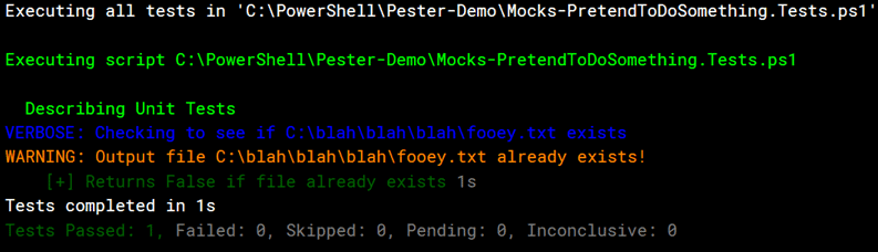
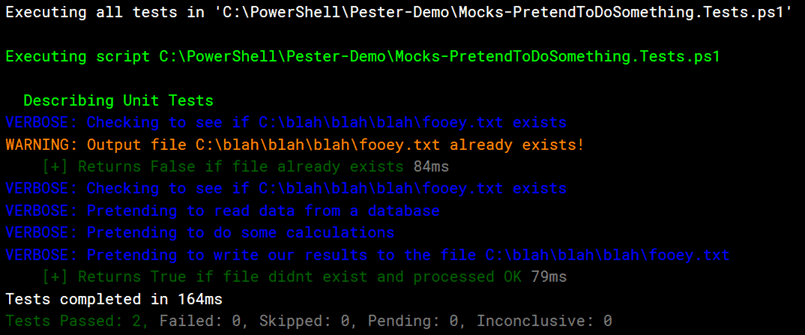
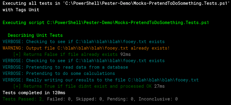
button in the toolbar. When you do, in the output you’ll see only the unit tests were executed.

As you can see, only the describe block for unit tests was executed. Additionally, in the very first line of the output we see Pester outputs with the Tag Unit to show that it’s only executing tests with Describe blocks having the Tag of Unit. You can repeat this for integration and acceptance tests.

Invoke-Pester "$dir\Mocks-PretendToDoSomething.Tests.ps1" -Tag 'Integration'
Invoke-Pester "$dir\Mocks-PretendToDoSomething.Tests.ps1" -Tag 'Acceptance'

You can also include multiple tags on the Invoke-Pester call.

Invoke-Pester "$dir\Mocks-PretendToDoSomething.Tests.ps1" -Tag 'Unit', 'Integration'

I’ll leave it to you to execute and see the output.

Summary

This article began with a review of mocks, and how important they are to creating your unit tests. It then covered examples of unit, integration, and acceptance tests, and how Pester’s TestDrive can assist you with creating integration tests. Finally, I wrapped this article up by showing how to Tag each of your test groups, and to invoke Pester so that it only executes tests with the specified tag or tags.

In the next article, you’ll see how to write Pester tests for your modules. It’s not quite as straightforward as you might think, but once you learn the secret you’ll be able to construct good tests for all your modules.

The post Advanced Testing of Your PowerShell Code with Pester appeared first on Simple Talk.


from Simple Talk https://ift.tt/2LGWO8f
via

Security, Compliance, Data Ethics, and Breaking the “Not My Job” Mindset

Security, compliance, and data ethics are related concepts that everyone who works with software should know about, from the help desk to the C-level office… but almost everyone thinks that worrying about these things is someone else’s problem.

As data breaches become increasingly common and data privacy regulations pass in more regions, there are increasing reasons to start regularly bringing up questions about security, compliance, and privacy in your everyday work: opportunities to contribute in this area are likely going to grow, and these opportunities are an emerging area open to everyone.

By gradually improving your own practices when it comes to these concepts, you’ll become a more valuable employee and broaden your options for advancing your career.

The first step is getting an understanding of the concepts.

Security includes everything you do to protect your data and systems. You may implement security measures to protect personal data, but you may also implement security measures for many other reasons: to protect other data that should not be in the public domain, to protect resources and make sure they are used only by their owners, etc.

Compliance answers the question: are you meeting your obligations? These obligations often involve data privacy, and the obligations can come from international laws, such as GDPR, from industry-specific regulations made by governments, such as HIPAA and SOX, or even to your own company policies.

Data privacy is concerned with information related to an identifiable person. “Personal data” is not anonymized: it might directly identify someone, or it might be multiple pieces of data that together identify a person.

Data ethics concerns questions about our individual and societal responsibilities when it comes to how data is collected, used, stored, shared, and maintained.

These concepts get neglected by many data professionals because of a “not my job” mindset. Security is a scary topic: it’s complex, threats to security evolve quickly, and it’s a high stakes game. Compliance is no different: as new regulations are passed and implemented, it’s intimidating to think about keeping up with the details. Many people think that these are important topics, but they are best left to the specialists.

Not everyone needs to become a security specialist, but everyone who works with data, or governs an organization that works with data, does need to think about these concepts. Bringing up conversations around data ethics and implementing processes that address data privacy, security, and compliance will benefit your employer and your customers.

A good way to break out of the “not my job” mindset is to build a checklist of questions to ask when you interact with a dataset in your work environment– and then to use it regularly. Here’s a great example checklist for developers building data-driven applications. Your checklist may start small, but if you use it consistently then you will find yourself refining it and increasingly becoming more proactive when it comes to data privacy, security, and compliance.

Commentary Competition

Enjoyed the topic? Have a relevant anecdote? Disagree with the author? Leave your two cents on this post in the comments below, and our favourite response will win a $50 Amazon gift card. The competition closes two weeks from the date of publication, and the winner will be announced in the next Simple Talk newsletter.

The post Security, Compliance, Data Ethics, and Breaking the “Not My Job” Mindset appeared first on Simple Talk.


from Simple Talk https://ift.tt/2N5hoE0
via

Wednesday, August 29, 2018

How to Linux for SQL Server DBAs — Part 1

Walt Whitman said “Simplicity is the key to harmony” as it is for technology, too. As more companies speed up their development cycle with DevOps, elimination of complexity is among the top priorities to accomplishing this. Windows is still the champion of the user world, but for the DevOps enterprise environment, a single operating system can provide a powerful step in shortening automation and delivery cycles.

Microsoft’s Entrance to the Linux Arena

With this shift to more agile development, Microsoft has embraced Linux to assist in aligning them with significantly more of the DevOps community. Linux was introduced with SQL Server 2017 beta for on-premises and this brings SQL Server in as an option for DevOps solutions using Linux without multi-operating system complexity.

This opens a new challenge for SQL DBAs as the comfort they once had with Windows is no longer there. SQL Server, unlike Oracle, is a product that was built by the same company as the operating system, so it was more embedded into the OS layer. Many performance tools were dependent upon the version of the OS and simultaneously, much of the internals of SQL Server were hidden inside the database tier to create a boundary between server administrator and database administrator.

With the move to Linux, the SQL Server DBA may find they don’t have the on-premises administration professionals to support them as Oracle DBAs have had in the past. Windows administrators may be as hesitant to work with Linux as Linux administrators have hesitated to work with Windows. If you’re a database professional working with an IaaS, (Infrastructure as a Service) or on-premises solution and don’t have the expertise in the platform your database resides on, this can have a considerable impact to the level of support you are also able to offer.

History Lesson

There were a few stops and starts before Linux came to be the monolith we know today. DOS was well known by the 1980’s, the operating under the covers of every Windows machine in the world by the 90’s and Unix, no matter what the flavor, was the powerhouse behind enterprise hosts. The chipsets they ran on weren’t compatible and the worlds stayed separate until a new version of Unix, called Minix was introduced by a Dutch professor, Andrew Tannenbaum in the mid-1980’s. This new OS ran on Intel 8086 processors, and its goal was to offer Tannenbaum’s students an operating system to work and build on. As the operating system became more well-known in Europe and its user group grew, one of those students became passionately devoted to the code base. That developer was a young, Finnish student, named Linus Torvalds.

Minix has other relationships to Linux, as both projects also go back to the GNU project, (and the GNU C Compiler) a focus to offer free and quality software, and at the GNU Project’s head, Richard Stallman, like Andrew Tannenbaum, had a God-like status in Linus’ world.

With the goal of creating an operating system robust enough to take on the industry, Linus began to write his own operating system, following in the footsteps of those he admired. Linus took what he viewed was great about Minix, but also made a significant change–his version of Unix was truly free, where Minix required a license. In 1991, Linus Torvalds introduced his new operating system to the masses. He originally named the operating system Freax, but the name didn’t stick, and it was soon renamed by his loyal followers to Linux. 

As the product was truly open source, the generation of developers in the 90’s began to feed into what Linus had already put his heart and mind into. One of the most interesting aspects of the connection between Minix founder, Andrew Tannenbaum and Linus Torvalds, is that Tannenbaum once confronted Linus on the Minix User Group and declared,

“…Be glad you are not my student. You would not get a high grade for such a design. Linux is dead.”

Thankful for the IT industry, Linus didn’t listen to the man he had once admired and continued to work with the Unix community to build out the Linux OS. With over 20 million lines of code for the kernel, including versions like Redhat, Debian, Ubuntu, Suse and others, it has become the OS that makes the world go around with versions that are still open source and enterprise.

Getting Your Linux Going

As this series of articles are published, it will be important that you have a way to do some hands on with Linux, not just read about this powerful operating system. To accomplish this, my recommendation is to download Docker for Windows.

Choosing to use Docker over a VM or a cloud deployment might seem odd at first, but I’ve found that Docker is the perfect option from the testing and classes I’ve led. The Docker image is light–using a minute number of resources on any laptop. Access to the docker image isn’t dependent upon Wi-Fi or the user having a cloud account. The image, for the most part, offers an experience that is incredibly similar to a full Linux server in functionality for no additional cost.

Once you’ve downloaded Docker and have it installed, create a Linux container with SQL Server on your workstation, (thanks to Microsoft) to work with and build your knowledge. Start by opening a Command Prompt, cmd from the search option in Windows.

NOTE: Microsoft recommends PowerShell for installing and working with Docker, but I’ve often run into problems and recommend the Command Prompt instead. Be sure to remove any line continuations (back ticks `) before running their PowerShell commands in the Command Prompt.

Creating the Docker container requires a simple, single line command, replacing the password and the container name with those of your choice:

docker run -e "ACCEPT_EULA=Y" -e "MSSQL_SA_PASSWORD=<password>" -p 1433:1434 --name <container name> -d microsoft/mssql-server-linux:2017-latest

You can follow these steps to create the Microsoft SQL Server 2017 container with Linux. I have some recommendations to offer you a high rate of success, so take advantage of these tips and read this article before creating your container. This post will cover any prerequisites as well as help you avoid common pitfalls that I’ve experienced while giving my classes.

Although this isn’t an article on Docker, there are a few commands that will assist you going forward with the management of the container, so I’ve added them here:

Task

Command

Notes

Stop or (re)start a container

Docker stop <container name>

Docker start <container name>

Docker restart <container name>

Stop is often required before dropping a container

Remove a Container

Docker rm <container name>

Removing containers are no big deal, as you can so easily recreate them.

Status of Containers and Info

Docker ps -a


View Logs for a container

Docker logs <container name>

Log entries scroll from earliest to latest.

Inspect a specific container

Docker inspect <container name>

Gives you all the information, port info, ip address, etc for a container.

Now that you know a bit of how to use docker, let’s cover the first facts to know about Linux:

  • Everything in Linux is treated as a file.
  • Although everything is installed as root and you are logging into the container as root, that’s not the proper configuration of an enterprise server. ROOT IS GOD and just as you would in a database server, the privileges least required to perform a task is the best practice.
  • Linux doesn’t have registry to act as an anchor for shared files or protect you from yourself when you log in, (especially root!)

Logging into your docker container is quite simple from the command prompt, (notice I didn’t say Power Shell… 😊):

docker exec -it <container name> "bash"

You should see the following on your screen:

Although it isn’t the case for most Linux servers, the Linux image is kind enough to use the following for the prompt: username@hostname:path#

You are now connected to your Linux container with a secure shell using bash, also known as ‘Born Again Shell.’ Things to remember:

  • Linux is CASE SENSITIVE. You must use capital letters when present.
  • The wild card (*) works to shorten typing, (i.e. /var/t* = /var/tmp)
  • You can do anything to this server- YOU ARE GOD. If you delete a file, it’s GONE, (but I also discuss in my blog post on why this is a safe place to be testing this out.)
  • This is a container, so although most commands and activities are just like a Linux host, there will be a few things that don’t work.

The first commands we’ll learn are those to tell us about our environment:

Command

What it Does

Warnings or Hints

whoami

Tells you who you are logged in as

If you’re switched users, it will show you the user you ARE currently.

pwd

Directory path you currently are in

No, it’s not for password. No, don’t attempt to make an alias to try to make it password. Bad idea.

cd /

Top of the root directory, parent directory of EVERYTHING

You are root. You have rights to this right now, but in an enterprise environment, this would most likely NOT happen, unless you have a really foolish administrator.

df -h

File system, directory and storage information in appropriate size format

You can perform this same command with a -k instead of the -h if you like really big numbers to calculate from kilobytes.

ls

ls -la

ls -ltr

To list

To list all, including permissions

To list all, most recent last

Notice the differences in these commands and what DOESN’T show up when you don’t use the -a argument.

cd <directory>

cd ..

cd

Change directory

Change directory one dir up

Change directory to home dir

cd to /var/tmp, then perform the next two and see how the location changes.

touch <file name>

Creates an empty file

The file doesn’t require an extension and you can create it in a distinct directory by prefixing the filename with the directory name.

apt-get

yum

Two most common updaters and installers for Linux packages

We’ll get into these first, even though they’re listed last.

First Steps with Your Container

This container, although brand new, is a snapshot in time and it may be missing the latest updates for the OS and utilities. As Linux doesn’t have a registry, you can run the updater yourself and not have to worry about rebooting. Its just a very rare thing to have to reboot a Linux/Unix machine.

Run this to get the upgrade for your container:

apt-get upgrade

Download all the latest updates for your container:

apt-get update

The apt-get utility will download all the critical updates for the OS and the most common updates for packages. This is done by connecting to the repositories listed in the sources.list file in the /etc/apt directory on the container host and similarly on a standard Linux server. Your admin could add new repository locations to the file if needed.

Once this is complete, then run the install command, which will install any OS or security required packages and updates.

apt-get install

ls Don’t be surprised if a number are noted, but nothing is done. It means your image is up to date, but the number shown at the end have been made available to your system.

0 upgraded, 0 newly installed, 0 to remove and 20 not upgraded.

Now you’re ready to install a few packages that I think are essential to a Linux host that aren’t included in the image to keep it as small and nimble as possible.

The first thing you’ll desire is the ability to view, edit, as well as view sections of files. Install the following packages:

Package Name

Utilities Included

vim

View, VI, VIM

net-tools

Networking utilities

npm

More

less

Install less separately, from the npm package

The command to install will be similar to the one you typed to update the OS:

apt-get install <package name>

As an example, you can run:

apt-get install vim
apt-get install net-tools

OR you can run:

apt-get install vim net-tools

Notice when installing more than one package at a time, it doesn’t require a ‘,’ between the package names. If you’re asked to confirm during the installation, choose Y to confirm and hit enter or N to abort.

Summary

In this article, you’ve been introduced to:

  • A light history about Linux
  • Creation of a Docker container with Linux and SQL Server installed
  • Some basic commands
  • Learned how to update your Linux container with the latest updates and a few packages.

The next article will cover user, groups, permissions, and much more! You’ll also begin to work with the server processes, log into the SQL Server, and begin to manage the Linux host.

The post How to Linux for SQL Server DBAs — Part 1 appeared first on Simple Talk.


from Simple Talk https://ift.tt/2BYVfTE
via

Wednesday, August 22, 2018

Questions About Kerberos and SQL Server That You Were Too Shy to Ask

The Questions

  1. What is Kerberos?
  2. Why is Kerberos needed for SQL Server?
  3. Can’t I just avoid using Kerberos?
  4. What is a Service Principal Name (SPN)?
  5. Is there a way to see SPNs in AD?
  6. How are SPNs created or changed?
  7. What happens if I change the service account of my SQL Server?
  8. How can I tell if I’m connecting with Kerberos authentication?
  9. I’m connecting from another server, but it’s using NTLM. How did that happen?
  10. Kerberos authentication is working for the instance, but why aren’t the SSRS reports running?
  11. How do I set up Kerberos for linked servers?
  12. Any other surprises I need to know about?

1. What is Kerberos?

Kerberos is an authentication protocol used in networks, including Active Directory (AD), that is based on the use of encrypted tickets for access to network resources.

In a situation in an AD network when Kerberos can’t be used, then the older and less secure NTLM authentication protocol is used instead. There are many situations where the end user will not be able to access the resources they need with NTLM. This is especially true when more than one network resource is involved with the request (double-hop), such as is often the case with SSRS (SQL Server Reporting Services) or a linked server.

For Kerberos authentication to connect to a SQL Server instance, Service Principal Names (SPNs) must be properly configured in AD. While these are not difficult to create, most DBAs will not have rights to do so. Even with network administrator privileges, it’s easy to make a mistake when creating SPNs. When DBAs understand Kerberos, they can help the network administrator troubleshoot issues.

2. Why is Kerberos needed for SQL Server?

When NTLM is used, the client, for example a user logged into a laptop, contacts a domain controller when requesting access to a resource in the network. This resource could be an SSRS report, for example. When using NTLM, the user proves their identity to the SSRS server. Unfortunately, the SSRS server cannot forward the credentials of the user along to the database server. The database server will deny the request, and the end user will see an error message. This is common with SSRS but will also be seen whenever resources are needed involving multiple servers.

When Kerberos is property configured, the SSRS server can pass along confirmation of the identity of the requester to the database server via the ticket. If the login of the original requester has permission to select the data, it’s returned to the SSRS server, and the report is delivered.

Even if you are not using SSRS, you can run into issues when Kerberos is not configured properly. For example, you will often see error messages when trying to connect to SQL Server using SSMS (SQL Server Management Studio) when logged into another server when SPNs are misconfigured.

3. Can’t I just avoid using Kerberos?

If the resources are located within the same physical server or virtual machine, then Kerberos authentication is not required. In this case, the identity of the requester is just needed on one server; nothing needs to be forwarded along. Typically, an SSRS server runs reports that need data from many servers across the network. Even if that’s not the case, SSRS is often installed on its own server for performance reasons. This is that double-hop issue I mentioned earlier.

Another way to avoid using Kerberos in any situation is by using SQL Server logins or users instead of network accounts. For example, if the SSRS report contains credentials for a SQL Server login, Kerberos will not be involved when the request is made to the database. This may or may not be a good idea in your organization depending on security policies or application requirements.

You can also save the credentials for a Windows account in an SSRS data source. This will avoid the double-hop problem since the user name and password will be used by the SSRS server when making the request to the database server. Keep in mind, however, that only one set of credentials can be saved in a data source, so this will probably not be the credentials of the person who wants to run the report. As long as the user has rights to run the report, they do not need permission to the actual data. Again, this might be something you use now, possibly for SSRS subscriptions, but it also might be something you should avoid depending on the policies in your organization.

One other option for SSRS is to save Windows credentials but try to impersonate the user running the report. Theoretically, this can be used to bypass Kerberos, but it uses the SETUSER command after connecting to the database. This command is deprecated and requires either sysadmin or db_owner membership by the account whose credentials you are saving. That is not a great idea! It may be a good choice for other sources of data, such as SSAS Tabular, but it’s probably not suited for a traditional SQL Server database.

4. What is a Service Principal Name (SPN)?

SPNs are properties of service accounts in AD. It associates the service account to the service. SPNs are in the form Service/Server Domain\ServiceAccount. Here is an example:

Fully qualified server name: SQL1.mydomain.local

Port: 1433

Instance: Default

Service account: sqlservice1

There should be two SPNs registered for the SQL Server instance:

MSSQLSvc/SQL1.mydomain.local mydomain\sqlservice1

MSSQLSvc/SQL1.mydomain.local:1433 mydomain\sqlservice1

If the SQL Server instance is using a local account instead of an AD account, the computer name will be used instead of a service account name. Here is an example:

Fully qualified server name: SQL1.mydomain.local

Port: 1433

Instance: Default

Service account: Network Service

There should be two SPNs registered:

MSSQLSvc/SQL1.mydomain.local mydomain\SQL1

MSSQLSvc/SQL1.mydomain.local:1433 mydomain\SQL1

If you have a SQL Server with a named instance, then the SPNs would look like this:

Fully qualified server name: SQL1.mydomain.local

Port: 49827

Instance: Inst1

Service account: Network Service

There should be two SPNs registered:

MSSQLSvc/SQL1.mydomain.local:inst1 mydomain\SQL1

MSSQLSvc/SQL1.mydomain.local:49827 mydomain\SQL1

5. Is there a way to see SPNs in AD?

You can see the SPNs in the Active Directory Users and Computers utility. The first step is to enable the Advanced Features view.

After finding the object, search in the Attribute Editor for servicePrincipleName and click Edit. This example shows the SPNs that are registered using the computer account because the default account was used during installation of the instance. It’s also a named instance.


You can also add or remove SPNs from this dialog with the appropriate rights.

6. How are SPNs created or changed?

To add or delete an SPN, use the setspn utility in a command window or PowerShell session. Keep in mind that DBAs will likely not have rights to add or delete SPNs, but it’s useful to know what needs to be changed when working with your network administrators.

Here are the commands:

Setspn -L will list all the SPNs registered for a given service account. In the case of a SQL Server using a local account, you will use the computer name.

Setspn -L mydomain\sql1
Setspn -L mydomain\sqlservice1

Setspn -D is used to delete an SPN.

Setspn -D MSSQLSvc/SQL1.mydomain.local mydomain\SQL1

Setspn -S is used to add an SPN. It avoids creating duplicate SPNs for a given service. If an SPN is already registered for a service with a different service account, it should return an error message including the account with the current SPN.

Setspn -S MSSQLSvc/SQL1.mydomain.local:1433 mydomain\sqlservice1
Setspn -S MSSQLSvc/SQL1.mydomain.local mydomain\sqlservice1

Setspn -Q is used to search for existing SPNs registered for a given service. This is helpful when troubleshooting Kerberos issues and you can’t figure out where the SPN is registered.

Setspn -Q MSSQLSvc/sql1.mydomain.local

7. What happens if I change the service account of my SQL Server?

When the service account changes, the SPNs must be switched to the new service account. Before a new SPN is added, any incorrect SPNs must be removed. The old SPN will not be removed automatically, and you cannot have multiple entries for the same service. Often, SQL Server instances are installed using the default account, which is local. Only later will the correct service account be set up. When this happens, the old SPN will be left in place, and Kerberos authentication will not work. SSRS reports that were running previously may begin erroring out instead. Often, you’ll see this error when attempting to connect via SSMS from another computer.

Someone with permission to create and remove SPNs will need to run the setspn -D command to remove the old SPNs and the setspn -S command to add the new ones. You may need to restart the SQL Server instance and wait for it to be replicated in AD before the change works.

8. How can I tell if I’m connecting with Kerberos authentication?

First, Kerberos only comes into play when connecting from a different server. If you are remote controlling the server, you will not be using Kerberos. If you have VIEW SERVER STATE permission on the instance, you can run this query:

SELECT S.login_name, C.auth_scheme, s.host_name
FROM sys.dm_exec_connections AS C
JOIN sys.dm_exec_sessions AS S ON C.session_id = S.session_id;

You can also use the klist command to view the tickets. In this example, you can see the ticket for the SQL Server in #2.

You will see this error message when Kerberos is required, but you are not able to use it.

9. I’m connecting from another server, but it’s using NTLM. How did that happen?

If no SPNs are configured for the instance, then NTLM will be used without error as long as no double-hop is involved. This could happen when the DBA installs the instance and doesn’t have permission to create SPNs, which is typically the case.

10. Kerberos authentication is working for the instance, but why aren’t the SSRS reports running?

There are five steps you must complete to get Kerberos configured for native mode SSRS connecting to a SQL Server database:

  • Create an SPN for the SSRS server. The SPN should look like this for a server named SSRS1 and service account SSRSservice1:
Setspn -S http/SSRS1.mydomain.local mydomain\SSRSservice1

It might also be a good idea to set one up for the server name without the domain as well. If the SSRS service is using a local account, then no SPN needs to be created. Instead, it uses the HOST SPNs that should already be in place.

  • Set the Delegation property for the SSRS service account in AD to Trust this user for delegation to any service (Kerberos only). The Delegation page will not show up in Active Directory Users and Computers until the account has an SPN filled in. Note that this is not the setting used for SharePoint integrated mode or for the new Power BI Report Server. These steps are for native mode pointing to a SQL Server database only.

  • Make sure that the Account is sensitive and cannot be delegated property is disabled.

  • Add a value to the SSRS RSReportServer.config file on the SSRS server.

  • Once everything is complete, restart the SSRS service

Microsoft has made a tool available, Kerberos Configuration Manager, that can help troubleshoot SPNs when setting up Kerberos for SSRS.

11. How do I set up Kerberos for linked servers?

Set up SPNs for both instances. Set delegation to Trust this user for delegation to any service on the service account being used on the instance where the linked server is set up. Basically, the server that must pass the ticket along must be set up for delegation.

12. Any other surprises I need to know about?

If there are any time discrepancies on the servers, Kerberos will not work. For example, if you set up a test domain in virtual machines on your laptop, make sure that the domain controller is in the same time zone as the laptop.

Another problem could be that the SSRS server needs the .NET Framework 3.5 feature installed. I’ve seen situations where everything was configured properly, and reports using SQL Server authentication worked, but Kerberos authentication for SSRS just wouldn’t work. Installing .NET Framework 3.5 and restarting the SSRS service fixed the issue.

Instead of using dynamic ports for your instances, be sure to set static ports to make sure that the port doesn’t change and break the SPN.

When testing, you may need to clear out existing tickets with the klist purge command and log out and back in. Sometime, just waiting a few minutes is required for a change to be replicated in AD is needed. You also may need to reboot the server after adding an SPN.

This article focused on native mode SSRS connecting to a SQL Server database in the same domain. You will have to do some additional research to understand the settings required to enable Kerberos for other applications, services, and situations.

The post Questions About Kerberos and SQL Server That You Were Too Shy to Ask appeared first on Simple Talk.


from Simple Talk https://ift.tt/2PsEeUE
via

Tuesday, August 21, 2018

Power BI Introduction: Building Reports in Power BI Desktop — Part 7

The series so far:

  1. Power BI Introduction: Tour of Power BI — Part 1
  2. Power BI Introduction: Working with Power BI Desktop — Part 2
  3. Power BI Introduction: Working with R Scripts in Power BI Desktop — Part 3
  4. Power BI Introduction: Working with Parameters in Power BI Desktop — Part 4
  5. Power BI Introduction: Working with SQL Server data in Power BI Desktop — Part 5
  6. Power BI Introduction: Power Query M Formula Language in Power BI Desktop — Part 6
  7. Power BI Introduction: Building Reports in Power BI Desktop — Part 7

Until now, this series has focused primarily on building datasets in Power BI Desktop, with the understanding that the data would ultimately be used to create visualizations that provide insights into the underlying information. The visualizations would be included in one or more reports that could then be published to the Power BI service for wider distribution.

This article switches focus from building datasets to creating reports that rely on those datasets, using the tools within Power BI Desktop for visualizing the data. The article offers several examples of how to add visualizations to a report to provide different perspectives of the data. The visualizations are based on a single dataset, created from data in the AdventureWorks2017 sample database in SQL Server 2017.

If you plan to try out the examples for yourself, you can use the following T-SQL statement to add a dataset to Power BI Desktop:

SELECT h.SalesPersonID AS RepID,
  CONCAT(p.LastName, ', ', p.FirstName) AS FullName, 
  a.City, sp.Name AS StateProvince, cr.Name AS Country, 
  h.OrderDate, h.SubTotal
FROM Sales.SalesOrderHeader h 
  INNER JOIN Person.Person p
    ON h.SalesPersonID = p.BusinessEntityID
  INNER JOIN Person.BusinessEntityAddress ba
    ON p.BusinessEntityID = ba.BusinessEntityID
  INNER JOIN Person.Address a
    ON ba.AddressID = a.AddressID
  INNER JOIN Person.StateProvince sp
    ON a.StateProvinceID = sp.StateProvinceID
  INNER JOIN Person.CountryRegion cr
    ON sp.CountryRegionCode = cr.CountryRegionCode
WHERE h.SalesPersonID IS NOT NULL
ORDER BY FullName ASC;

For information about using a T-SQL query to create a dataset, refer to Part 5 of this series.

After you import the data into Power BI Desktop, change the name of the dataset to Sales, update the format of the OrderDate column to show only the dates (not the times), and update the SubTotal column to show whole number currency values.

To update for the OrderDate column, select the dataset in Data view and then select the OrderDate column. On the Modeling ribbon, select Date from the Date type drop-down list. Next, click the Format drop-down list, point to Date Time, and click the format 2001-03-14 (yyyy-MM-dd).

To update the SubTotal column, select the column in Data view and then select Whole Number from the Data type drop-down list. You should receive a warning message about the loss of data precision. Click Yes to continue. In the Currency format drop-down list, click $ English (United States). In the Decimal places box, set the number of decimal places to 0.

Getting started with Power BI Desktop Reports

With the dataset in place, you’re ready to start adding visualizations to the report. But before you do, save the file if you haven’t already done so. The file provides the structure necessary for publishing the report—along with its visualizations and datasets—to the Power BI service. Each file is associated with a single report made up of one or more pages, with each page containing the actual visualizations.

To add a visualization to a report, go to Report view, where you’re presented with a design surface and the Visualizations and Fields panes, as shown in the following figure. The design surface contains the report pages, with Page 1 already added to the report.

The Visualizations pane provides the tools necessary for adding and configuring the visualizations. The Fields pane includes a list of the defined datasets, with access to each dataset column. The above figure indicates that the Sales dataset is the only visible dataset included in this report file. (In Power BI Desktop, you can configure a dataset to be hidden in Report view.)

Most of the tasks you carry out in Report view are point-and-click or drag-and-drop operations. For example, to add a visualization to a report page, you simply click the visualization’s button at the top of the Visualizations pane. Power BI Desktop will add the visualization to the design surface, where you can drag it to a different position or resize its window. You can then specify what data to add to the visualization by selecting columns from the Fields pane.

When a visualization is selected on the design surface, Power BI Desktop updates the Visualizations pane to include configuration options specific to that visualization. For example, the following figure shows the Visualizations pane with a Matrix visual selected on the design surface. In this case, the Country and FullName columns have been added to the Rows section and the OrderDate column has been added to the Columns section, with the date hierarchy expanded. (We’ll be getting into the details of how to add columns in just a bit.)

The top of the Visualizations pane contains the icon buttons you use to add visualizations to a report. The rest of the pane is specific to configurating the selected visualization. This part of the pane is divided into three tabs: Fields, Format, and Analytics. In the above figure, the Fields tab is selected, as indicated by the red circle. The options on this tab are used to apply data to the visualization.

The second tab, Format, provides options for configuring how the selected visualization appears. The options are separated into categories, which are specific to the selected visualization. The following figure shows the Format categories for the Matrix visual.

The Analytics tab lets you add dynamic reference lines to certain types of visualizations. Later in the article, we’ll be discussing this tab in more detail.

Creating a Matrix Visual

The best way to understand how to work with visualizations is to set them up for yourself. In this way, you get hands-on experience with the tools, while seeing how all the pieces fit together. For the first example, you’ll add and configure a Matrix visual and two Slicer visuals. The following figure shows what they’ll look like after you’ve set them up. The visualization on the left is the Matrix visual and the two on the right are the Slicer visuals. The Matrix visual is selected in the figure, as indicated by the menu across the top of the visualization and the frame that surrounds it.

The Matrix visual aggregates measure data across both columns and rows, while supporting extensive drill-down capabilities, depending on the data and how you’ve configured the matrix.

To add the Matrix shown in the previous figure, take the following steps:

  1. Click the Matrix button in the top section of the Visualizations pane. This adds a placeholder object to the design surface, which is already selected.
  2. Drag the Country column from the Fields pane to the Rows section on the Visualizations pane.
  3. Drag the FullName column from the Fields pane to the Rows section on the Visualizations pane, directly beneath the Country column. By adding the FullName column after the Country column, you make it possible for users to drill down into the country to view data about the sales reps in that country.
  4. Drag the OrderDate column from the Fields pane to the Columns section on the Visualizations pane. Because the OrderDate column contains date values, Power BI Desktop automatically defines hierarchical levels that can be used to drill down into the data based on dates.
  5. Drag the SubTotal column from the Fields pane to the Values section on the Visualizations pane. The SubTotal column provides the measure on which the aggregations are based.

The Fields tab on the Visualizations pane should now look like the one in the following figure.

After you add the data you need, you can configure the visual’s settings on the Format tab to ensure it looks just the way you want, and the data can be easily understood. To make your matrix look similar to the one shown in the above figure, take the following steps:

  1. Expand the Matrix style section and select Minimal from the Style drop-down list.
  2. Expand the Grid section and set the Vert grid option to On, and then select the lightest yellow color for the Vert grid color option.
  3. Expand the Column headers section and set the Text size option to 12.
  4. Expand the Row headers section and set the Text size option to 12.
  5. Expand the Values section and set the Text size option to 10.
  6. Expand the Subtotals section and set the Text size option to 10.
  7. Expand the Grand total section and set the Text size option to 10.
  8. Expand the Title section and set the Title option to On. In the Title Text box, type Sales by Country, and set the Font color option to the darkest aquamarine. In the Alignment subsection, click the Center option, and then set the Text size option to 17.
  9. In the Border section, set the option to On.

Your Matrix visual should now be in fairly good shape. Going forward, I’ll leave it up to you to decide how to configure the settings on the Format tab, based on your own preferences. The main thing to keep in mind when formatting a visualization is to make sure it’s selected on the design surface.

When you select a Matrix visual on the design surface, drop-down list is available for choosing whether drill-down operations are based on columns or rows, as shown in the following figure.

To test this out, select Columns from the Drill on drop-down list, and then click the button Expand all down one level in the hierarchy (third button to the right of the drop-down list). When you click the button, the matrix provides a breakdown of the aggregated data based on quarters as well as years, as shown in the following figure.

To return to the previous view, click the Drill Up button just to the right of the Drill on drop-down list. Next, click the button Click to turn on Drill Down near the top right corner to turn on drill-down capabilities directly within the matrix. When this button is selected, its shading is reversed.

With drill-down enabled, click the 2013 column header. The matrix will now display data specific to that year, as shown in the following figure.

As already noted, Power BI Desktop automatically creates a hierarchy based on the date values, with years at the top, then quarters, next months, and finally days. You can drill down into all levels within a Matrix visual. For example, to drill into the first quarter, click the Qtr 1 column header, which allows you to view sales data at the month level, as shown in the following figure.

If you select the Rows option in the Drill on drop-down list, instead of the Columns option, you will see different results when drilling into the data. For example, if you click the name of a country in the Country column, the matrix will display a list of sales reps for that country, along with their sales totals. Give it a try and see how to goes.

You can also view a visualization in Focus mode, which enlarges the visualization so that it uses the entire design surface. To view a visual in focus mode, click the Focus mode button near the top right corner. Your Matrix visual should now look similar to the one in the following figure. To return back to the regular view of the design surface, click the Back to Report button.

You can also add slicers to your reports that provide a way for users to filter the data within the visualization. For this exercise, you will add two slicers, one for countries and one for years.

To add the Country slicer, verify that no visualizations are selected on the design surface, and then click the Slicer button at the top of the Visualizations pane, as shown in the following figure. The Slicer button is outlined in yellow to indicate that it is the selected visual type.

Next, drag the Country column from the Fields pane to the Field section in the Visualizations pane. You can then move and resize the slicer, as well as apply formatting. Power BI Desktop will automatically link the slicer to any related visualizations on that page. You might also need to change the slicer type from a dropdown list to a regular list of items so the slicer is more readable. To change the type, click the down arrow within the slicer visual itself, near the top right corner, and then select List.

To add the Year slicer, take the same steps as you did for the Country slicer, only this time, add the OrderDate column. Next, click the column’s down arrow (on the Visualizations pane), and click Date Hierarchy. Power BI Desktop adds only the Year level to the slicer. Again, you might need to change the slicer type from Dropdown to List.

When formatting the two slicers, you can add a Select All value to the list of available values. To add the value, go to the Format tab on the Visualizations pane, expand the Selection Controls category, and set the Show “Select All” option to On.

To test the new slicers, select France, Germany, and United Kingdom in the Country slicer, and select 2013 and 2014 in the Year slicer. To select multiple values in a slicer, select the first value, press Control, and select the remaining values. Your visualizations should now look like those shown in the following figure.

Once you’ve mastered how to add and configure a Matrix visual, you’ll find that many of the concepts introduced here will apply to other visualizations. Just be certain to save your report file regularly to ensure that none of your changes get lost.

Creating Table and Card Visuals

When you add columns to a visualization, Power BI Desktop will often summarize the data to provide a big-picture perspective of the information. You saw this with the Matrix visual in the previous section, in which the SubTotal column (the measure) was aggregated across the Country and OrderDate columns to provide subtotals for each discrete group.

In some cases, you might not want the data automatically aggregated. For example, you might want to add a Table visual that lists individual Canadian sales only. To add this table, click the Plus button at the bottom of the design surface to insert a second page. Next, click the Table button on the Visualizations pane, and then add the RepID, FullName, OrderDate, and SubTotal columns to the Values section of the Visualizations tab.

Power BI Desktop will automatically try to summarize the RepID and SubTotal columns because they contain numerical values, using the Count and Sum aggregate functions, respectively. For each of these two columns, click the column’s down arrow (in the Visualizations pane), and select Don’t summarize, as shown in the following figure. Power BI Desktop will update the data to include individual rows.

When you add a date column to the Table visual, Power BI Desktop automatically breaks the dates into hierarchical levels, which results in four columns (Year, Quarter, Month, and Day). If you want a single date column instead, you must reset the OrderDate column. In the Visualizations pane, click the column’s down-arrow and select OrderDate. Power BI Desktop will update the table so the entire OrderDate value is listed in a single column.

The last step is to filter out all rows except the Canadian sales. To filter the data, drag the Country column from the Fields pane to the Visual level filters subsection in the Filters section of the Visualizations pane. Expand the Country section if not already expanded and select the Canada checkbox, as shown in the following figure.

Once you’ve set up the data, position and resize the Table visual and apply the necessary formatting. Your table should now look similar to the one shown in the following figure but formatted according to your preferences.

The figure also shows a second visual, which is a Multi-row card. In this case, the card displays the name of each Canadian sales rep, along with the total sales for that rep.

To add this card, verify that the Table visual is not selected and then click the Multi-row card button on the Visualizations pane. Next, drag the FullName column from the Fields pane to the Fields section of the Visualizations pane, and then do the same for the SubTotal column. Finally, set up the same filter you set up for the Table visual so that only Canadian sales reps are listed. Position, resize, and format the card as necessary, and be sure to save the report file.

Creating Pie, Donut, and Treemap Charts

In the next example, you’ll add a page to the report and then add three visuals: Pie chart, Donut chart, and Treemap. The visualizations will display sales information for all countries except the United States. Although you’ll be creating three different types of visualizations, you’ll configure them exactly the same.

To add the Pie chart visual, take the following steps:

  1. Click the Plus button to add a new page, and then click the Pie chart button on the Visualizations pane.
  2. Drag the Country column from the Fields pane to the Details section of the Visualizations pane.
  3. Drag the Subtotal column from the Fields pane to the Values section of the Visualizations pane.
  4. Expand the Country column in the Filters section and select all countries except the US.
  5. Position, resize, and format the visualization as necessary.

Once you have the first visualization exactly as you want to, you can create the next one, using the following steps:

  1. Ensure that the Pie chart visual is selected.
  2. Click Copy on the Home ribbon, and then click Paste. A copy of the original visualization is added to the design surface.
  3. Drag the copied visual to its new position.
  4. Click the Donut chart button on the Visualizations pane.

When you click one of the visualization buttons and a visualization is already selected, Power BI Desktop tries to apply the newly selected visual to the original configuration. This means that the visuals need to compatible with each other for this to work, like the two you just added.

The next step is to add the Treemap visual, taking the same approach as with the Donut chart visual. Copy and paste one of the other visuals and then click the Treemap button at the top of the Visualizations pane. When you’re finished, you should end up with three visuals similar to those shown in the following figure.

The visuals are positioned in the order they were created: Pie chart, Donut chart, and Treemap. Normally, you would not add such similar visuals to the same page unless you had a compelling reason, but what we’ve done here demonstrates how easy it is to copy a visualization and change it to a different type.

In the figure above, the Treemap visual also shows a pop-up message, which appears when you hover over a section of the visual. In this case, the pop-up is showing the total sales for the United Kingdom, but you can get information for any category on any of the three visualizations. In fact, most visualizations in Power BI Desktop support this feature.

Creating a Clustered Column Chart

The next visualization you will add is a Clustered column chart that shows US sales information for each sales rep with over $1 million in annual sales. The following steps walk you through the process of adding the visualization:

  1. Click the Plus button to add a new page to the report, and then click the Clustered column chart button on the Visualizations pane.
  2. Drag the FullName column from the Fields pane to the Axis section of the Visualizations pane. The axis provides the foundation on which the chart is built.
  3. Drag the OrderDate column from the Fields pane to the Legend section of the Visualizations pane. The legend determines how data will be clustered.
  4. In the Visualizations pane, click the OrderDate column’s down arrow, and then select Date Hierarchy. Power BI Desktop automatically limits the hierarchy to the Year level.
  5. Drag the SubTotal column from the Fields pane to the Value section of the Visualizations pane. The value serves as the measure used for aggregating the data.
  6. Drag the Country column from the Fields pane to the Visual level filters subsection in the Filters section of the Visualizations pane. Expand the Country section and select United States to include only that country.
  7. In the Filters section of the Visualizations pane, expand the SubTotal section, select is greater than from the first drop-down list, type 1000000 in the text box directly below the list, and click Apply filter. By applying this filter, only sales totals greater than $1 million will be included in the visualization.
  8. Position, resize, and format the visualization as necessary.

Your visualization should now look similar to the one shown in the following figure, except that it won’t include the red analytics line. You’ll be adding that shortly.

Analytics is a feature in Power BI Desktop that lets you add dynamic reference lines to a visual to provide additional insights into the data or reflect important trends. The analytic in the above figure shows the average sales amount based on values in the SubTotal column. To add this analytic, take the following steps:

  1. Ensure that the Clustered column chart visual is still selected on the design surface.
  2. In the Visualizations pane, go to the Analytics tab, expand the Average Line section, and click Add.
  3. In the text box at the top of the Average Line section, change the default name to Average.
  4. From the Measure drop-down list, select SubTotal if it’s not already selected.
  5. Configure the formatting settings as desired. You format the analytic directly on the Analytics tab when adding the analytic. For example, you can configure the analytic’s color, percentage of transparency, and line style.

The following figure shows how I configured the analytic on my system.

You can add whatever analytics you think will be serve your purpose. Note, however, that not all visualizations support analytics.

Creating a Filled Map

In this last example, you’ll add a Filled map visual and then a Table visual that contains data corresponding to the map. The Filled map visual uses patterns or shading to show how values differ across geographic regions. The visual relies on Microsoft’s Bing service to provide default map longitude and latitude coordinates. As a result, you must be online when working with the Filled map visual for the map to fully render on the design surface.

To add a Filled map visual based on the Sales dataset, take the following steps:

  1. Click the Plus button to add a new page to the report, and then click the Filled map button on the Visualizations pane.
  2. Drag the StateProvince column from the Fields pane to the Location section of the Visualizations pane. Power BI Desktop will automatically use these values to come up with their coordinates, leveraging the Bing service.
  3. Drag the SubTotal column from the Fields pane to the Color saturation section of the Visualizations pane. The column serves as the measure used for aggregating totals and arriving at the state shading.
  4. Drag the Country column from the Fields pane to the Visual level filters subsection in the Filters section of the Visualizations pane. Expand the Country section and select United States..
  5. Position, resize, and format the visualization as necessary.

That’s all there is to adding the Filled map visual. You can then add the Table visual, using the following steps:

  1. Ensure that the Filled map visual is not selected on the design surface, and then click the Table button on the Visualizations pane.
  2. Drag the StateProvince, FullName, and SubTotal columns from the Fields pane to the Values section of the Visualizations pane.
  3. Drag the Country column from the Fields pane to the Visual level filters subsection in the Filters section of the Visualizations pane. Expand the Country section and select United States.
  4. Position, resize, and format the visualization as necessary.

Your visualizations should now look similar to those shown in the following figure.

Power BI Desktop automatically links visualizations located on the same report page. As a result, when you select an item in one visualization, the data is updated in the other visualizations. For example, in the following figure, Washington state is selected in the Filled map visual. As a result, the Table visual now includes only data about sales in Washington state.

Linked visuals can be a handy way to allow users to gain quick insights into the same data from different perspectives, without having to create lots of extra visualizations. This also works for slicers as well, which are added at the page level, again providing a simple way to offer different perspectives into the data.

Lots More Where That Came From

Power BI Desktop supports a number of visualizations in addition to what we’ve covered here. For most of those visualizations, you can apply many of the same concepts that were demonstrated in this article. Power BI Desktop also supports the ability to use R scripts to create visualizations or to import R-based custom visualizations, as described in the Part 3 of this series.

Regardless of the visualization type, the best way to learn how to build reports in Power BI Desktop is to experiment with the visualizations themselves, trying out different ones against the same data or different data. The more time you spend working directly with these features, the better you’ll understand their capabilities and the quicker you’ll be able to create visualizations that provide meaningful insights into the data. Power BI Desktop offers a solid foundation for building effective business intelligence reports, but it’s up to you to figure out what it takes to get there.

The post Power BI Introduction: Building Reports in Power BI Desktop — Part 7 appeared first on Simple Talk.


from Simple Talk https://ift.tt/2PrAnqL
via