Tuesday, April 23, 2019

Comparing SQL Server Instances: Objects by Name

It is all to easy to build a database on a server and then expect it to be fully functional. Not so fast: There are a number of possibilities in terms of server-based functionality that can defeat you. Databases are likely to have scheduled jobs and alerts, and may have server triggers or even message queues. They are going to have different credentials and logins, proxy accounts, shared schedules and so on. Database applications will sometimes consist of several database components or may require linked servers to be set up. For this reason, it is important to be certain what this server-based functionality is, where it is, and to ensure that it is scripted out into source control so it can be used when provisioning a server for the application.

I’ve written in the past about how to script out server code. However, there is a different problem which is to work out the difference in configuration between two servers. Once you know the differences between the server configuration of a SQL Server instance that holds a working database application and the instance on which you wish to build a version of the application, then you can produce the relevant scripts to provide the database with the required working environment. This is a fairly common DevOps requirement, but one that seems to have few tools to help with the task. The possible reasons for this become apparent as soon as you look at the settings, properties and attributes of the server. Not only are there a great number of them, but few are likely to be relevant. When you are just starting out with this problem, It is much better to have an overview of the differences rather than become overwhelmed with a tsunami of possibly irrelevant data.

To get an overview, I prefer to examine what SMO regards as the server collections. These include such things as databases, endpoints, agent jobs, alerts and linked servers. The simplest comparisons are on the actual names. This tells you whether the two servers have, for example, a linked server of the same name. It is a start, but two servers can have, say, the same agent job with the same name, but that do different things, or are at different versions. You will still need to script them out and check that the scripts are the same, though you should then beware of false negatives due to headers with dates in them.-scripts will show up as different when the difference is actually just the date you did the scripting!

There is an important distinction to be made. The server can consist of a range of objects, such as a database. If we examine the name, we can tell fairly well what databases should be on the server we are provisioning. However, if you compare two databases, you can say whether the names are the same or different, but we are not saying whether the databases with the same name are identical or different. It is the same with settings: we can say that servers have the same settings, but they may have wildly different values. Now the fact that they have different values may, or may not, be important to the provisioning process. It would be foolhardy to say what is important because that will depend on your circumstances. After all, the fact that the server has a different name is very unlikely to be interesting.

We therefore will concentrate, in this script, on comparing the names of the objects in the various collections. This will at least tell you if a component is missing and is a lot quicker than tooling about with SSMS’s object browser!

For this work, there is a useful built-in Cmdlet called Compare-Object. Once you’ve understood the way it works it is very handy for doing comparisons. Its only problem is that it is not the most intuitive visual way of reporting differences, so we use the Compare-Object’s ‘SideIndicator’ for building up the results and then convert the results in one go, into something that is easier to understand. Note that I’m not listing objercts that are equal, just those that exist only on one server or the other. That is a knob you can twiddle but I’d only do that where there are likely to be just a limited number of objects.

Obviously, this would be wrapped into a function in general use. I’ve unwrapped it here to make it easier to investigate.

$Data = @{

"source" = @{
    #this is the source server server you are comparing
    'Server' = 'MySourceServer'; #The SQL Server instance
    'instance' = '\'
    'username' = 'ArthurGig'; #leave blank if windows authentication
  }
"target" = @{
    #this is the server you are comparing it with
    'Server' = 'MyTargetServer'; #The SQL Server instance
    'instance' = '\'
    'username' = 'PhilipJFactor'; #leave blank if windows authentication
  }
}

$BadChars = '[\\\/\:\.]' #characters that we don't want in filenames

set-psdebug -strict # to catch subtle errors
$ErrorActionPreference = "stop" # you can opt to stagger on, bleeding, if an error occurs
# Load sqlserver module
$popVerbosity = $VerbosePreference #remember current verbosity setting
$VerbosePreference = "Silentlycontinue"
# the import process is very noisy if you are in verbose mode
Import-Module sqlserver -DisableNameChecking #load the SQLPS functionality
if ([System.Reflection.Assembly]::LoadWithPartialName("Microsoft.SqlServer.Management.XEvent") -eq $null)
{
  throw "Could not load library for Extended Events."
}
$VerbosePreference = $popVerbosity
<#  ----  now pick up the credentials if using SQL Server Authentication #>
@($Data.source,$Data.target)|foreach{
# get credentials if necessary
    if ($_.username -ne '') #then it is using SQL Server Credentials
    { #have we got them stored locally
      $SqlEncryptedPasswordFile = `
      "$env:USERPROFILE\$($_.username)-$($_.Server+$_.Instance -replace $BadChars, '').txt"
      # test to see if we know about the password in a secure string stored in the user area
      if (Test-Path -path $SqlEncryptedPasswordFile -PathType leaf)
      {
        #has already got this set for this login so fetch it
        $Sqlencrypted = Get-Content $SqlEncryptedPasswordFile | ConvertTo-SecureString
        $SqlCredentials = `
        New-Object System.Management.Automation.PsCredential($SqlUserName, $Sqlencrypted)
      }
      else #then we have to ask the user for it
      {
        #hasn't got this set for this login
        $SqlCredentials = get-credential -Credential $SqlUserName
        $SqlCredentials.Password | ConvertFrom-SecureString |
        Set-Content $SqlEncryptedPasswordFile
            }
    $_.Credentials=$SqlCredentials #save them with the server data
    }
}

$ms = 'Microsoft.SqlServer'
$My = "$ms.Management.Smo" #

<# now we use the information we have and the credentials to connect 
to the servers #>
@($Data.source,$Data.target)|foreach{
        if ($_.username -eq '') #dead simple if using windows security
    { $s = new-object ("$My.Server") $_.Server+$_.Instance  }
    else # if using sql server security we do it via a connection object
    {
      $ServerConnection = new-object "$ms.Management.Common.ServerConnection" (
        "$($_.Server)$($_.Instance)" , $_.username, $_.Credentials.Password)
      $s = new-object ("$My.Server") $ServerConnection
    }
    $_.ServerObject=$s
}

$sourceName=$Data.source.ServerObject.Name #for the result headings
$TargetName=$Data.Target.ServerObject.Name #for the result headings
<# now we start by collecting all the possible properties, excluding any that
we know give trouble. and we go through each collection, comparing the
names between the two servers #>
$ComparisonList=$Data.source.ServerObject|gm -MemberType 'property'|
 where {$_.definition -like '*collection*'}| #all the collection objects
   select name | #filter out the ones that cause problems
     where {$_.Name -notin @('SystemMessages','OleDbProviderSettings')}|
       foreach  { #for each collection name ...
     $currentType=$_.Name #we now get a list of objects for each
     $sourceList=$Data.source.ServerObject.$currentType|select name
     $TargetList=$Data.target.ServerObject.$currentType|select name
     #we check that they both have objects in the list
     if ($SourceList -ne $null -and $TargetList -ne $null)
         {Compare-Object $sourceList $TargetList -Property name|
           select name,SideIndicator, @{Name="Type"; Expression = {$CurrentType}}}
     elseif ($TargetList -ne $null) # well it is easy, only in the source
         { $TargetList|
           select Name, 
             @{Name="SideIndicator"; Expression = {'=>'}},
             @{Name="Type"; Expression = {$CurrentType}}}
     elseif ($SourceList -ne $null) # we know they are only in the target
         { $SourceList|
           select Name, 
             @{Name="SideIndicator"; Expression = {'<='}}, 
             @{Name="Type"; Expression = {$CurrentType}}}
}

#Now we get all the collections in the jobserver
$ComparisonList+=$Data.source.ServerObject.Jobserver|gm -MemberType 'property'|
 where {$_.definition -like '*collection*'} | #get all the jobserver collection objects
# all the Agent objects we want to script out
    Foreach {
     $currentType=$_.Name #get a list of all the objects
     $sourceList=$Data.source.ServerObject.JobServer.$currentType|select name
     $TargetList=$Data.target.ServerObject.JobServer.$currentType|select name
     if ($SourceList -ne $null -and $TargetList -ne $null)
         {Compare-Object $sourceList $TargetList -Property name|
           select name,SideIndicator, @{Name="Type"; Expression = {$CurrentType}}}
     elseif ($TargetList -ne $null) 
         { $TargetList|
           select Name, 
             @{Name="SideIndicator"; Expression = {'=>'}},
             @{Name="Type"; Expression = {$CurrentType}}}
     elseif ($SourceList -ne $null) 
         { $SourceList|
           select Name, 
             @{Name="SideIndicator"; Expression = {'<='}}, 
             @{Name="Type"; Expression = {$CurrentType}}}
}
# finally, we pick up the XEvents which are stored separately
$Data.source.SqlConn = $Data.source.ServerObject.ConnectionContext.SqlConnectionObject
$Data.Target.SqlConn = $Data.Target.ServerObject.ConnectionContext.SqlConnectionObject

$Data.Source.XEstore = New-Object  Microsoft.SqlServer.Management.XEvent.XEStore $Data.Source.SqlConn
$Data.Target.XEstore = New-Object  Microsoft.SqlServer.Management.XEvent.XEStore $Data.Target.SqlConn

$sourceList=$Data.source.XEStore.Sessions | select name
$TargetList=$Data.Target.XEStore.Sessions | select name

if ($SourceList -ne $null -and $TargetList -ne $null)
         {$ComparisonList+= Compare-Object $sourceList $TargetList -Property name|
           select name,SideIndicator, @{Name="Type"; Expression = {'Xevent Sessions'}}}
     elseif ($TargetList -ne $null) 
         { $ComparisonList+= $TargetList|
           select Name, 
             @{Name="SideIndicator"; Expression = {'=>'}},
             @{Name="Type"; Expression = {'Xevent Sessions'}}}
     elseif ($SourceList -ne $null) 
         { $ComparisonList+= $SourceList|
           select Name, 
             @{Name="SideIndicator"; Expression = {'<='}}, 
             @{Name="Type"; Expression = {'Xevent Sessions'}}}

<# Now we have the entire list we then list them out.#>
$ComparisonList|
  select @{Name=$sourceName; Expression = {if ($_.sideIndicator -eq '<=') {$_.Name} else {''}}}, 
         @{Name=$TargetName; Expression = {if ($_.sideIndicator -eq '=>') {$_.Name} else {''}}},
         @{Name="Type"; Expression = {$_.Type}}

Here is a result from running it on a couple of development servers. The first two columns have the names of the two servers at the top, and the third column has the type of object we’re investigating

DeepThink\              BigThought\                   Type           
----------              -----------                   ----           
                        Nell                          Credentials    
                        Dan McGrew                    Credentials    
                        Abednego                      Databases      
                        Antipas                       Databases      
                        Archaelus                     Databases      
                        Daniel                        Databases      
                        Meshach                       Databases      
                        RedGateMonitor                Databases      
                        ServerEvents                  Databases      
                        WebsiteUsage                  Databases      
AdventureWorks2012                                    Databases      
contacts                                              Databases      
Customers                                             Databases      
MarineMammals                                         Databases      
NorthWind                                             Databases      
WSLSOURCE                                             LinkedServers  
ReportingServer                                       LinkedServers 
                        Wheezy                        LinkedServers     
                        BIGTHOUGHT\Administrator      Logins         
                        BIGTHOUGHT\Nell               Logins         
                        BIGTHOUGHT\Posh               Logins         
                        PercyTheGreenEngine           Logins         
MSSecurityMtr                                         Logins         
DEEPTHINK\Administrator                               Logins         
DEEPTHINK\Nell                                        Logins         
                        HostDistribution              Properties     
                        HostRelease                   Properties     
                        HostServicePackLevel          Properties     
                        HostSku                       Properties     
                        RG_SQLLighthouse_DDLTrigger   Triggers       
                        208 Error                     Alerts         
                        InvalidObjectError            Alerts         
Business                                              JobCategories  
                        CheckClones                   Jobs           
                        CheckConfiguration            Jobs           
                        InvalidObjectDetected         Jobs           
                        RunPowerShellScript           Jobs           
                        Nell                          ProxyAccounts  
                        PoshProxy                     ProxyAccounts  
                        RunItEveryMinute              SharedSchedules
                        AllErrors                     Xevent Sessions
                        allLogins                     Xevent Sessions
                        AllSQLStatementsExecuted      Xevent Sessions
                        AllWarnings                   Xevent Sessions
                        BatchCompleted                Xevent Sessions
                        CheckingSPsAndSQLStatements   Xevent Sessions
                        MonitorErrors                 Xevent Sessions
                        PermissionsErrors             Xevent Sessions
                        QueryTimeouts                 Xevent Sessions
                        QuickSessionStandard          Xevent Sessions
                        QuickSessionTSQL              Xevent Sessions
                        sqlmonitor_session            Xevent Sessions
                        UncompletedQueries            Xevent Sessions
                        WhoChangedWhat                Xevent Sessions
MonitorSuspiciousErrors                               Xevent Sessions
Recompile_Histogram                                   Xevent Sessions
Recompiles                                            Xevent Sessions


The post Comparing SQL Server Instances: Objects by Name appeared first on Simple Talk.


from Simple Talk http://bit.ly/2UTFQNB
via

Overview of Azure Cosmos DB

Cosmos Database (DB) is a horizontally scalable, globally distributed, fully managed, low latency, multi-model, multi query-API database for managing data at large scale. Cosmos DB is a PaaS (Platform as a Service) offering from Microsoft Azure and is a cloud-based NoSQL database. Cosmos DB is sometimes referred to as a serverless database, and it is a highly available, highly reliable, and high throughput database. Cosmos DB is a superset of Azure Document DB and is available in all Azure regions.

With Cosmos DB you can distribute the data to any number of Azure regions, i.e., the data can be replicated to the geolocation from where your users are accessing, which helps in serving data quickly to users with low latency.

Features of Cosmos DB

Globally Distributed

With Azure Cosmos DB, your data can be replicated globally by adding Azure regions with just one click.

Linearly Scalable

Linear Scalability is the ability to handle the increased load by adding more servers to the cluster. Cosmos DB can be scaled horizontally to support hundreds of millions of transactions per second for reads and writes.

Schema-Agnostic Indexing

Cosmos DB’s database engine is schema agnostic, and this enables automatic indexing of the data. Cosmos DB automatically indexes all the data without requiring schema and index management.

Multi-Model

Cosmos DB is a multi-model database, i.e., it can be used for storing data in Key-value Pair, Document-based, Graph-based, Column Family-based databases. Irrespective of which model you choose for your data persistence, global distribution, provisioning throughput, horizontal partitioning, and automatic indexing capabilities are the same.

Multi-API and Multi-Language Support

Microsoft has released SDKs for multiple programming languages including Java, .NET, Python, Node.js, JavaScript, etc. Cosmos DB has Multi API support, i.e., SQL API, Cosmos DB Table API, MongoDB API, Graph API, Cassandra API, and Gremlin API.

Multi-Consistency Support

Cosmos DB supports 5 consistency levels, i.e., Eventual, Prefix, Session, Bounded and Strong. Multi Consistency is discussed in detail later in the article.

Indexes Data Automatically

Cosmos DB indexes data automatically on ALL fields in all documents by default without the need for secondary indexes, but you can still create custom indexes. Azure’s automatic indexing capability indexes every property of every record without having to define schemas and indices upfront. This capability works across every data model.

High Availability

Cosmos DB provides 99.999% availability for both reads and writes for multi-region accounts with multi-region writes. Cosmos DB provides 99.99% availability for both reads and writes for single-region accounts. Cosmos DB automatically fails over, if there is a regional disaster. Your application may also programmatically failover if there is such a case.

Guaranteed Low Latency

Azure Cosmos DB always guarantees 10 milliseconds latency at the 99th percentile for reads and writes for all consistency levels. Data can be geographically distributed to any number of Azure regions, so the stored data can be available nearest to the customers, which reduces the possible latency in retrieving the data.

Multi-Master Support

Cosmos DB supports multi-master, which means the writes, in addition to reads, can be scaled elastically across any number of Azure regions across the world. With the multi-master feature, you can choose that all data servers act as write servers. To enable the multi-master feature for your applications, you need to enable multi-region writes. Follow these instructions to configure the multi-master feature.

Multi-master support is now available in all Azure regions.

How Cosmos DB Works

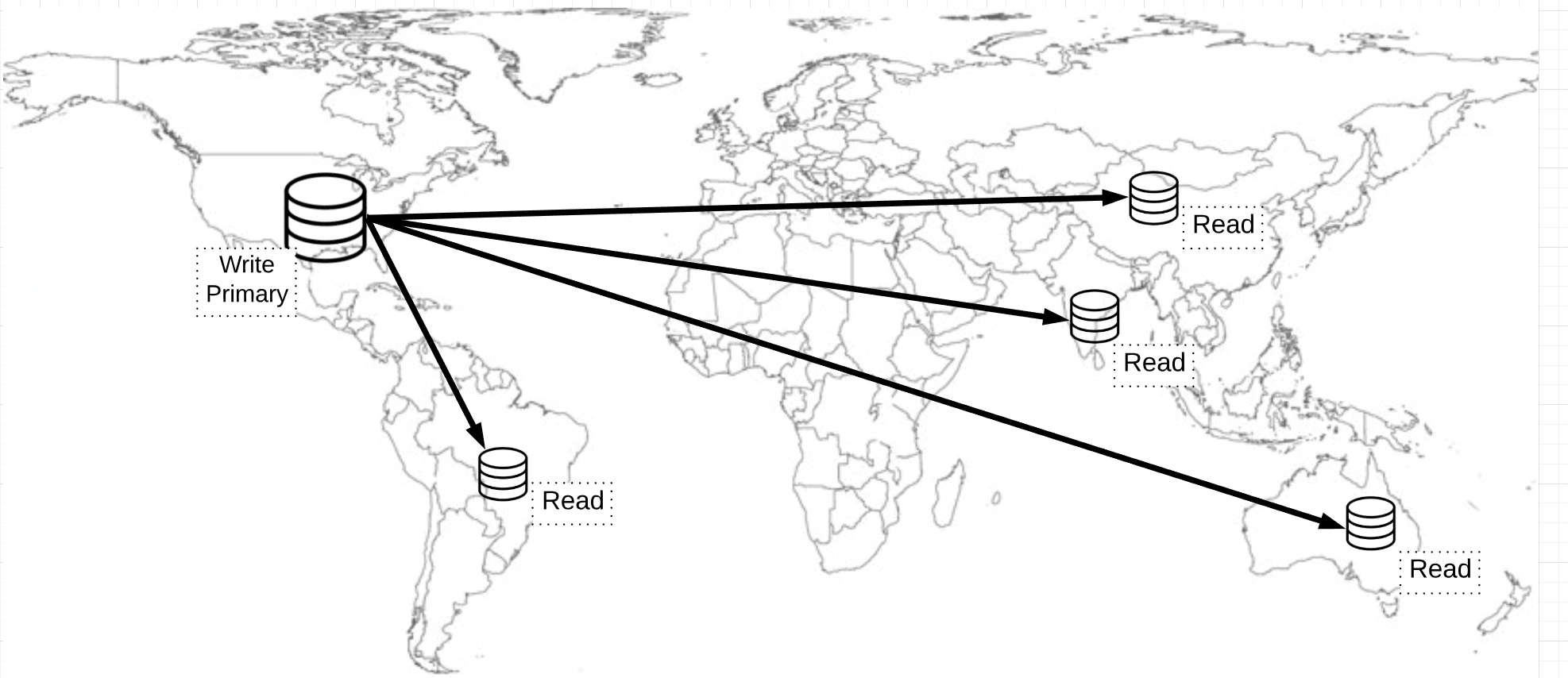
Assume you have a website that’s used by users across multiple geographic locations and the database writes are into the database located in US region (in non-multi-master mode). This database is considered as a primary. When the data is written to the US database, the users in the US location will be able to get the data faster compared to other users in other geo locations due to network latency. If the multi-master feature is enabled, the data is concurrently written to all the selected regions simultaneously.

To solve these latency issues, the data has to be replicated to the user’s nearest region so that users can fetch the data faster from the nearest region. For example, if a user is located in Mumbai, India, then this user should be able to access data from the Mumbai region. Set up read databases in the nearest region of your users and replicate the data from the primary database to this secondary read database. When data is written to the primary database, the data is replicated to read databases, which are globally distributed.

The challenge to achieving the planet scale database architecture is Consistency (Consistency is a property that indicates all replicas of the database are in sync and maintain the same state of a given object at any given point of time). For example, if the data is written to the primary database in the U.S, then it takes a few milliseconds to sync this data to other regions from the primary. During this synchronization period, users reading from the U.S get the latest data, while users from another region may get old data, i.e., the data is not consistent between primary and replicas. This is called as Eventual Consistency.

Consistency Levels in Cosmos DB

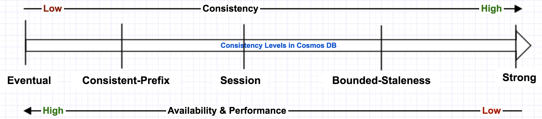
Azure Cosmos DB offers 5 consistency levels so that you can choose the right consistency level for your application.

Eventual:

In eventual consistency, the data that is written to the primary node is propagated to read-only secondary nodes, which are globally distributed, eventually. It takes some time to get the data available to the users of the readable secondary. This consistency level is suitable for applications that are not mission critical. It gives low latency and better performance, but there is a possibility that these users may see stale data for a brief period, and the data may not be in order.

Consistent Prefix:

Clients read the data in the same sequence (D, C, B, A) that has been committed (A, B, C, D). You’ll start seeing the updated data as it starts to go and the data is the right order. However, a complete data set is not guaranteed.

Session:

Committed users will see the data that they just committed. However, users in other geo locations may not be able to get this data version until replication happened. This is the most widely used consistency level.

Bounded Staleness:

It is an indicator to define how much staleness period you set. If you set staleness period as 2 hours, then even though the data is replicated to all secondary nodes, the clients still see the old value. If you set staleness=0, then it’s a strong consistency.

Strong:

Strong consistency always guarantees the latest copy of the data (i.e., highly consistent data) for clients irrespective of where they are reading from but gives a relatively low performance. This consistency level scoped to a single region. This consistency level is suitable for mission-critical applications (e.g., stock trading applications),

Eventual consistency may result in inconsistencies in the data the clients read due to the data being replicated to secondary nodes eventually, but it gives better performance. Strong consistency results in consistent data served to clients but gives poor performance.

While creating Azure Cosmos DB, you can choose the default consistency level, but this can be changed while reading the data from Cosmos DB from your application.

Consistency vs Performance on different consistency levels.

Cosmos DB Containers

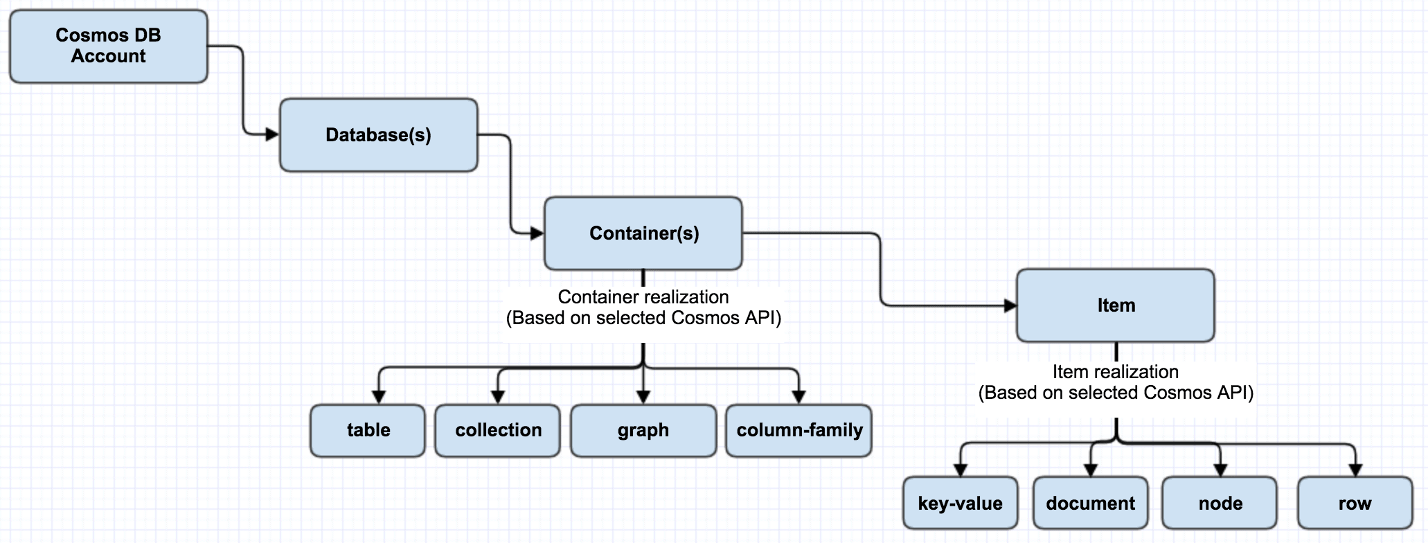
Azure Cosmos DB Container is schema-agnostic and the unit of scalability. A container is horizontally partitioned and replicated across multiple regions. Based on the partition key, added items in the container and provisioned throughput are distributed automatically across a set of logical partitions. Items in the container don’t need to be similar items (e.g., Person, Vehicle, Business Entity, etc.) and they can have arbitrary schemas. Containers can have fixed or unlimited collections. Fixed collections limit you to a single partition, and don’t need a partition key set since everything is stored in a single partition. In unlimited, collections are not limited in the number of partitions.

Azure Cosmos DB allows you to set TTL (Time-To-Live) for each item in the container or set the same TTL for all the items in the container. Once the TTL is expired, those items will be deleted from the container, and the query on this container will not return the expired items. You may follow the steps outlined here to enable the TTL on items in the containers.

Following diagram outlines the relation among Cosmos DB account, Database, Collection, and Items.

Cosmos DB’s Multi-Model Capabilities

Cosmos DB supports the following five data models: Key-Value, Column-Family, Document, and Graph database models. Regardless of which data model you use, core content model of the Cosmos DB engine is based on ARS (Atom-Record-Sequence, which defines persistent layer for key-value pairs) and projects different data models in different APIs. Cosmos DB exposes the data in JSON format.

Depending on the type of application, use an appropriate data model. If an existing MongoDB or Cassandra Database based applications are to be migrated to Cosmos DB, it requires minimal to no code changes in application code. If an application requires a relationship between entities, then a graph data model works better. Each of the supported data models has an API to integrate with Cosmos DB. The data model is determined based on the selected API for the database. You have to choose the most relevant API for your application at the time of creating the container (i.e. “database instance”). Based on the chosen API, the desired data model (graph, key-value, document or column) is projected on the underlying data store. Because of the way the data is stored and retrieved, you can use only one API against a container; multiple APIs usage is not possible.

Take a look now into each of the data models.

Key-Value Pair Data Model (Table API):

In this data model, each entity consists of a key and a value pair. The value itself can be a set of key-value pairs. This is very similar to a table in a relational database where each row has the same set of columns. The Key-Value pair solution is supported on standard Azure table API. This Table API is primarily helpful for existing Azure Table Storage customers in migration to Cosmos DB.

Column-Family Data Model:

This data model supports Cassandra API. Existing Cassandra implementations can be easily and quickly moved to Cosmos DB and use column family format, which is used in Cassandra. Column Family data model is similar to key-value data model except that the items in the data model adhere to the defined schema.

Document Data Model:

This model supports SQL API and MongoDB APIs; both of these APIs give the document data model. These two APIs are different, though they are similar in data modeling. SQL API allows building transactional stored procedures, triggers, and user-defined functions. SQL API stores entities in JSON in a hierarchical key-value document. MongoDB API stores in BSON (Binary encoded version of JSON, which extends JSON with additional data types and multi-language support).

SQL API works with Document DB protocols, whereas MongoDB API works with MongoDB APIs. Both these APIs allow interacting with the documents in the database. If you already have a MongoDB solution and you want to make it scale out or globally aware, you can switch to Cosmos DB and use MongoDB API for interacting with the documents.

The max document size in Cosmos DB is 2 MB unlike the max document size of 16MB in MongoDB.

Graph Data Model:

Graph database implements a collection of interconnected entities and relationships. Microsoft has chosen to use Gremlin API from Apache Tinkerpop open source project. Gremlin API allows you to interact with a Graph database globally scaled and provides a graph traversal language, which enables to efficiently query across many relationships exist in a graph database.

Best Practices in Using Cosmos DB for Better Performance

  • Partition Key: Partition Key acts as a logical partition of your data. There are logical and physical partitions in Cosmos DB. Each Partition has a limit of 10GB. If this limit is exceeded per partition, “Partition key reached maximum size of 10 GB” error will be thrown. If you see this error, then it indicates that you have reached the limit for your partition in the collection. To resolve this issue, you have to recreate the collection and choose your partition key such that all the data items stored against that key are under the 10 GB limit and transfer your data from old collection to new.
  • Getting data from the same partition will be much faster than getting data from multiple partitions. Cross-partition queries add latency.
  • Use Table API for migrating existing Azure Table Storage customers into Cosmos DB quickly. Document Data model SQL API is more capable than Table API.
  • Cosmos DB document size is limited to 2 MB and is not supposed to be used for content storage. For larger payload storage, use Azure Blob Storage instead.
  • To get better performance, relax consistency as needed.
  • Tune indexing policy appropriately for faster writes.
  • Cosmos DB is rate limited. If you have set low RU (Read Units)/s and executing a large query, the results from Cosmos DB may be slow.

Summary

Understanding Cosmos DB’s features such as multi-model, multi API and different levels of consistency levels helps in selecting the right API and model for your application. Choosing the right API model and the right level of consistency for your application will help improve the performance of the queries. This article discusses different features and consistency levels of Cosmos DB and also some of the best practices.


The post Overview of Azure Cosmos DB appeared first on Simple Talk.


from Simple Talk http://bit.ly/2IOfQvN
via

Thursday, April 18, 2019

The Future of Medicine

If you are a Star Trek fan, you’ve seen the future of medicine, or at least how the writers imagine it will be. Painless, needless injections are given by hypospray devices, right through clothing with no chance of cross-contamination. The medical tricorder provides an accurate diagnosis in seconds. Broken bones, illnesses, and injuries are quickly healed. Replacement parts, like Captain Picard’s artificial heart, are no big deal and can last for hundreds of years. There is even a holographic doctor filling in when no humanoid one is available, complete with a lousy bedside manner.

Dr. “Bones” McCoy, the first Star Trek physician, was appalled by the state of 20th-century medicine during a time-travel trip to the 1980s. Of course, we can feel the same as we look back over the history of medicine. Consider formerly popular treatments, like bloodletting. Today we wonder how anyone would think that was a good idea. (Actually, bloodletting is still used for a small number of conditions.)

Even today, we use modern technology like lasers, recombinant DNA, artificial intelligence, and 3D printers to produce treatments that replace some of the surgical procedures and pharmaceuticals used just a few years ago. I remember when synthetic human insulin, made in part by altering the DNA of bacteria, became available in the 1980s, replacing insulin extracted from beef and pork sources. This is even more remarkable if you realize that insulin was only discovered 60 years earlier. Before that discovery, juvenile onset diabetes (now known as Type I) cases were typically fatal in a short time.

Despite the current innovations, it may seem like we are a long way from Star Trek medicine, but we may be closer than you think. Many of us are measuring and tracking data like heart rate, blood pressure, and glucose levels with our smartphones. You can run an EKG (records heart rhythm) with an Apple Watch. Data from fitness trackers have even been used to assist in diagnosis and treatment.

The handful of metrics that can be collected with fitness devices and smartphones is just the beginning. In 2017, the XPRIZE Foundation awarded $2.6 million to an organization that came closest to meeting the requirements of a 21st-century Tricorder. The idea was to create a small non-invasive device that non-medical personnel could use to diagnose thirteen medical conditions and monitor five vital signs. Since no team was able to meet all the criteria for the grand prize, the remaining funds are being used to help develop the most promising devices. In the near future, doctors will be using small devices to diagnose illness in emergency rooms without blood tests and costly scans. Patients will be monitoring conditions like congestive heart failure at home.

The technology available today was beyond the imaginations of doctors and patients just a few decades ago. Thanks to Star Trek, we have a way to see the future now.


The post The Future of Medicine appeared first on Simple Talk.


from Simple Talk http://bit.ly/2KJgmO1
via

Using the FILTER Function in DAX

The series so far:

  1. Creating Calculated Columns Using DAX
  2. Creating Measures Using DAX
  3. Using the DAX Calculate and Values Functions
  4. Using the FILTER Function in DAX

The FILTER function works quite differently than the CALCULATE function explained in the previous article. It returns a table of the filtered rows, and sometimes it is the better approach to take.

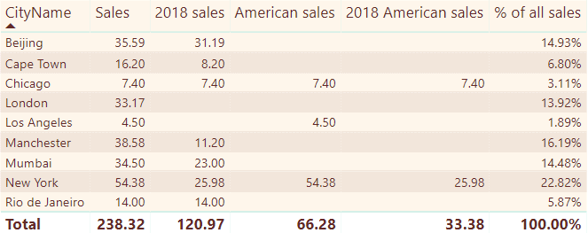
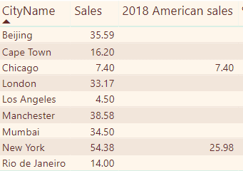
I’ll spend most of this article explaining how to create the following measures:

The columns above show, respectively:

  1. The city name;
  2. Total sales for the city in question (the filter context);
  3. Total sales for the city in question for 2018;
  4. Total sales for the city in question for the USA;
  5. Total sales for the city in question for the USA for 2018; and
  6. The percentage each city’s sales contributes to the total.

First, I’ll show you how to set up the example. Then I’ll dive into the syntax of the FILTER function. I’ll finish by highlighting the differences between the FILTER and CALCULATE functions.

A Quick Refresher

To work through the examples in this article, you’ll need to create a simple Power BI report containing a single table and then create and show a series of measures. Here’s a quick run-through of how to get started.

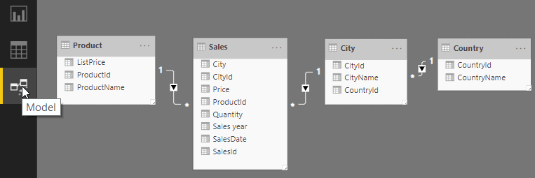
First, create a Power BI report based on the tables used in the previous articles. You can load them either from the SQL Server database given or the Excel workbook. You should now have something like this (if your diagram looks a bit different, you may not have updated your instance of Power BI to include the March 2019 update, which included the new Model View):

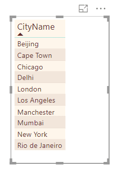
Now create a table in Report view to list out the city names. Make sure the Table visualization is selected and click CityName in the Fields list.

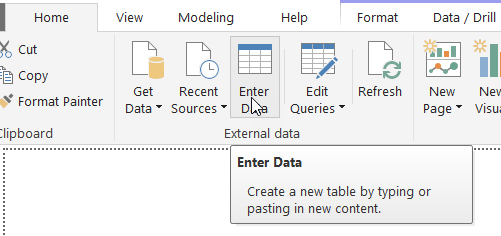
Switch to the Home ribbon and select Enter Data. This will add a new table to your report to contain your measures. To understand why you might want to do this, see this previous article in this series:

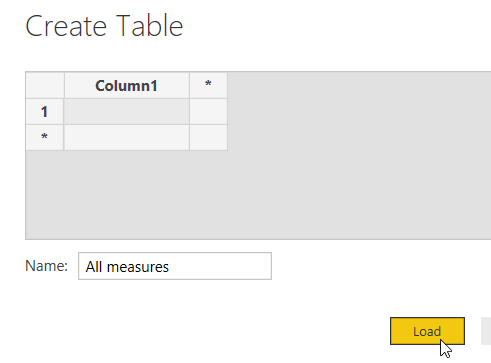
Give this table a name. Here I’ve called mine All measures:

Click Load. Now add the following measure to your All measures table. You can right-click on the table and choose New measure to do this:

Sales = SUMX(
    // multiply the price of each transaction by
    // its quantity, and sum the result
    Sales,
    [Price]*[Quantity]
)

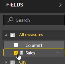
Choose to display this measure in your table:

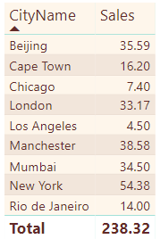
You should now be able to see the total value of sales for each city:

What happens if you want to show the sales for American cities only? Or sales taking place in 2018 only?

The FILTER Function

The measure for the sales column shown above, giving total sales for each city, is as follows:

Sales = SUMX(
    Sales,
    [Price]*[Quantity]
)

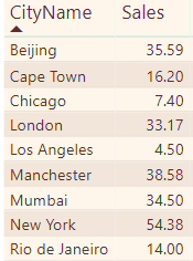
What this does (as readers of this series of articles will know) is to iterate down the rows in the Sales table, calculating the price multiplied by the quantity for each and summing the result for each city to get this:

To get the sales in 2008, you could use a CALCULATE function so that this measure would work:

2018 sales using CALCULATE = CALCULATE(
    SUMX(
        Sales,
        [Price]*[Quantity]
    ),
    YEAR(Sales[SalesDate]) = 2018
)

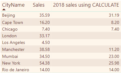
This takes the filter context for each city, and further reduces it to consider only those rows where the sales occurred in 2018 to get this:

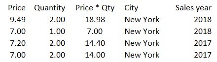
Another way to solve the problem, however, is to treat the sales for the current filter context as a table and filter it accordingly. Consider the example of sales for New York. Here’s the underlying data for this city:

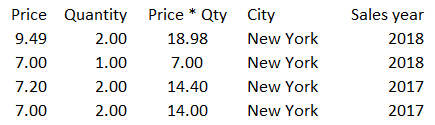
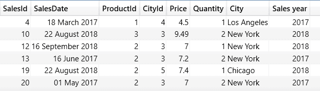
The total figure for sales for New York for 2018 is 25.98 (18.98 + 7.00). One way to get to this would be to follow these steps when compiling the data for New York. Firstly, get the data for the filter context:

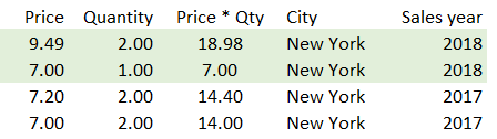
Secondly, filter this data to include only those sales for 2018, by iterating down each row deciding whether to include it. This will include only the shaded area below:

This leaves this table, which is the one whose sales Power BI will sum:

Here’s the formula to accomplish this:

2018 sales = SUMX(
    FILTER(
        Sales,
        YEAR(Sales[SalesDate])=2018
    ),
    [Price]*[Quantity]
)

This will give exactly the same results as the formula using CALCULATE above. The CALCULATE function will run more quickly because it doesn’t have to iterate down each row in the table testing a condition. At this point, you may be asking yourself what the point of the FILTER function is. I’ll return to this later in this article.

Linking tables within the Filter Function

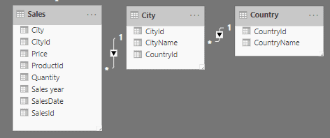
Take a look at how to show total sales for the USA for each city. The Sales, City and Country tables are related as follows:

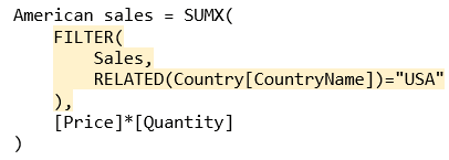
What’s needed is to iterate down the rows in the sales table, calculating the sales (price times quantity) for each but only where the country name is USA. Here’s the formula to do this:

American sales = SUMX(
    FILTER(
        Sales,
        RELATED(Country[CountryName])="USA"
    ),
    [Price]*[Quantity]
)

The expression gives these results:

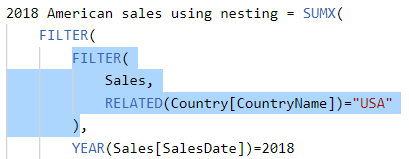
The question is – why use the RELATED function when the DAX formulae using filter context automatically link tables together? The answer is that within this formula, row context, not filter context, is used. The shaded lines in the formula below iterate over each row in the Sales table returned for the filter context, creating a row context for each:

Because within the shaded bit of the formula DAX has to create a row context for each row in the sales table, it then has to use the RELATED function to bring in the country name from the Country table.

Combining Filters Without Nesting

It’s now time to look at how to combine criteria: how to show sales which happened in 2018 and which took place in the USA. I’ll show in a bit how to do this by nesting one FILTER function within another, but for now, I’ll show ways to combine criteria. There are two basic ways to do this in DAX – either by using && or the AND function (or if either of two conditions can be true, using || or the OR function).

Here’s a version of the measure using the AND function:

2018 American sales = SUMX(
    FILTER(
        Sales,
        AND(
            RELATED(Country[CountryName])="USA",          
            YEAR(Sales[SalesDate])=2018
        )
    ),
    [Price]*[Quantity]
)

Here’s the same measure, but using the && symbols:

2018 American sales using && = SUMX(
    FILTER(
        Sales,
        RELATED(Country[CountryName])="USA" &&
        YEAR(Sales[SalesDate])=2018
    ),
    [Price]*[Quantity]
)

Personally, I’d use the AND (or OR) functions any time, as they work in the same way as their Excel counterparts, and it’s easier to indent and comment formulae. However, you should use whichever floats your particular boat.

Even more sales have dropped from the figures:

Combining Conditions by Nesting Functions

The other way to solve this would have been to nest one function within another:

2018 American sales using nesting = SUMX(
    FILTER(
        FILTER(
            Sales,
            RELATED(Country[CountryName])="USA"
        ),
        YEAR(Sales[SalesDate])=2018
    ),
    [Price]*[Quantity]
)

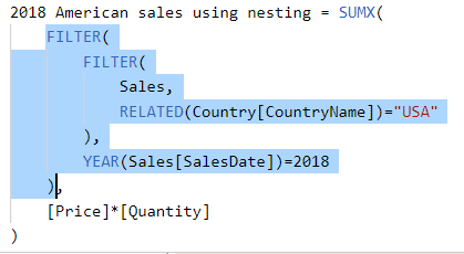
Consider what this does for the New York row in the table:

Filter context restricts the data to sales for the current city in question.

The inner FILTER function iterates over each row in the table of data for the filter context, picking out only rows where the country is in the USA.

The outer FILTER function then iterates over each row in the table of sales for the USA for the filter context and applies a further constraint that the sales year must be 2018.

Depending on your data, nesting FILTER functions could speed up processing. If the vast majority of sales were outside the USA, the inner condition could eliminate nearly all rows for each city in the filter context, with the result that Power BI would only need to test the sales date for the few remaining rows.

Using ALL to Remove Any Filters

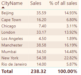
Every example shown so far has taken the set of rows for the current filter context and applied additional constraints to pick out only certain rows. However, you can use the ALL function when filtering to work with the entire table, rather than just the data for the current filter context. You could use this, for example, to show the percentage contribution of each city’s sales to the grand total:

Here’s the formula for the above measure:

% of all sales = DIVIDE(
    // calculate the total sales for the current filter context
    SUMX(
        Sales,
        [Price]*[Quantity]
    ),
    // divide this by total sales for all cities
    SUMX(
        ALL(Sales),
        [Price]*[Quantity]
    )
)

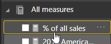
Incidentally, if you’re wondering how to get the nice percentage format, just select the measure you’ve created:

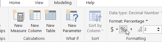
You can then set the formatting in the Modeling tab on the menu:

The Difference Between CALCULATE and FILTER

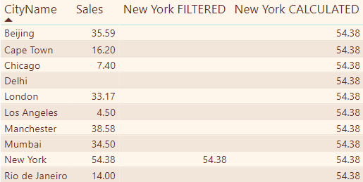
To see the difference between the way in which CALCULATE and FILTER filter data, consider this example:

The first measure applies the filter context (so it only calculates sales for the city in question), and applies an additional constraint that the city should be New York:

New York FILTERED = CALCULATE(
    // work out total sales
    // for the filter context
    SUMX(
        Sales,
        [Price]*[Quantity]
    ),
    
    // but whittle the filter context
    // down to show only those cities
    // within it called New York
    FILTER(
        City,
        City[CityName]="New York"
    )
)

The second measure replaces the filter context with a new constraint that the city should be New York, which results in the same figure appearing in every row:

New York CALCULATED = 
    CALCULATE(
    
        // work out total sales
        // for the filter context
        SUMX(
            Sales,
            [Price]*[Quantity]
        ),
        
        // changing the city criteria
        // so it is New York, not 
        // whatever the filter context
        // originally said
        City[CityName]="New York"
)

Debugging Using the FILTER Function (Method 1)

To make debugging easier, first add a couple of calculated columns to the Sales table, to give the city name and sales year. The formulae are shown below:

Here’s the formula for the City column. It just looks up the name of each city in which sales took place:

Here’s the formula for the Sales year column. It gives the year in which each sale took place:

These two columns will make it easier to check what’s going on when debugging.

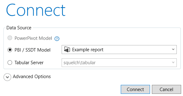
The FILTER function creates virtual tables which, under normal circumstances, you never see, but you can use a tool like DAX Studio to show the rows these virtual tables contain. I’ve covered how to download and use DAX Studio in a previous article in this series, but here’s a quick refresher. When you run DAX Studio, choose to connect to an open Power BI report:

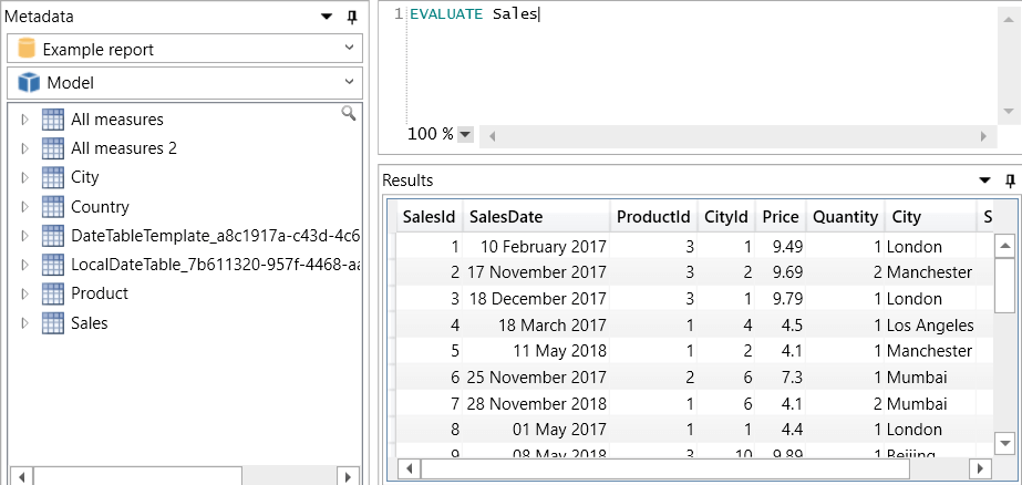
Type in a DAX query in the top right-hand window and press the F5 key to run this. The results will appear beneath it. For the example below, I’m just listing out the contents of the Sales table:

Incidentally, if you’re wondering what those long date table names are, you’re not the only one. I presume they are created behind the scenes to provide the built-in date hierarchy included in the March 2019 update of Power BI.

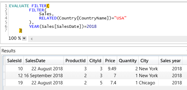
You can evaluate any table, including one which is returned from a filter function. A good thing to ask might be: which sales were in the United States? You can do this by copying this part of the measure you created earlier:

Precede this with the word EVALUATE in DAX Studio, and you’ll get this:

Run this to get the following output:

That’s looking good, so now you can repeat this technique with the outer bit of the FILTER function:

This gives only 3 rows:

From this, it’s easy to see why you get the figures for this measure.

Debugging Using the FILTER Function (Method 2)

Another way to debug a DAX formula using the FILTER function (or any other DAX formula, for that matter) is to use variables. I’ve already covered this for scalar variables (ones holding a single value) in the previous article in this series on measures, but did you know a variable can hold an entire table?

Here’s another way to write the nested FILTER function:

US sales in 2018 = 
// create a variable to hold the sales in the USA
VAR UsaSalesTable =  FILTER(
    Sales,
    RELATED(Country[CountryName])="USA"
)
// create another variable to filter this to show
// only sales in 2008
VAR UsaSales2018 = FILTER(
    UsaSalesTable,
    YEAR(Sales[SalesDate])=2018
)
// finally, calculates sales for these figures
RETURN SUMX(
    UsaSales2018,
    [Price]*[Quantity]
)

The advantage of breaking the complicated formula down into different parts is that you could then test each in isolation.

Why Would You Use the FILTER Function?

I promised I would return to this question: why would you use the FILTER function when the CALCULATE function seems to offer a better alternative? There are at least four advantages:

I’ve already shown that it’s easier to debug DAX expressions that use the FILTER function.

I think expressions using the FILTER function are easier to understand than equivalent expressions just using CALCULATE.

Learning the FILTER function will help you to understand the EARLIER function, which will be the subject of the next article in this series.

There are some problems which the CALCULATE function won’t solve (an example follows).

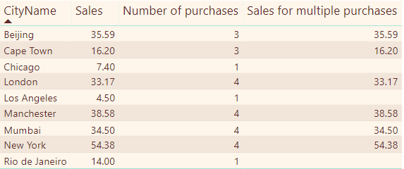
To illustrate the last point, suppose that you want to create a measure showing total sales for cities having two or more purchases. Here are the figures that this should return:

There are no sales recorded for Chicago, LA and Rio in the new measure because they each only witnessed a single sale.

Assume in all of the following that [Number of purchases] is a measure with this formula:

Number of purchases = COUNTROWS(Sales)

Here’s a measure which you could use to try to solve this problem (although it won’t work):

Sales for multiple purchases = CALCULATE(
    // calculate total sales where ...
    SUMX(
        Sales,
        [Price]*[Quantity]
    ),
    // ... the number of purchases is more than 1
    [Number of purchases] > 1
)

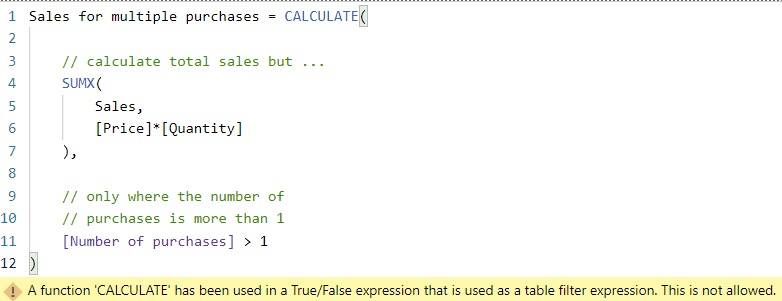
If you type in this measure, you’ll see the following error message:

This isn’t a brilliant description of the problem, which is that you can’t use a measure in the filtering part of a CALCULATE function; you can only refer to columns. You can, however, solve this problem by rewriting it to incorporate a FILTER function:

Sales for multiple purchases = CALCULATE(
    // calculate total sales but ...
    SUMX(
        Sales,
        [Price]*[Quantity]
    ),
    // only where the number of 
    // purchases is more than 1
    FILTER(
        City,
        [Number of purchases] > 1
    )
)

This will calculate total sales, but only for those cities where the number of purchases was more than 1.

Summary

The FILTER function in DAX allows you to iterate down the rows of any table, creating a row context for each and testing whether the row should be included in your calculation. You can combine filters using keywords like AND and OR and also nest one filter within another. The FILTER function allows you to perform some tasks which the CALCULATE function can’t reach, and also (in my opinion) lets you create formulae which are easier to understand.

The post Using the FILTER Function in DAX appeared first on Simple Talk.


from Simple Talk http://bit.ly/2V5gknB
via
Tuesday, April 16, 2019

Power BI and The Matrix: A Challenge

In this article, I will show an example to demonstrate some interesting techniques using the Matrix visual. This was inspired by a friend, Albert Herd, who asked for some help in our Malta user group to solve a problem.
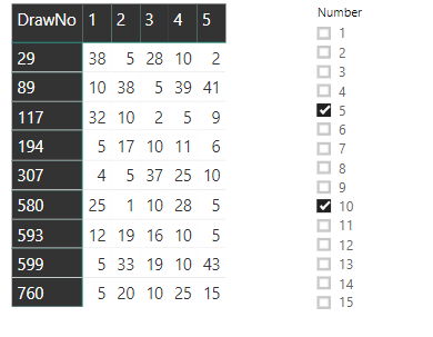
The data used in the example is the list of numbers drawn on the Maltese lotto. Each record is one number from a drawing, and each drawing has five records which are the five numbers from each drawing. You can download a zip file containing a csv file with the source data, a pbix file with the data already imported to start creating the visuals, and the completed solution.

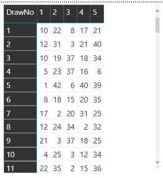
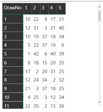
By using the Matrix visualization, the numbers for each drawing can be displayed as a single line as shown in this figure.

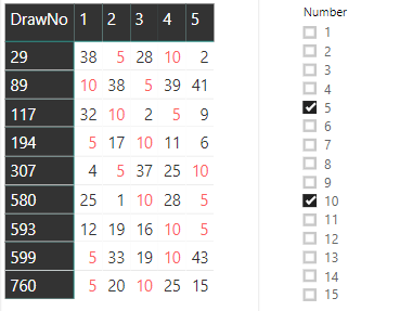
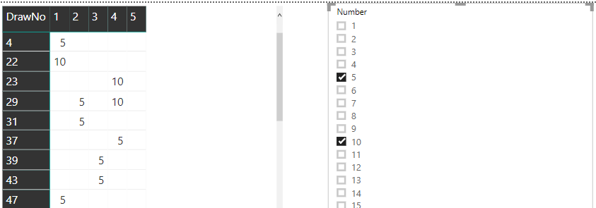
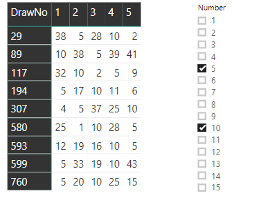
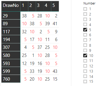
The goal is to add a slicer that filters the rows based on the number or numbers chosen. For example, if you select 5 and 10, the rows that contain those numbers will be displayed:

It’s also possible to add conditional formatting so that the selected numbers light up in the colour of your choice.

Accomplishing this is not as straightforward as it might seem. Continue reading to learn more.

The Data

Each record in the table is one number drawn on a specific lotto drawing. Each drawing has 5 numbers, so each drawing has 5 records in the table. The table is called Lotto, and the fields most important for this example are these:

DrawNo: The number of the drawing

DrawOrder: The order of the drawn number

Number: The drawn number

Starting with a new Power BI dashboard and import the csv file. As an alternative, you can also start with the MatrixSimpleStart.pbix file provided in the zip file.

Creating the Matrix

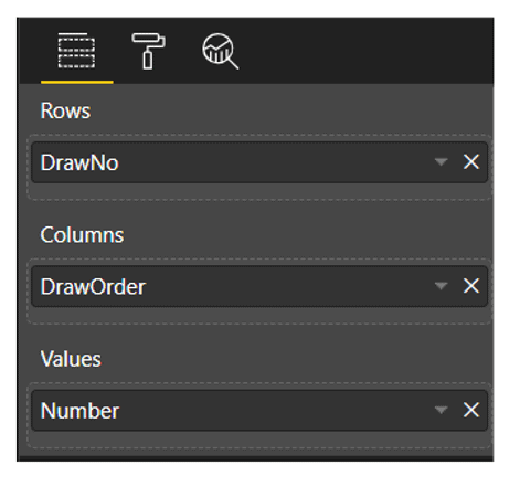
The Matrix visual has three fields to be configured: the field used for the rows, the field used for the columns, and the field used for the values. Each line of the visual should show a single drawing with the five numbers. Due to that, the field for the rows will be the DrawNo, aggregating the drawings on each row.

Each drawing has five records, the five drawn numbers, so how do you show five records on each line? The content of the field you choose as a column field will be used as the title of the columns. The best choice is easy: DrawOrder. Each row shows the DrawNo. Each column has the DrawOrder as a title and will show the drawn Number as a value in the column.

Once you have the file MatrixSampleStart.pbix opened or the csv file imported, follow a simple sequence of steps to configure the Matrix visual. You’ll be working in Report view.

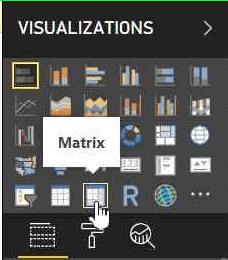
    1. Add a Matrix visual to the report from the Visualizations pane

    1. In the Fields Pane, drag the three fields, DrawNo, DrawOrder, and Number to the correct slots.

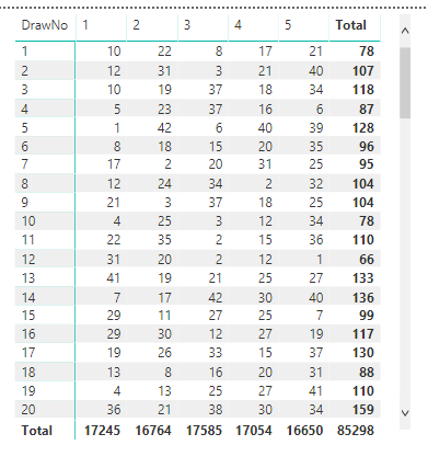
Once you have the fields in the correct spots, the Matrix will resemble this image:

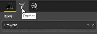
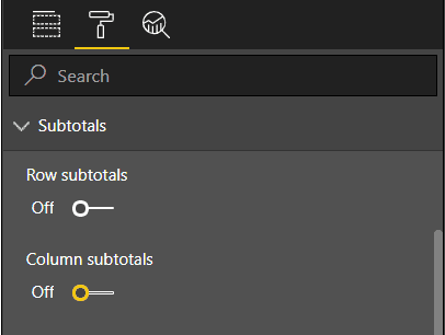
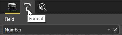
    1. In the Visualizations Pane, with the matrix selected, click the Format button and disable the subtotals for rows and columns as they are not needed.

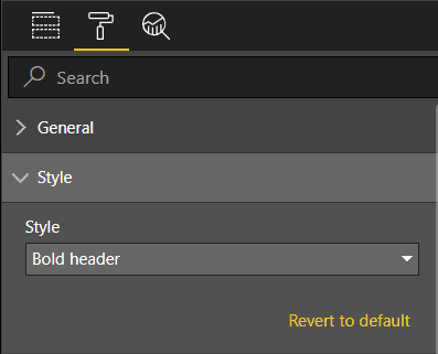
    1. While still in the Format tab, under the Style option, change the style of the matrix. You can choose any available style; I suggest Bold Header.

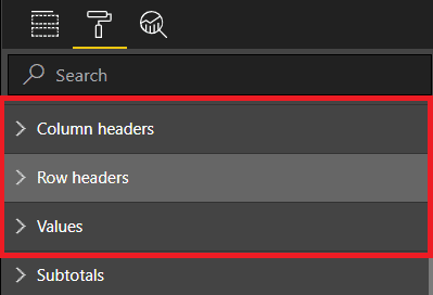
  1. Still in the Format tab, change the font size under these three different options: Row Headers, Column Headers, and Values. I like to use 12 as font size.

The completed Matrix should look like this:

Creating a Slicer and Filtering the Matrix

The matrix contains numbers from lotto drawings, so a good option for a slicer is to filter the drawn numbers, showing only the drawings with the selected drawn numbers.

There are three possible approaches to create a slicer:

  • Create a slicer based on the original table fields (Lotto)
  • Create a slicer based on a new calculated table by using a DAX expression to create the new table from the original one
  • Create a slicer based on a What-If parameter

NOTE: DAX is an expression language used in tabular models, such as the model in Power BI, to allow creating calculations over the model.

The first two options keep a relationship with the original table (Lotto). Although this relationship is not important for the result at all, it causes a small bug. The slicer needs to be inserted in the page before the matrix. If the slicer is inserted after the matrix, some of the slicer configurations will not be available. The slicer needs to be inserted first.

Creating a Slicer from the Same Table

The easiest way to add a slicer is from a field in the table. Unfortunately, it doesn’t quite provide the solution in this case. Follow these steps to see how to add a slicer based on the table:

    1. Drop the matrix
    2. In the Fields Pane, select the Number field in the Lotto table
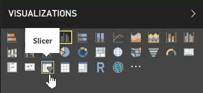
    3. In the Visualizations Pane, change the visual to Slicer

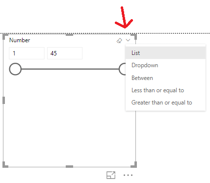
    1. In the slicer type option, inside the slicer, change the slicer format to List

    1. In the Visualizations Pane, with the slicer selected, click the Format button. In the Selection Control options, disable the Single Select option, allowing multiple numbers selection

  1. Repeat the steps in the “Create the Matrix” section to recreate the matrix.

To test this solution, select two numbers, such as 5 and 10, in the slicer and look at the result in the matrix. You will notice two problems:

  • The draws are filtered to show only the selected numbers instead of all the numbers of the selected draws. That’s not the best result for this solution.
  • The multiple selections act as an OR, not an AND. Draws with only one of the two selected numbers appear.

Fixing the Selection

In order to fix the selection, a different approach for this problem is needed. The filter is automatically made by the model and visual engine in Power BI, showing only the selected numbers. In order to show all the numbers of the selected draws, you will need to break the automatic filter and create a DAX formula that will control which draws need to appear.

This leads back to the decision about how to build the slicer: Building the slicer directly from the draws table (Lotto) creates a relationship that can’t be broken. That’s the only slicer option that will not work. If you choose to build the slicer from a calculated table or What-If parameter, the relationship to the source table (Lotto) can be controlled, avoiding the filtering.

Once the matrix is not directly filtered by the slicer, you can create a DAX formula to filter the drawings. The expression will need to compare the numbers on the current drawing row to the selected numbers on the slicer, identifying if the row should be displayed or not.

First, you’ll see the two additional ways to create the slicer, both using a helper table. You can choose either method.

Creating the Slicer – Calculated Table

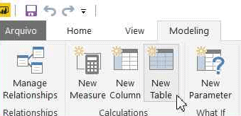
You can create this table using a very simple DAX expression. On the top menu, Modeling tab, you’ll find a button called New Table. After clicking this button, a space expands where you can introduce the DAX expression for this table.

Call the table Selector. The expression is very simple:

Selector = VALUES (Lotto[Number] )

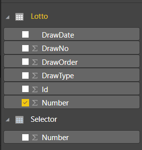
The newly created table, Selector, will have no relationship with the original one. Although it was created from the Lotto rows, the only effect will be the strange visual behaviour that requires the slicer to be created before the matrix.

Choosing this option for the Selector table, you will need to execute the following steps:

  1. Drop the slicer
  2. Drop the matrix
  3. Create the slicer again using the steps from the “Creating a Slicer from the Same Table” section but use the Number field from the Selector table
  4. Create the matrix again

Note that at this point, the slicer will not filter the data. Continue reading to learn how to get it to work filtering the matrix.

Creating the Slicer from the What-if Parameter

Instead of creating the Selector table based on the Lotto table, you can create a What-if parameter. This is a new table with no relationship to the Lotto table.

If you created the Selector based on the table in the previous section, delete it before following these steps.

    1. Delete the matrix
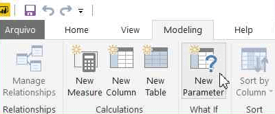
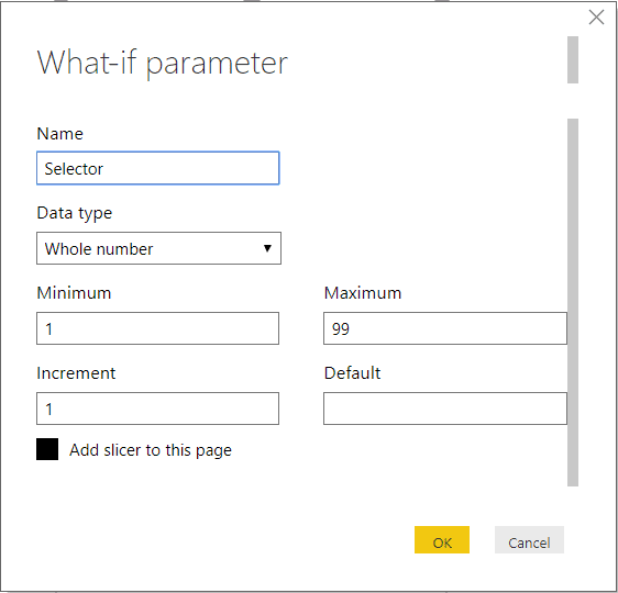
    2. On the top menu, Modeling tab, click the Create Parameter button to bring up the What-if Parameter window.

  1. Change the Name to Selector and specify a table of values from 1 to 99.
  2. Click OK once the properties have been filled in

The DAX formula generated behind the scenes is:

Selector = GENERATESERIES ( 1, 99, 1 )

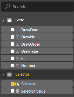
You’ll see the new measure in the Fields pane:

As you will notice on the image above, there is one small difference on this option: the field created inside the Selector table is also called Selector instead of Number as on the previous option.

In order to make both options the same, you can rename the Selector field to Number. It’s optional, but if you don’t, the following expressions will need to use Selector[Selector] to refer to this field instead of Selector[Number].

The steps to rename this field:

  1. In the Fields pane, under the Selector table, next to the Selector field, click the ‘…’ (More Options) button
  2. Click the Rename menu item in the context menu that will appear
  3. Change the field name to Number

Follow these steps to complete the slicer

  1. Repeat the formatting (steps 4 and 5 in the “Creating a Slicer from the Same Table”) to format the new slicer that will be automatically added to the report.
  2. Recreate the matrix as shown in the “Creating the Matrix” section

If you chose this method for the slicer, continue to learn how to get it to work filtering the matrix.

Measures vs. Calculated Columns

Before going forward, it’s interesting to understand why to create measures and not calculated columns. Both measures and calculated columns accept DAX expressions. However, they have some differences. While the calculated column expression is evaluated in the row context, row by row, measures are used on aggregations.

Another significant difference, usually the easiest one to help with the decision, is when the calculation is made. The calculated column expressions are evaluated when the table is processed, and the result is stored within the Power BI file. This means they can’t rely on any interaction with the visuals, because they are calculated before.

This makes the decision easy: you need measures that will react to the selection on the slicer as the user make it. The fact these measures will be calculated on each line of the matrix, which in fact is an aggregation of five records, is just an additional reason.

Creating the Measures for Filtering

To filter the rows according to the selected numbers, you will need to create one measure to identify if each row has the selected numbers on the slicer. It’s a boolean measure which should result in true or false, but here comes the first trick: Power BI doesn’t deal very well with boolean measures used for filtering, so you need to create it as a numeric measure resulting in 1 or 0.

Another concern about this formula is to display all the rows when there is no selection in the slicer. In this case, the measure should return 1 for all the rows, showing everything.

This measure will be calculated for each row of the matrix, and each row of the matrix has a set of five numbers. The slicer, on the other hand, also will have a set of numbers selected and you don’t know how many. If the drawing numbers in the row contain all the numbers of the slicer, the result should be 1 (show the line), otherwise 0.

A DAX expression allows you to create variables inside the expression, and you can put this to good use to solve this problem. Here is the beginning of the expression:

LineFilter =
VAR tab =   VALUES (Selector[Number] )
VAR tab2 =  VALUES ( Lotto[Number] )
VAR common =  INTERSECT ( tab, tab2 )
VAR rowsCommon =  COUNTROWS ( common )
VAR rowsSelected =  COUNTROWS ( tab )

It’s essential to consider the context used to process this expression. The Values function over the Selector table will return only the numbers selected on the slicer or all the numbers, while the Values function over the Lotto table will return only the numbers for the current drawing line, since the expression will be analysed for each line of the matrix.

On the final part of the expression, if the rowsCommon variable is equal to the rowsSelected variable, it means all numbers selected on the slicer are on this drawing, and the result will be 1. Otherwise, it will be 0. However, you need also to consider if the slicer is not filtered at all. For this, you have the ISFILTERED DAX function.

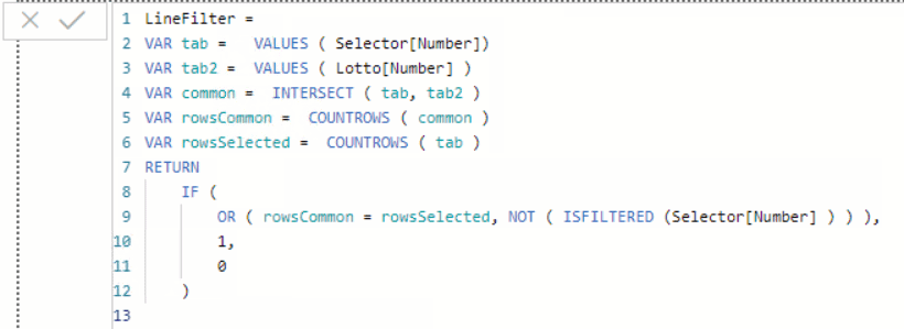
The full DAX expression is:

LineFilter =
VAR tab =   VALUES ( Selector[Number] )
VAR tab2 =  VALUES ( Lotto[Number] )
VAR common =  INTERSECT ( tab, tab2 )
VAR rowsCommon =  COUNTROWS ( common )
VAR rowsSelected =  COUNTROWS ( tab )
RETURN
    IF (
        OR ( rowsCommon = rowsSelected, 
          NOT ( ISFILTERED ( Selector[Number] ) ) );
        1,
        0
    )

The steps to use this expression are the following:

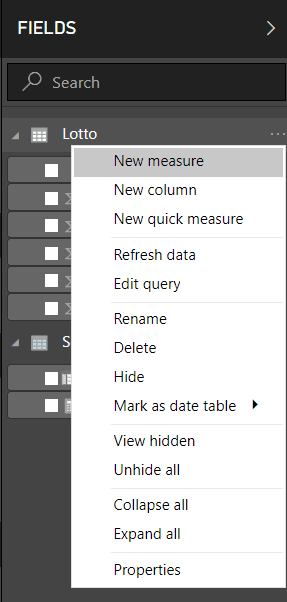
    1. In the Fields pane, Click the ‘…’ (More Options) button close to the Lotto table
    2. Click the New Measure menu option in the context menu that will appear

    1. Paste the entire expression, including the measure name, in the formula bar

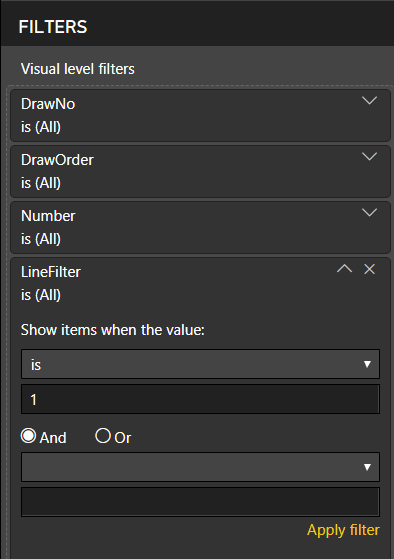
    1. Drag the newly created measure to the filter area of the matrix configuration
    2. Change the comparison expression Show items when the value to is
    3. Fill the value expression with 1

  1. Click Apply Filter

After completing these steps, the filter will be working. When you select multiple numbers on the slicer, you will see only the draws that contain all the selected numbers.

Conditional Formatting

The conditional format is the “cherry on top” of this solution. You can not only filter the drawings, but you can also highlight the numbers selected on the slicer within each line with a different colour.

The numbers selected in the slicer should appear in red or whatever colour you select. This is too complex for the conditional formatting. Due to that, you need a new measure that tells you, for each number in the drawing, if it’s selected or not.

Since this measure will be used only for conditional filtering, it will be processed for each number and not sets of numbers. However, since it’s a measure, you still need to apply an aggregation function to the Number field, a simple SUM will do the job.

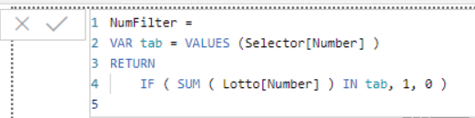
The final measure will look like this:

NumFilter =
VAR tab = VALUES (Selector[Number] )
RETURN
    IF ( SUM ( Lotto[Number] ) IN tab, 1, 0 )

The steps to complete the conditional formatting are:

    1. In the Fields pane, Click the ‘…’ (More Options) button close to the Lotto table
    2. Click the New Measure menu option in the context menu that will appear
    3. Paste the entire expression, including the measure name, in the formula bar

    1. Select the matrix visual on the main pane
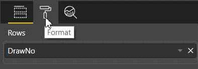
    2. In the Visualizations pane, with the matrix selected, click the Format button

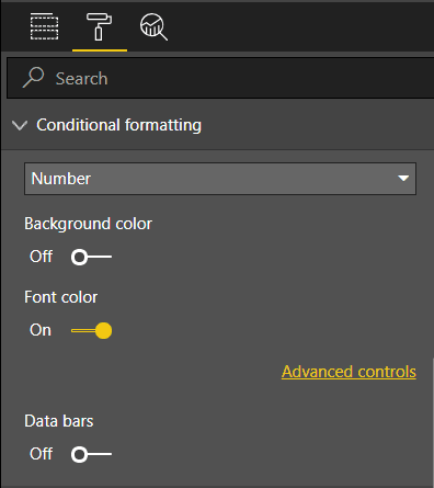
    1. In the Visualizations pane, open Conditional formatting
    2. Under the Conditional Formatting element, enable Font color option

    1. Click on the Advanced Controls link that will appear below the Font color option
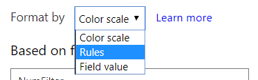
    2. In the Font color window, on the Format by dropdown box, select Rules

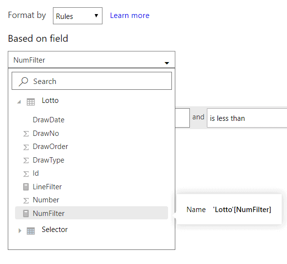
    1. On the Based on field dropdown box, select the measure, NumFilter

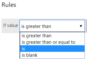
    1. On the If value dropdown box select the is option

  1. Type 1 in the textbox besides the previous dropdown
  2. Select Red in the color picker, if not selected already
  3. Click Ok

Once you have followed the steps, you should see the selected numbers light up in red or the colour that you selected.

Summary

Using some interesting DAX expressions, each line of a matrix could be filtered according to a slicer. In addition, the numbers selected could be highlighted. Of course, this is a very specific example, but I’m sure you can adapt the expressions shown here to your challenges using the Matrix visual.


The post Power BI and The Matrix: A Challenge appeared first on Simple Talk.


from Simple Talk http://bit.ly/2KFIi5m
via