The series so far:
A measure is any formula which aggregates data, whether it be counting the number of transactions in a database, summing the sales figures for a region, or working out the highest-earning salesperson for each division of a company. A measure always involves aggregating data in some way. In Power BI (and PowerPivot and SSAS Tabular) you create measures using the DAX formula language.
It takes a while – and a few bites of the cherry – to understand DAX properly (I’ve been teaching Power BI for some years now, and still haven’t come up with a way to make it intuitive to understand). The crucial thing is to comprehend two concepts called filter context and row context. In this article, I’ll explain what measures are, where and how to create them, and I’ll explain the difference between filter and row context in DAX.
The Example Database for this Article
This article uses the same simple database as its predecessor. This database shows sales of three toys for different cities around the world:

You can import this data into your own Power BI data model by first downloading this Excel workbook, or by running this SQL script in SQL Server Management Studio.
What are Measures?
The easiest way to think of a measure is by reference to a pivot table in Excel – like this one:
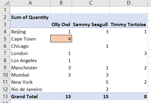
The value 4 shown in the coloured box represents the total quantity of sales of the Olly Owl product in Cape Town. If you double-click on the cell, you’ll see the underlying data:

The selected values sum to 4 and represent all the sales for this product (Olly Owl) and this city (Cape Town). This represents the filter context for this cell. The pivot table doesn’t sum all of the sales in this cell – just the ones which are for the product and city for this particular row and column of the pivot table.
The formula in the red box below – summing the quantity of goods sold for each cell in the pivot table – is a measure. Microsoft flirted with the idea of calling it a calculated field instead in Excel 2013, but they wisely reverted to using the term measure for Excel 2016):
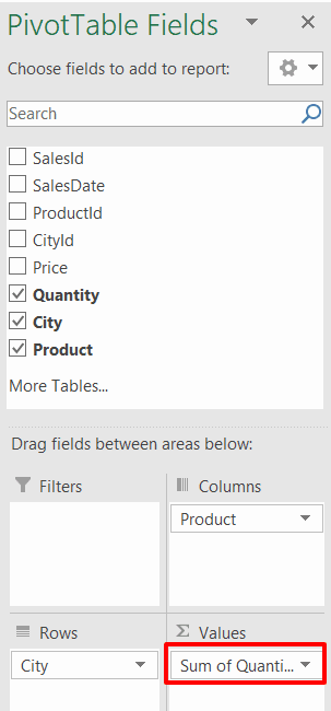
The underlying formula for this implicit measure – if you could but see it – would be =SUM(Sales[Quantity]).
You’ve Already Created Measures
If you’ve been using Power BI at all, you’ll already have created measures. When you drag a field onto a table, matrix or chart, you create a hidden measure. In the diagram below, someone is about to drag the Quantity column into the Values section of a matrix, which will by default sum the quantity for each product and country:
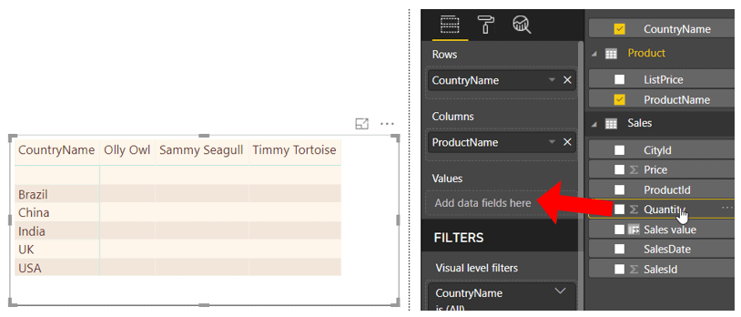
Adding the Quantity field to the Values section of the matrix would show this ‘measure:’
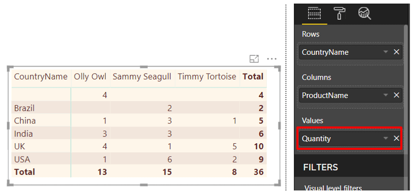
In Power BI there is no way to see the DAX formula underlying this measure, but believe me, it exists, somewhere hidden away behind the scenes. PowerPivot has an advanced option allowing you to view implicit measures like this, but the Power BI elves don’t want to confuse you by letting you do this.
Creating a Measures Table
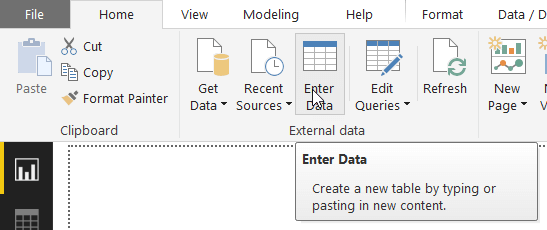
Before you create a measure, you need somewhere to put it. You can add measures to any table in your data model, but the best solution is to create a separate table to hold only measures. One way to do this is to create a new table by clicking on the Enter Data tool in Power BI:
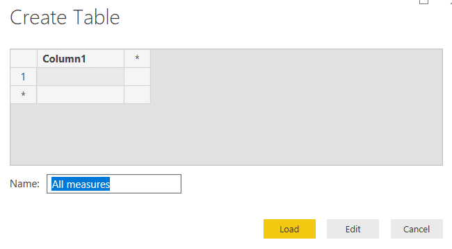
Leave everything as it is but overtype the name Table1 with your own name. All measures is a good choice to ensure the table appears high up in the list alphabetically:
After clicking Load, you’ll now have a nearly-empty table, in which you can create measures:
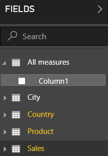
Note that you should resist the temptation to remove the useless column Column1 at this stage since Power BI would then helpfully remove the now empty table too. As soon as you’ve created at least one measure in your new table, you can delete Column1.
Creating a Measure
To avoid being too ambitious to start with, begin by creating a basic measure to sum the quantity of goods sold. This example is completely pointless, because I’ve just shown that you can get this figure by dragging the existing [Quantity] column onto a visual, but it is a nice simple example to get you started. First, right-click on your new All measures table, and choose to add a new measure:
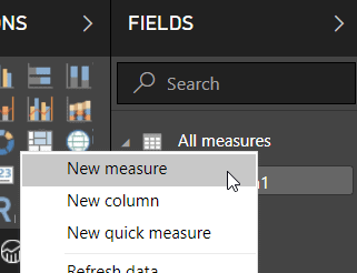
There are many other ways to do the same thing, but this seems the easiest. I’ve covered creating new calculated columns in the previous article in this series, and I’ll show what quick measures are towards the end of this article. Here’s what you’ll see after choosing to create a new measure:

You can now type in any measure name and any valid formula. It’s up to you whether you include blank lines and comments. Here is the formula for Total quantity sold:
Total quantity sold =
// sum the quantity column
SUM(Sales[Quantity])
Your new measure will look like this in the formula bar.

After pressing Enter, you can now choose to display your squeaky-clean new measure in your visual:
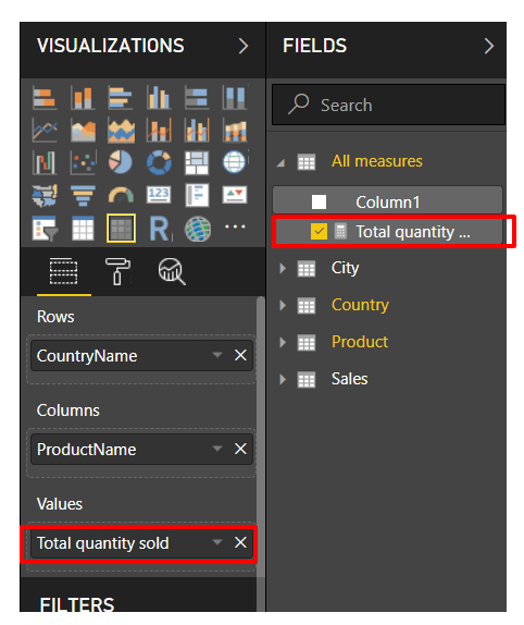
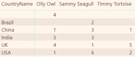
It would be worrying if this didn’t give the same results as the implicit measure I showed earlier since it’s doing the same thing:
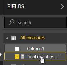
Finally, it would be a good idea to set default formatting for your measure, so that it will look good wherever you show it. To do this first select the measure:
You can now choose an appropriate default format:

Here I’ve said that a comma will appear for sales of more than 999 items.
Aggregation Functions Allowed
Here are the main aggregation functions that you can use in DAX:
|
Function |
What it does for a column’s values |
|
AVERAGE, AVERAGEA |
Returns the average (arithmetic mean), ignoring or taking account of text entries (see hint below) |
|
COUNT |
Returns the number of cells that contain numbers |
|
COUNTA |
Returns the number of non-empty cells |
|
COUNTBLANK |
Returns the number of blank cells |
|
COUNTROWS |
Returns the number of rows in a table |
|
DISTINCTCOUNT |
Returns the number of different distinct values |
|
GEOMEAN |
Returns the geometric mean |
|
MAX, MAXA |
Returns the largest value |
|
MEDIAN |
Returns the median (the halfway point) |
|
MIN, MINA |
Returns the smallest value |
|
PERCENTILE.INC, PERCENTILE.ENC |
Two similar functions which return the nth percentile in a set of values |
|
STDEV.P |
Returns the standard deviation of the entire population |
|
STDEV.S |
Returns the sample standard deviation |
|
SUM |
Adds the cells’ values |
|
VAR.P |
Returns the variance of the entire population for a column |
|
VAR.S |
Returns the sample population variance for a column |
Aggregating Expressions – Why You Should Use Measures
Suppose now that you want to sum sales, not quantities. One way to do this is to create a calculated column in the underlying table, and sum this column:

Summing the [Sales value] column for the above table would give the correct result, however, the method above has two main disadvantages – it will slow loading data, and it will consume more memory. I’ll explain each of these disadvantages in turn.
When you click on a button to refresh your data, Power BI will do this in two stages although the nitty-gritty of this is hidden from you:
Processing — Power BI reloads the data for each of the tables in your data model.
Calculation — Power BI builds any calculated columns that you’ve added to tables, among other things.
It’s this second stage which will run more slowly since Power BI will have to reconstruct the [Sales value] column in the [Sales] table, even though you may never use it.
The second disadvantage is that the calculated column will take up more memory – probably much more memory. To see why, suppose you have data like this:
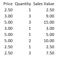
The granularity of the columns are as follows:
[Price] – 3 unique values (2.50, 3.00 and 5.00)
[Quantity] – 3 unique values (1, 2 and 3)
[Sales Values] – 7 unique values (2.50, 3.00, 5.00, 7.50, 9.00, 10.00 and 15.00)
Thus, the dictionaries for the calculated column will consume more memory than the original two columns’ dictionaries combined. You can see much more discussion about how DAX uses column storage rather than row storage in the first article in this series.
In summary, there’s a trade-off between aggregating the values in a calculated column (using functions like SUM) and aggregating the underlying expression (using a function like SUMX). The first method uses more memory but will then run more quickly, while the second method consumes less memory but may run more slowly. There doesn’t seem a clear consensus as to which method is better, so I would (as they say in the UK) “suck it and see”.
Creating Measures Using AggregateX Functions
A solution to the above problem is to sum the expression [Price] * [Quantity] from the Sales table, but the humble SUM function won’t do this, as the IntelliSense below shows (the function is expecting a single column, not an expression):

Instead, you need something which will sum an expression, and for that, you just add an X onto the end of your function name:

Here are the common function names that you can use to sum an expression across a table:
|
Function |
What it does for a column’s values |
|
AVERAGEX |
Returns the average (arithmetic mean) of an expression |
|
COUNTX |
Returns the number of cells that contain numbers |
|
COUNTAX |
Returns the number of non-empty cells |
|
GEOMEANX |
Returns the geometric mean |
|
MAXX |
Returns the largest value |
|
MEDIANX |
Returns the median (the halfway point) |
|
MINX |
Returns the smallest value (named after Minnie from The Beano) |
|
PERCENTILEX.INC, PERCENTILEX.ENC |
Two similar functions which return the nth percentile in a set of values |
|
STDEVX.P |
Returns the standard deviation of the entire population |
|
STDEVX.S |
Returns the sample standard deviation |
|
SUMX |
Adds the cells’ values |
|
VARX.P |
Returns the variance of the entire population for a column |
|
VARX.S |
Returns the sample population variance for a column |
In this example, you could create a new measure in the [All measures] table like this:
Total sales =
    // sum the product of price and quantity
    SUMX(
        Sales,
        [Price]*[Quantity]
    )
AggregateX Functions are Iterator Functions
Why does Power BI have a different library of functions in order to accomplish something which is essentially the same? The answer is that, from the point of view of the DAX database, the two measures are completely different. The first function was this:
SUM(Sales[Quantity])
Consider what this does for this cell containing the number 4:
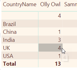
To calculate this, Power BI works out the filter context for this cell:

It then sums the numbers in the Quantity column for the filter context. Because these numbers are all stored in one place, the calculation is very quick: 1 + 1 + 2 = 4.
Now consider the second measure – the one which sums an expression:
SUMX(Sales, [Price]*[Quantity])
Here’s the equivalent figure for UK sales of Olly Owl products:
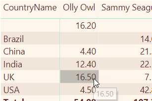
To calculate this figure, DAX can’t just sum the value of a column. Instead, it must work its way down the rows for the filter context, multiplying the price for each product by the quantity sold:

This will take much longer. The calculation is:
4.10 * 1 = 4.1
4.40 * 1 = 4.4
4.00 * 2 = 8.0
DAX then sums the results to get 4.10 + 4.40 + 8.00 = 16.50. To do this, it iterates over the rows, creating a row context for each. This is such an important statement that I’m going to spell it out in detail. First DAX creates a row context for the first row in the filter context:

Here’s what DAX can now see:

It multiplies the price by the quantity, stores the total and ends the row context, moving on to the next row in the filter context.
A function which behaves like this, which iterates down all the rows of a table, creating a row context for each row and performing some calculation before going on to the next row, is called an iterator function.
Creating a Measure to Calculate a Ratio
The database for this example contains two price fields. There’s the price at which goods are actually sold in the Sales table:

However, there’s also the list price for each product in the Product table:

A reasonable question to ask is this: for any given cell in a table or matrix, or any given data point in a chart, what is the ratio between the actual sales values of all the goods sold and what the sales value would have been if everything had sold at its list price? The answer should look like this:
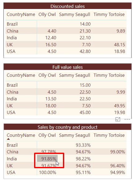
The top matrix shows the value of the sales that actually took place, the middle matrix shows what the value of these sales would have been if the list price was charged for each product in each case and the bottom matrix shows the ratio between the two values.
To calculate this ratio, first create a measure to sum actual sales:
Discounted sales values = SUMX(
// from the sales table, sum the
// price * the quantity for each row
        Sales,
        [Price]*[Quantity]
)
Now create another measure which will sum the product of two figures:
The sales quantity from the Sales table; and
The product’s list price from the Purchase table.
Here’s what this formula could look like:
Undiscounted sales value = SUMX(
    Sales,
    // multiply the product's list price times
    // the quantity sold
    RELATED('Product'[ListPrice])*[Quantity]
)
Why is the RELATED function needed to look up the list price for each product from a separate table? You’ve already seen that measures create filter context– you don’t have to specify how the underlying tables are linked together, as this is done automatically in DAX. However, the SUMX function is an iterator function which creates a row context for each row of the specified table (in this case Sales). Although the [Undiscounted sales value] measure above doesn’t need to cross-reference different tables, the SUMX function within it does, since all each row knows about by default is the columns within that table:

To find out for any row what the purchase list price was, you need to pull in a value from another table for this row context, and for that, you need to use the RELATED function.
The final measure just divides one measure by another:
% of full value =
DIVIDE([Discounted sales values],[Undiscounted sales value] )
Or, if you prefer not to use any intermediate measures, you could do everything in one formula:
% of full value (version 2) =
    DIVIDE(
        SUMX(
            // from the sales table, sum
            // the price * the quantity for each row
            Sales,
            [Price]*[Quantity]
        ),
        SUMX(
            Sales,
            // multiply the product's list price times
            // the quantity sold
            RELATED('Product'[ListPrice])*[Quantity]
        )
    )
Variables
The above all-in-one formula is getting a bit complicated. Here it is again in colour:
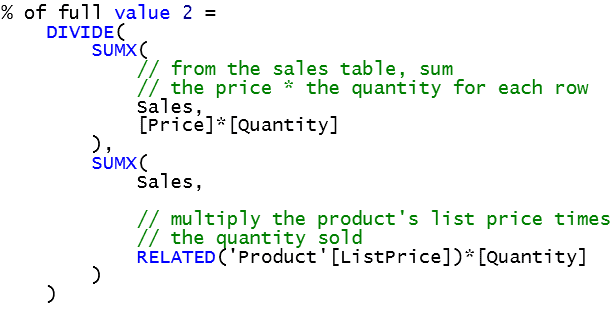
What it’s doing for each cell of a matrix or table, or for each data point in a visual, is as follows:
Calculating one number (total sales for the filter context) – call this A;
Calculating a second number (total sales for the filter context, but using the product’s list price) – call this B;
Dividing the first number by the second number.
You could make this formula easier to read by dividing this into separate stages, using variables to hold the value of the numbers calculated along the way. For this example, you’ll create the following two variables:
DiscountPriceSales to hold the value of A; and
ListPriceSales to hold the value of B.
Then divide one variable by the other to get the answer. The syntax for creating variables in a DAX measure is as follows:
MeasureName =
VAR Variable1 = expression
…
VAR VariableN = expression
RETURN expression
You can declare as few or as many variables as you like in a measure, but you must finish up by returning a value (every measure must calculate a single value for each filter context).
Given the above, here’s what the measure could look like using variables:
% of full value 3 =
VAR DiscountPriceSales =
    SUMX(
        // from the sales table, sum
        // the price * the quantity for each row
        Sales,
        [Price]*[Quantity]
    )
VAR ListPriceSales =
    SUMX(
        Sales,
        // multiply the product's list price times
        // the quantity sold
        RELATED('Product'[ListPrice])*[Quantity]
    )

RETURN DiscountPriceSales / ListPriceSales
It’s important to realise that the two variables retain their value only while each measure is being calculated. A matrix displaying the above two measures might show this after formatting as a percent:
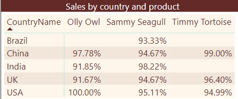
DAX will generate different values of the DiscountPriceSales and ListPriceSales measures for each cell in the filter context. Those who are experienced in programming in other languages should note that there’s no such thing as a public, static or global variable in DAX – at least, not yet.
Using Variables for Debugging
Variables are worth using in their own right since they break complicated formulae up into smaller, more manageable chunks. However, they also have another advantage – they allow you to debug code. Suppose you think you have a problem with the formula above (the version using variables). You could comment out some lines to experiment:
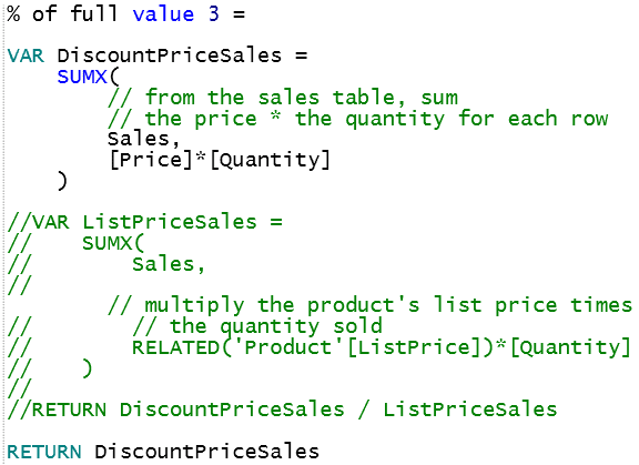
The above example will just show the value of the first variable, but when you’re happy that this is working OK, you could change things to show the value of the second variable:
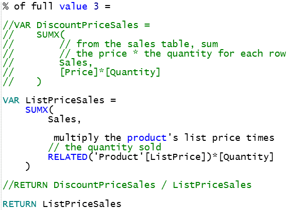
When you’re happy about this too, you could reinstate the original formula.
DAX Studio
I’d like to show how I managed to produce many of the code diagrams above quickly, using a free standalone DAX editing tool called DAX Studio. You can download DAX Studio here (one of a few possible download sites, actually), and then install it in the standard Windows way.
To use DAX Studio, first create a Power BI Desktop report – I’ve saved the one I’m working on as Variables example.pbix:

When you run DAX Studio, you can choose to connect to this data model:
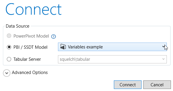
As the above diagram shows, you can link directly to a Power BI or SSAS Tabular data model. To link to a model in PowerPivot, you should install the Excel add-in option for DAX Studio which is out of scope for this article.
Here’s a quick run-down of some of the things you can do in DAX Studio. Firstly, it gives you great colour-coding:

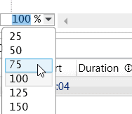
Secondly, you can zoom in and out by holding down the Ctrl key and using your mouse wheel, or by using this dropdown, although Power BI has just introduced this feature, at long last):
Thirdly, you can drag table and column names from the model’s Metadata on the left into the formula window:
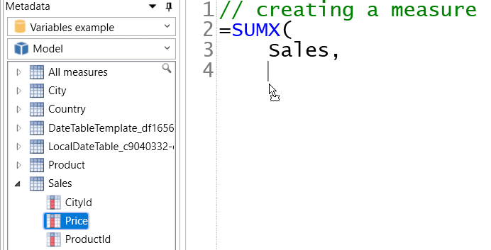
This example would give the following:

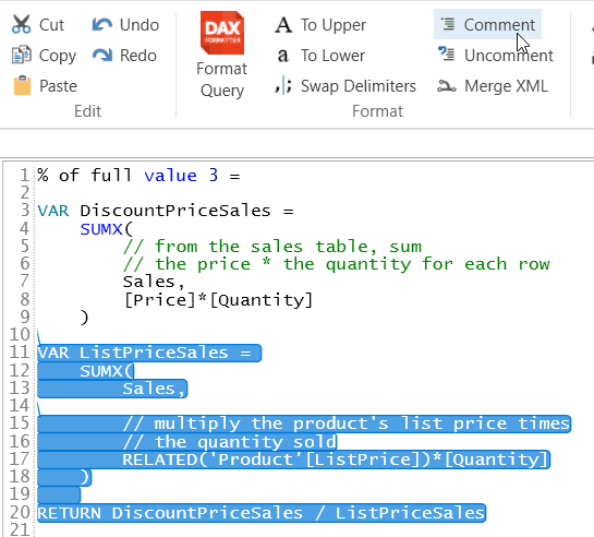
And fourthly, you can easily comment out or comment back in blocks of code which is how I produced my variable measure so quickly. To do this just select the block of text that you want to comment out, or back in, then click on the appropriate tool in the DAX Studio ribbon:
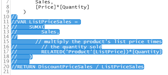
Here’s what this would give:
However, the single best thing about DAX Studio – and the reason I use it extensively – is a very simple one. When you press the ENTER key in DAX Studio, it adds a new line rather than assuming that you’ve finished creating your formula and hence trying to validate it.
DAX Studio does have one big drawback, however – you can’t use it to test a measure. After having painstakingly created a formula, it’s then up to you to select the text which comprises the formula, and then copy this back into Power BI Desktop. It’s worth noting that when you’re writing DAX queries as shown in this article by Robert Sheldon the exact opposite is true – you can run the DAX Queries in DAX Studio, but not within Power BI Desktop).
Quick Measures
Future articles in this series are going to take you a long way down the murky rabbit-hole that is DAX, but it’s worth mentioning that you don’t actually have to write a single formula yourself – you could let Power BI do it for you, using a built-in wizard called Quick Measures. Opinion in Wise Owl is deeply divided on this subject (it’s the Marmite of the DAX world, although I’m not sure that a UK cultural reference like this will travel well!). Some of our trainers love quick measures; I confess I don’t. On the plus side, they allow you to create complicated formulae very quickly, and without any typing. My objections to them are threefold:
They won’t help you to learn DAX, in fact, they might do exactly the opposite, as the formulae that they create can be quite off-putting;
Like all wizards, they generate over-complicated solutions; and
It’s not always obvious which calculation you should choose to use.
Using a quick measure is thus very similar to recording a macro in VBA: you’ll save yourself lots of typing, but the resulting code may be hard to understand, and it may well be written in a way which is often more complicated than a human would choose.
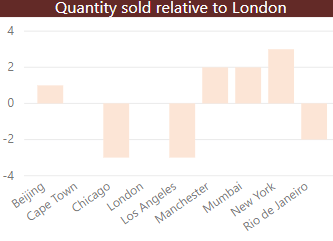
However, why not judge all this for yourself? Take a look at a couple of reasonably typical case studies of using quick measures: one to show the difference between each city’s sales and the sales figure for London, and one to show the chosen values for a slicer in a card.
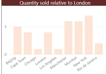
For the first one, suppose you have a column chart showing the quantity of goods sold for each city:
You now want to show this figure relative to the figure for London, to produce this:
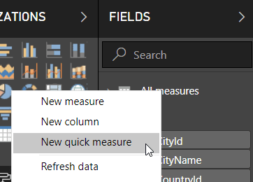
To do this, first create a quick measure by right-clicking on any table and choosing to create a new quick measure (although it makes sense to put your quick measures – just like your normal measures – into a dedicated table such as the All measures table we’ve been using):
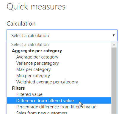
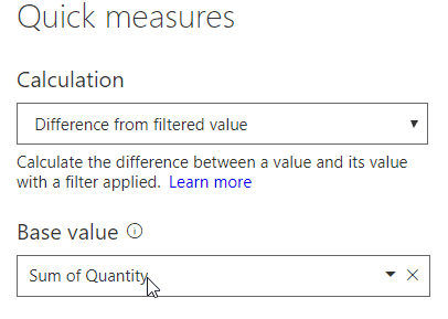
Choose the calculation you want to perform – in this case, it’s to show the difference from a filtered value, although I don’t think this is that obvious!
Now drag the field in that you want to aggregate, summing the quantity of goods sold:
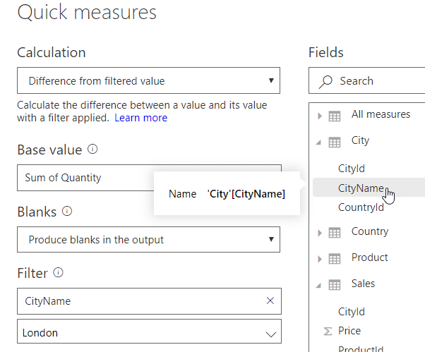
Finally, drag the field that you want to filter by from the fields on the right onto the Filter section of the dialog box to get this:
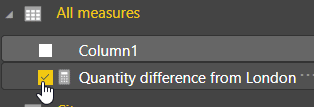
Power BI creates a new measure, automatically giving it a reasonably sensible name:
The measure generated – like many quick measures – makes copious use of variables. It probably won’t make a great deal of sense to you at the moment, as you haven’t yet seen the all-important CALCULATE function in this series of articles:
Quantity difference from London =
VAR __BASELINE_VALUE = CALCULATE(SUM('Sales'[Quantity]),
      'City'[CityName] IN { "London" })
VAR __MEASURE_VALUE = SUM('Sales'[Quantity])
RETURN
    IF(NOT ISBLANK(__MEASURE_VALUE), __MEASURE_VALUE - __BASELINE_VALUE)
For the second example, suppose you have a slicer by country:

You want to show the countries selected in a card:

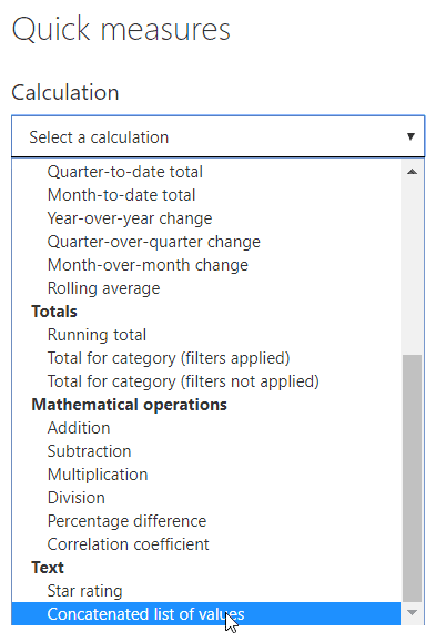
To do this, you could create a quick measure using the same method as above and choose to concatenate the country values selected. You have to scroll right down to the bottom of the list of calculation options to find this quick measure:
You could now drag the CountryName field from the list of fields on the right onto your formula:
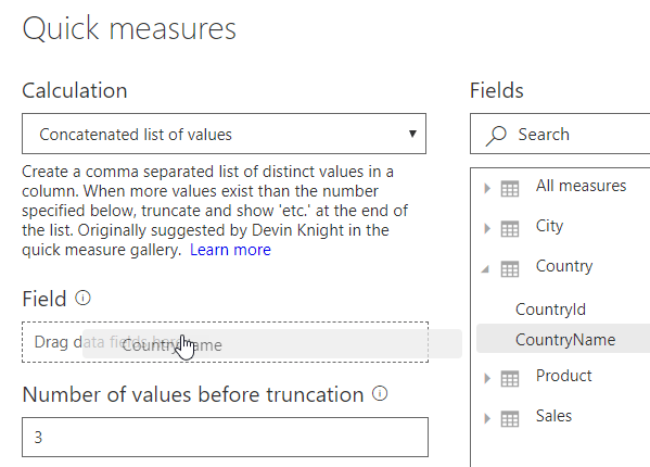
The number of values before truncation determines how many countries you’ll need to select before Power BI stops listing them, showing “etc.” instead. For example, if you leave this as the default value 3 – as above – and choose all of the countries, here’s what you’ll see:

Here’s what the measure generated for this example looks like:
List of CountryName values =
VAR __DISTINCT_VALUES_COUNT = DISTINCTCOUNT('Country'[CountryName])
VAR __MAX_VALUES_TO_SHOW = 3
RETURN
    IF(
        __DISTINCT_VALUES_COUNT > __MAX_VALUES_TO_SHOW,
        CONCATENATE(
            CONCATENATEX(
                TOPN(
                    __MAX_VALUES_TO_SHOW,
                    VALUES('Country'[CountryName]),
                    'Country'[CountryName],
                    ASC
                ),
                'Country'[CountryName],
                ", ",
                'Country'[CountryName],
                ASC
            ),
            ", etc."
        ),
        CONCATENATEX(
            VALUES('Country'[CountryName]),
            'Country'[CountryName],
            ", ",
            'Country'[CountryName],
            ASC
        )
    )
This is pretty hard-core DAX and probably won’t make any sense at all at the moment. It’s basically doing the same thing twice – once for the case where the number of countries chosen is more than 3, and once for when it’s 3 or less.
Conclusion
In this article, you’ve seen that the best place to put measures that you create is in a separate table. You’ve seen that measures always involve aggregation, whether this be for a single column using functions like SUM, AVERAGE, and COUNT or for an expression using the same functions, but with an X suffix. These last functions are called iterator functions and create a row context for every row in the table to which they refer. I then showed how you can create and use variables, and how you can use DAX Studio to edit your measures. Finally, finishing with two case studies of how to create quick measures to avoid typing any DAX in at all. In the next article in the series, I’ll show how you can use the CALCULATE function to change the filter context, and I’ll even explain what that sentence means!
The post Creating Measures Using DAX appeared first on Simple Talk.
from Simple Talk http://bit.ly/2ETNkXL
via
No comments:
Post a Comment